In Drupal, building and managing pages has often meant working hand in hand with developers. Content teams could swap out text or images, but creating new layouts or landing pages usually sat in a queue. Campaigns slowed down, costs crept up, and organisations struggled to move at the pace they needed.
Drupal Experience Builder changes that rhythm. With a visual, low-code interface, editors and marketers can design, structure, and publish pages themselves. Developers still play a role in extending the system with custom components, but everyday page building no longer depends on them. The payoff is faster launches, consistent design, and fewer bottlenecks.
The first stable release will be announced at DrupalCon Vienna in October 2025, though teams can already begin exploring what Experience Builder makes possible today.
Currently, the Experience Builder module primarily supports the Article content type out of the box. To use Experience Builder with Articles, you first need to enable its sub-module, Develop XB on top of the Standard install profile(xb_dev_standard).
However, this sub-module is located under the ‘tests’ directory, so it won't be visible on the Extend page by default.
To make it discoverable, you must first allow Drupal to find test modules. For that, add the following line to your settings.php file,
web/sites/default/settings.php:
$settings['extension_discovery_scan_tests'] = TRUE;
Note: Experience Builder setup currently uses developer/test modules such as xb_dev_standard. These modules may change after launch.
Now, to enable the module
- Navigate to the Extend page in your Drupal admin UI (/admin/modules).
- In the filter box, search for ‘XB’.
- Check the box for Develop XB on top of the Standard install profile (xb_dev_standard) and click Install.

After the module is installed, create a new Article or navigate to an existing one. You will now see a new link in the admin toolbar: Experience Builder: [Article Title].
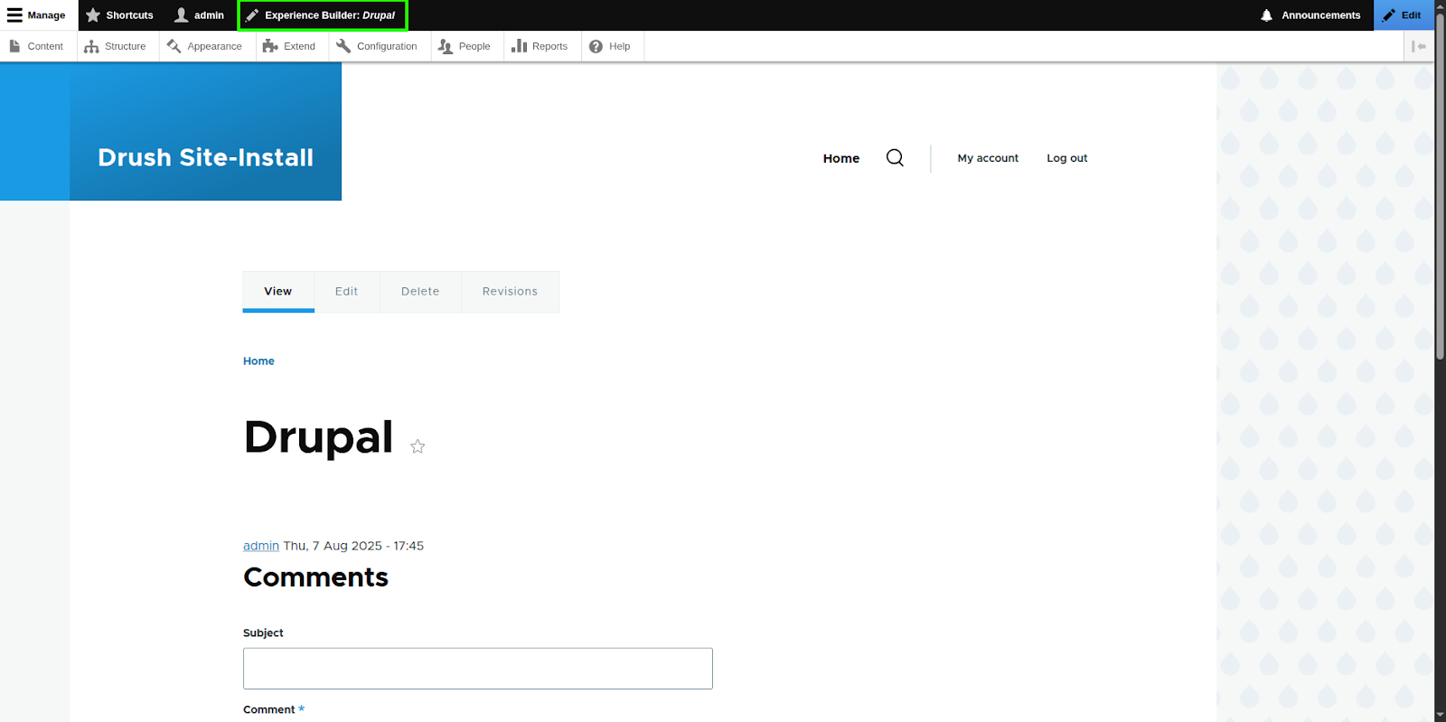
Clicking this link will launch the Experience Builder interface for that piece of content.

When the xb_dev_standard module is enabled, it automatically adds a new field named XB demo to the Article content type. This field is responsible for storing the data and structure of the components you add. It uses a dedicated Field Formatter, Render SDC tree, to ensure the components are rendered correctly on the page.
Getting to know the Experience Builder UI
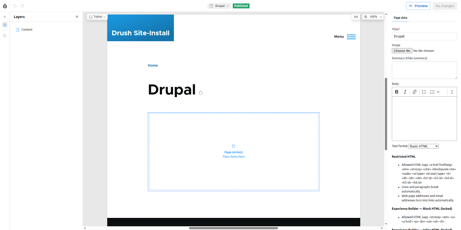
The UI is mainly divided into 4; Top bar, Left and Right sidebars, and the canvas where the live preview of the page is rendered.
Top bar
The top bar consists of the following elements.

- Close Experience builder UI
- Undo/Redo changes
- View the page in different viewports
- Create/Edit pages: Note: When you use the Create New option in Experience Builder, it creates an ‘XB Page’ entity, not an Article node — even if Experience Builder is enabled for the Article content type.If you want to use Experience Builder with another Article page, you must manually create a new one by going to Content → Add content → Article. Then, open that article and click the Experience Builder – {article name} link in the toolbar to access it in Experience Builder.
- Scale to fit
- Change zoom level
- Preview the page
- Review and publish changes
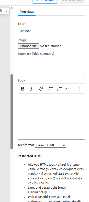
Right side bar
This is where the forms to update the page or component fields appear.
Left side bar
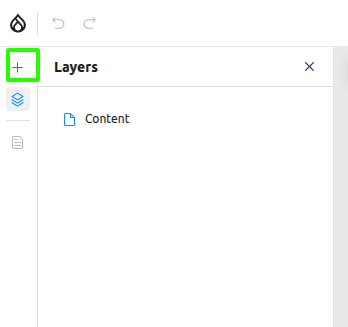
This is a region that lists mainly two things
- The component library, which can be opened by clicking the + button
- Layers: Which shows an overview of components placed on the page
The component library
Note: The demo Single Directory Components (SDCs) are provided through a test module (xb_test_sdc) and are intended for exploration only. Availability may differ after launch.
To begin adding content, click the + icon in the left sidebar. This opens the component library, which displays all the elements you can place on your page.
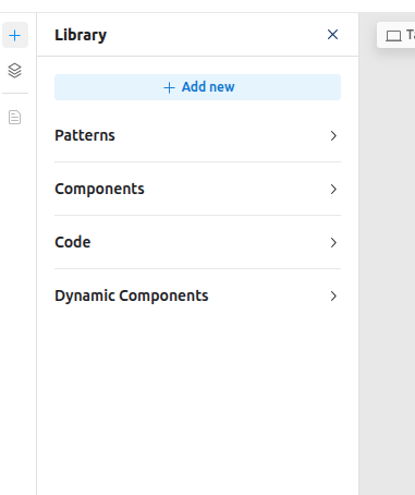
The component library contains the following sections
- Add new: Allows you to create your own custom React components directly from the browser.
- Patterns: Reusable layouts that can be created by combining one or more components into a single, cohesive unit.
- Components: Contains all the available Single Directory Components (SDCs) defined in your themes and modules, as well as custom code components.
- Code: Lists the React components you have created directly within the UI.
- Dynamic components: Includes Blocks. Yes, Experience Builder supports native Drupal Blocks!
On a fresh Drupal installation, your component library might be showing only a single Teaser component provided by the default Olivero theme.
To see a richer set of examples, you can enable the Experience Builder Test SDC (xb_test_sdc) module that ships with Experience Builder. This is another test module that contains several demo SDCs. Enable it from the Extend page, then return to the Experience Builder UI. You will now see a variety of demo components available to use. A live preview of each component can be seen hovering over its name.

Understanding components
In Experience Builder, a "component" can be a Single Directory Component (SDC) defined in your theme or module, a standard Drupal Block, or a custom React component. When Experience Builder detects any of these items, it creates a corresponding Component configuration entity in the Drupal backend.
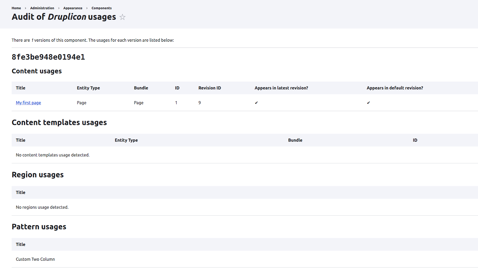
You can manage these component entities by navigating to Appearance > Components in the admin menu.

Here, components are organised into two sections:
- Enabled Components: These are the components that are compatible with Experience Builder and will appear in the component library.
- Disabled Components: This section lists all components that Experience Builder has detected but determined to be incompatible. Crucially, the system logs the exact reason for the incompatibility next to each entry. If an SDC from your theme is not appearing in the UI, this is the first place you would have to check.
This interface also allows you to manually disable any component, giving you full control over which items are available in the UI. Similarly, the Audit option provides a detailed overview of each component's usage across your site, helping you track where and how every component is used.
Adding components to the page
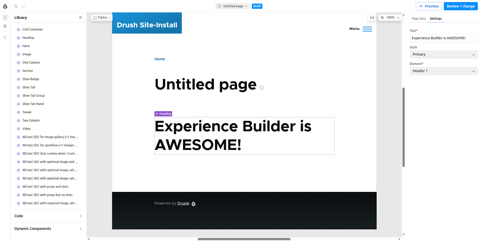
Components can be added to the canvas either by clicking their name in the library or by dragging and dropping them into a highlighted content region. Go ahead and click the Heading component to add it to the page.
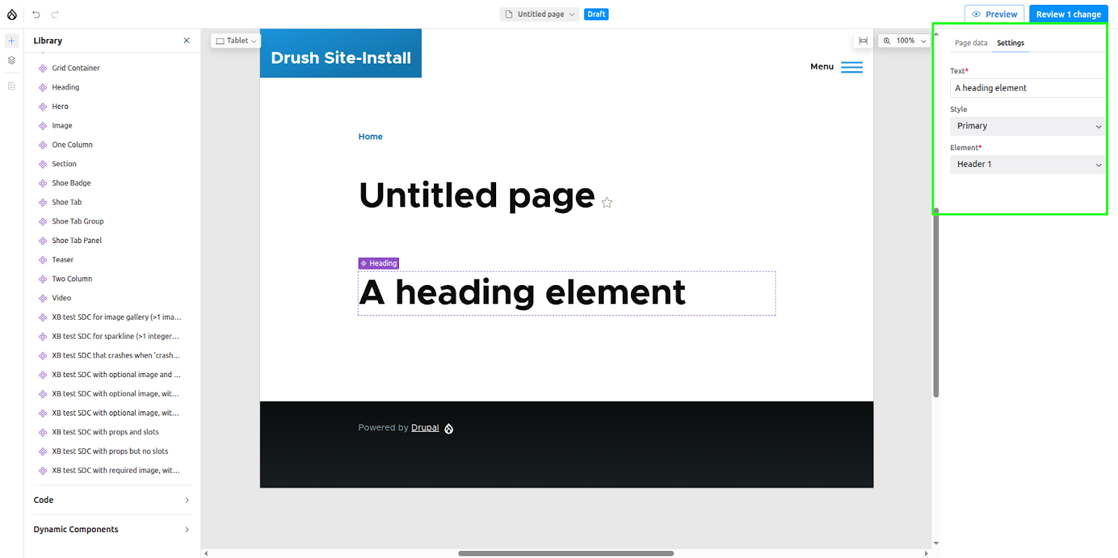
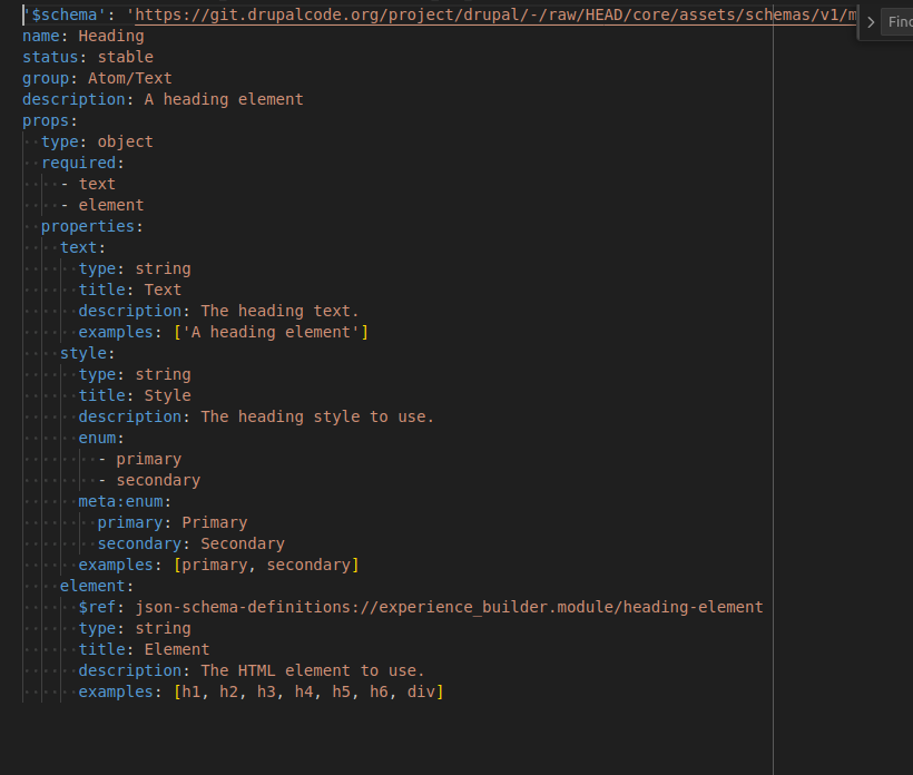
As soon as the component is added, its configuration form will appear in the right sidebar. This form displays the component's editable fields, known as props, which are defined in its corresponding YAML file.
experience_builder/tests/modules/xb_test_sdc/components/simple/heading/heading.component.yml
Try it out: change the heading text to "Experience Builder is AWESOME!" As you type, you will see the preview on the canvas update in real-time.
Next, let's work with a component that uses slots. From the component library, add the Two Column component to the canvas, placing it either above or below your existing Heading.

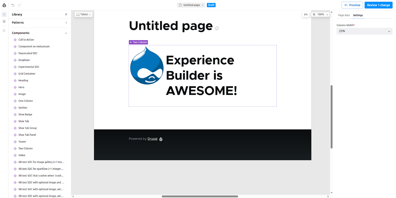
You'll notice that the Two Column component doesn't render any visible content by default. Instead, it provides two empty placeholders: Column One and Column Two. These are slots. Slots are designated areas within a parent component where other components can be nested.
To place a component into a slot, simply drag it from the library (or from elsewhere on the canvas) and drop it into the target slot. Let's try it:
- Drag the Heading component you already created and drop it into the Column Two slot.
- Now, add a Drupalicon component from the library and place it inside the Column One slot.
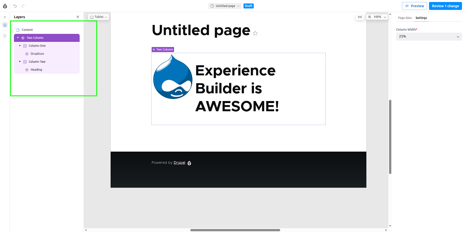
You can see the hierarchical "tree" view of all your components in the Layers panel.
This panel not only displays the nested structure of your page but also allows you to reorder elements with a simple drag-and-drop action. By default, all components are placed within the main Content region.
Editing placed components
Right-clicking on a component, either directly on the canvas or within the Layers panel, opens a context menu with several useful options.
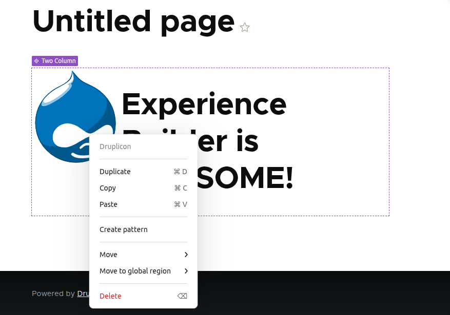
This menu supports common operations like Duplicate, Copy, and Paste, complete with standard keyboard shortcuts. You will also find a Move option, which allows you to precisely reposition a component above, below, or nested inside any other component on the page.
Creating patterns
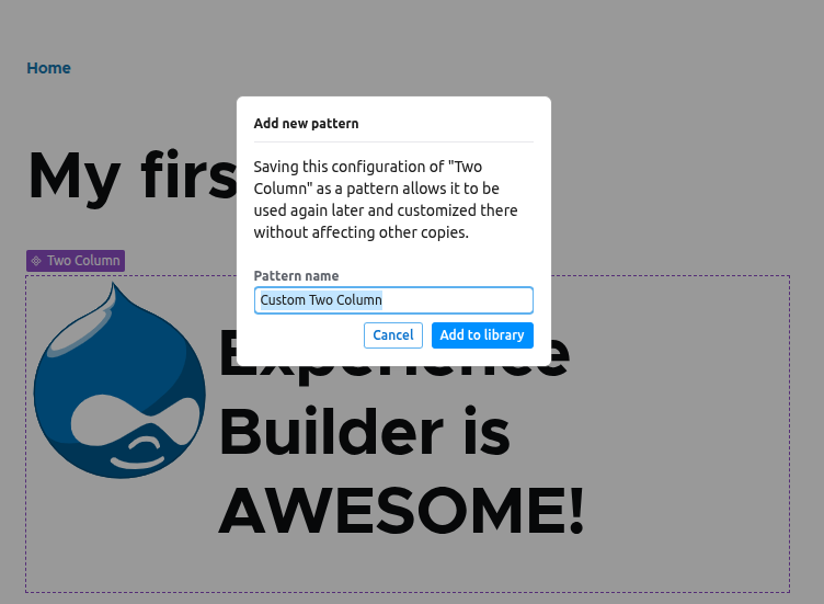
Our two-column layout containing a Drupalicon and a heading is a useful combination. If you want to reuse this structure in other places, you can save it as a pattern.
To do this, select the parent component (in this case, the Two Column layout) and right-click it to open the context menu. Select Create Pattern. When prompted, give your pattern a descriptive name and click Add to library.
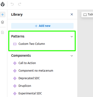
Your new pattern will now be available under the Patterns tab in the component library. You can add it to any page just like a regular component. Each time you use the pattern, you create a new, independent instance, allowing you to change its content without affecting the original saved pattern.
Preview and publish
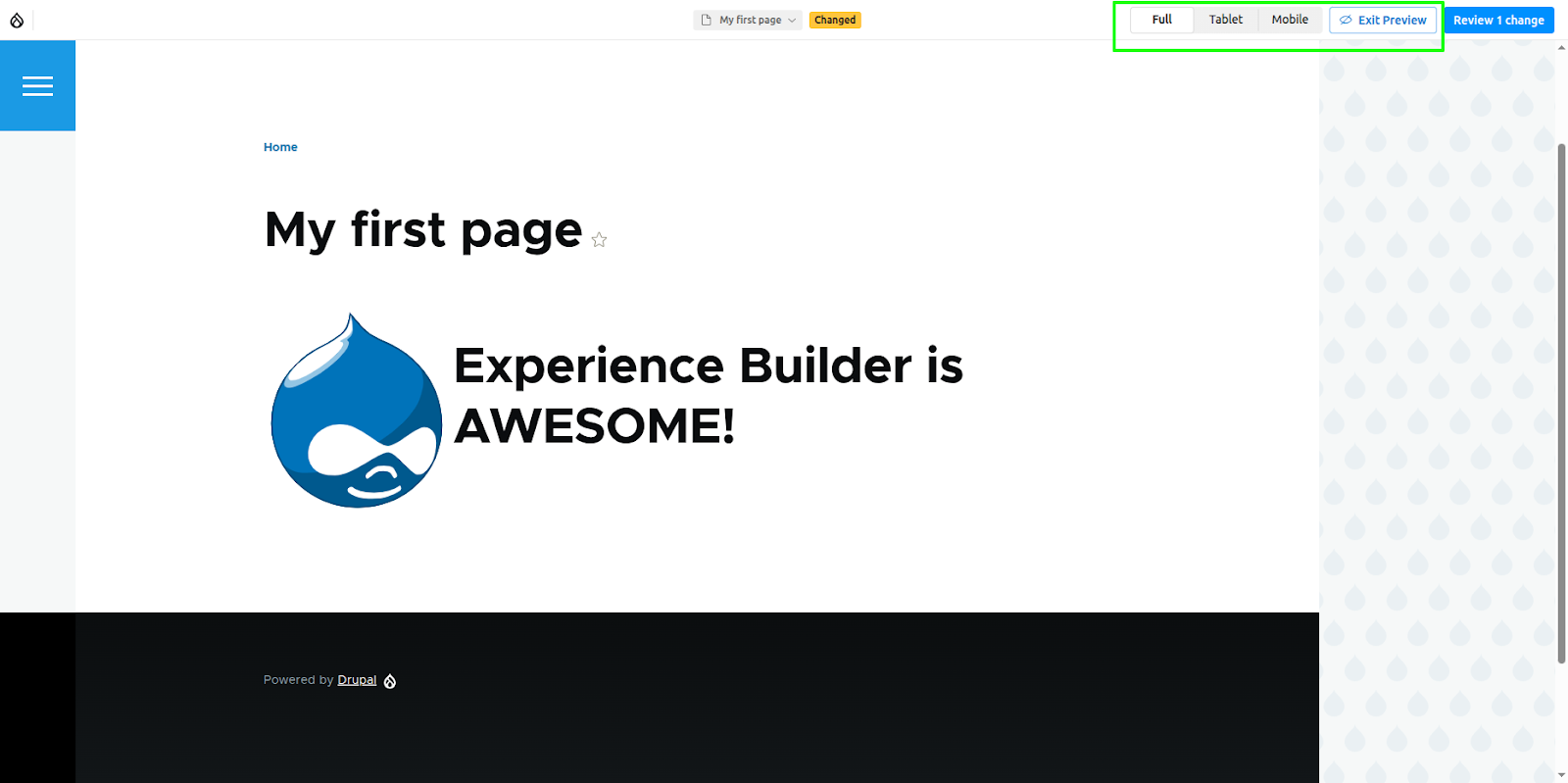
When you are ready, click the Preview button in the top toolbar to see how your content will look on the live site. This feature includes options to simulate how the page will render on different devices, such as tablets and mobile phones.
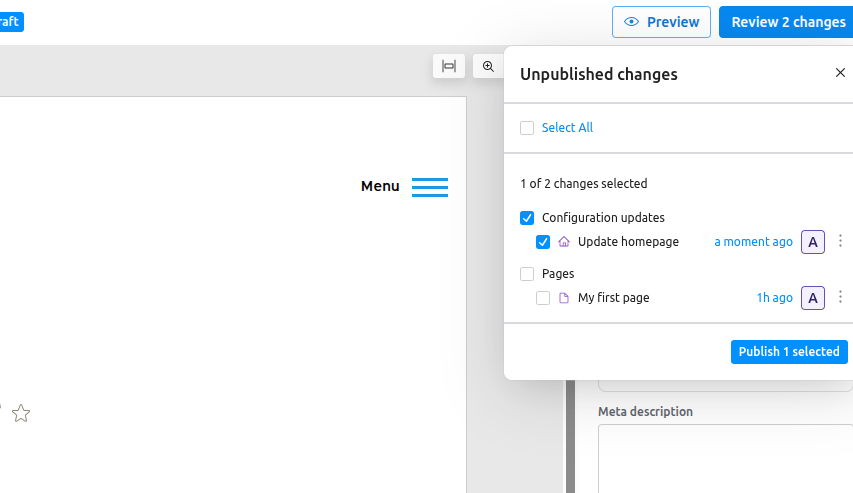
To publish, click the Review Changes button. This opens a screen that lists all pending updates across every page updated. The required changes can be selectively published.
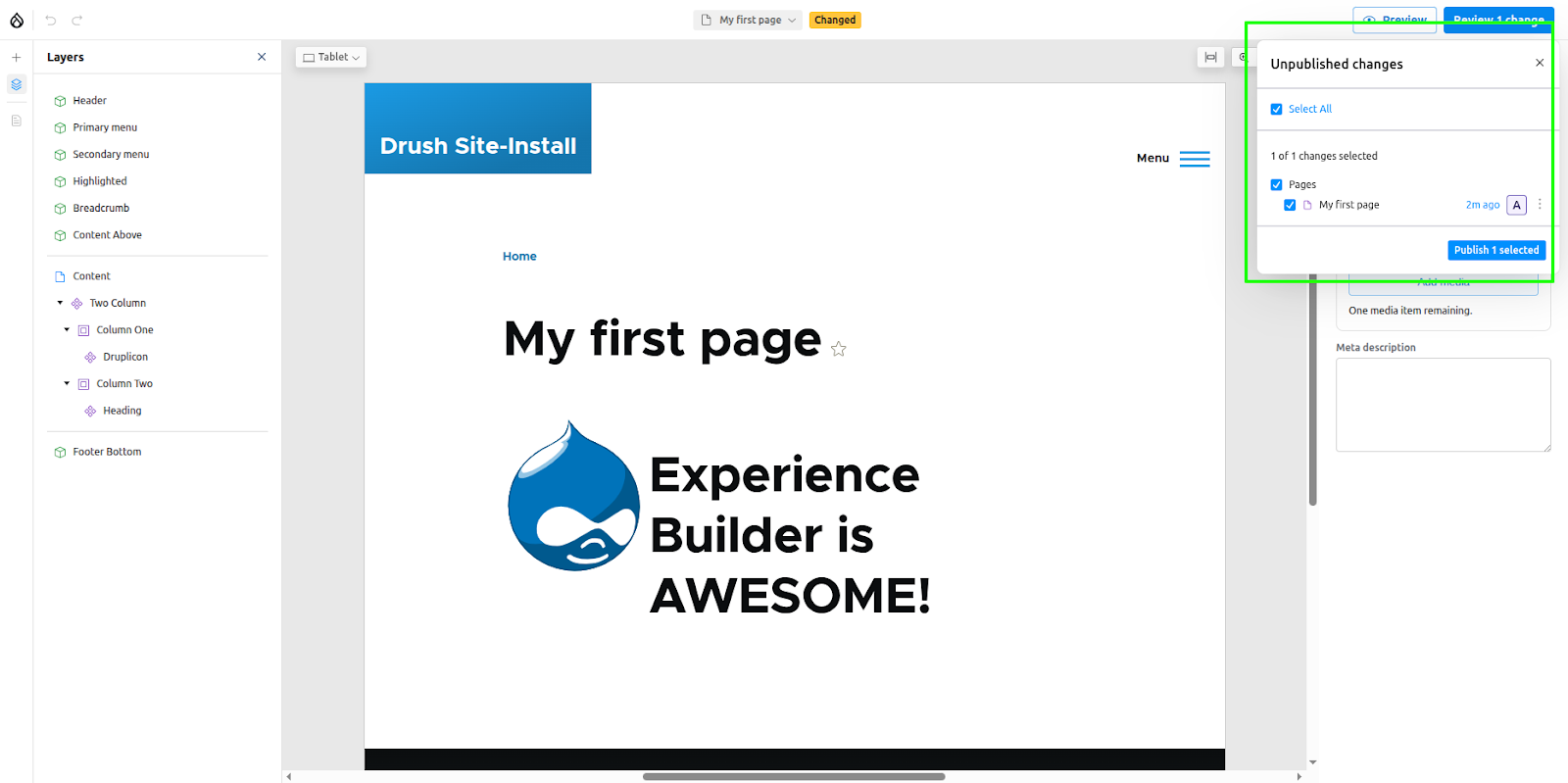
When you update a page using Experience builder, the component data is not immediately saved to the node's XB Demo field. Instead, the entire page layout is converted into a JSON format and stored in Drupal’s private TempStore. To understand this structure in detail, you can review the official data model documentation. Only when the node is published is this data retrieved from the tempstore and permanently saved to the field.
Setting the page as the homepage
Now that your page is published, you can designate it as your site's homepage directly from the Experience Builder interface.
- From the top bar, click the dropdown menu that contains the page name, and then click the ellipsis (...) icon next to the page title.
- A new menu will appear, providing several page-level options:
- Duplicate the page along with its components
- Set the page as the homepage
- Delete the page

- Click on ‘Set as homepage’.
- This action does not update the site's configuration immediately. Instead, the change is staged. This is a safety feature to prevent accidental modifications to your live site.
- To complete the process, you must navigate to the ‘Review’ section and explicitly publish this staged change. Once published, your page will officially become the new homepage.
Enabling global regions
By default, Experience Builder can only access the ‘content’ region, which constructs the main body of a page. However, it is also possible to enable other global theme regions, such as Header, Footer, etc.
To enable global regions, follow these steps:
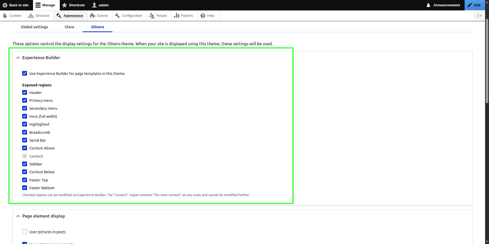
- Navigate to your theme's administration page at Appearance > [Your Theme Name] > Settings.
- Locate and check the option: ‘Use Experience Builder for page templates in this theme.’
- Once checked, a list of your theme's available regions will appear. Select all the regions you wish to manage.
- Click Save configuration.
Once enabled, you'll see these global regions available within the Experience Builder UI. To edit one, simply double-click the region or click the three-dot menu (...) next to its name and select ‘Edit Global Region’. This focuses the editor on that specific area, allowing you to add new components just as you would in the main content region.
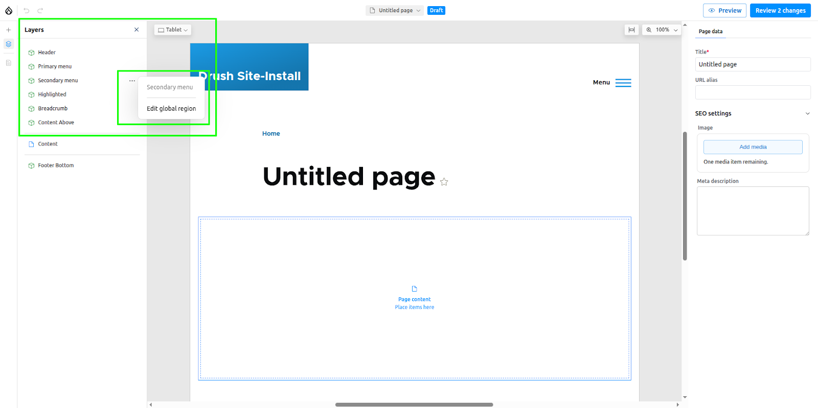
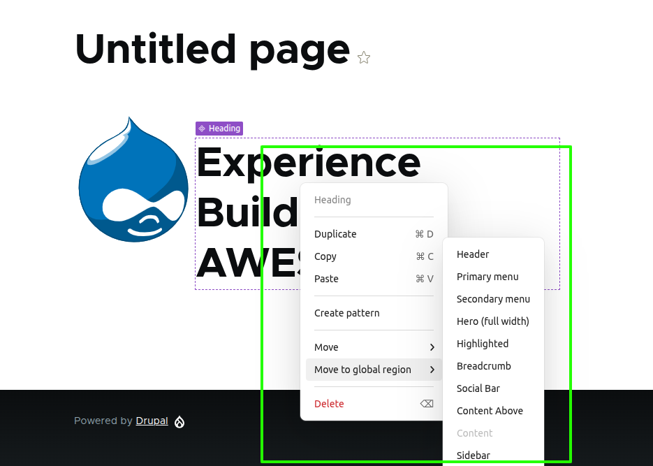
To return to editing your page's main content, just click the region name in the top bar or the left-hand sidebar. Similarly, you can move an existing component from the main content area directly into a global region by using the component's ‘Move to global region’ option.
This flexibility pairs well with Decoupled Drupal, especially where design and delivery teams need faster control of page elements.
Experience Builder permissions
Currently, Experience Builder supports the following permissions:
- Publish Experience Builder content: Allows users to publish changes made using Experience Builder.
- Administer patterns: Grants permission to create and edit patterns.
- Administer page templates: Grants permission to update global regions when enabled.
- Administer content templates: Grants permission to create and update content templates, which allow Site Builders to define pre-structured layouts for specific types of content. This feature is still in development.
- Administer components: Grants permission to manage all component entities.
- Administer code components: Grants permission to create and edit code components.
- Create/Edit/Delete permission for XB page entities.
Code components
Experience Builder lets you create components for your page directly from the UI. These are known as code components. Code components are created using React and should use Tailwind CSS for styling. They make Experience Builder usable for people who have no prior experience with Drupal or Single Directory Components.
Creating a code component
Let's create a small Button component to see how it works. To do this, click ‘Add new’ from the Component Library.
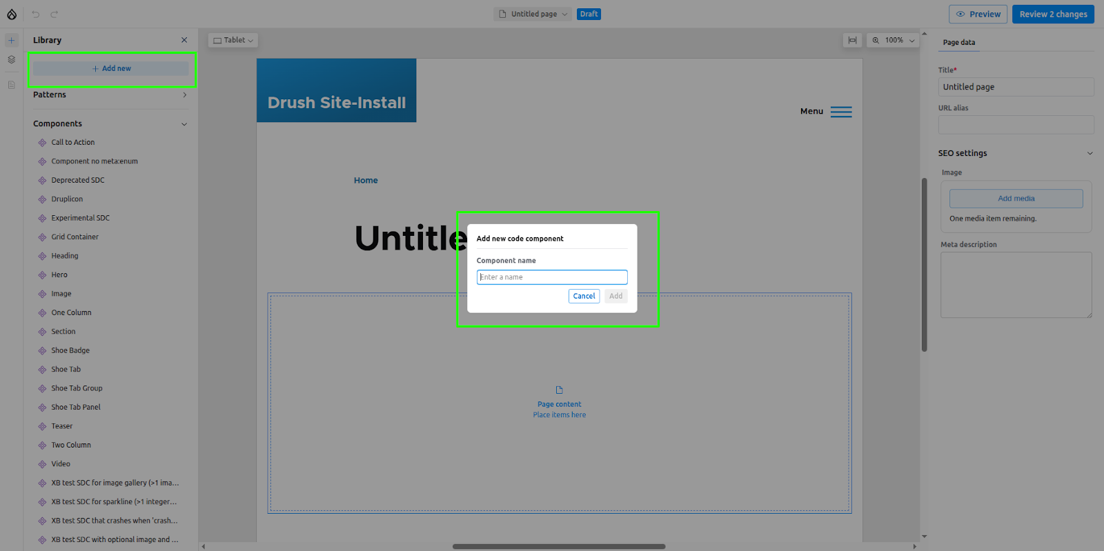
Enter the name ‘Button’ and click Add. This will open the code editor, which consists of four main sections:
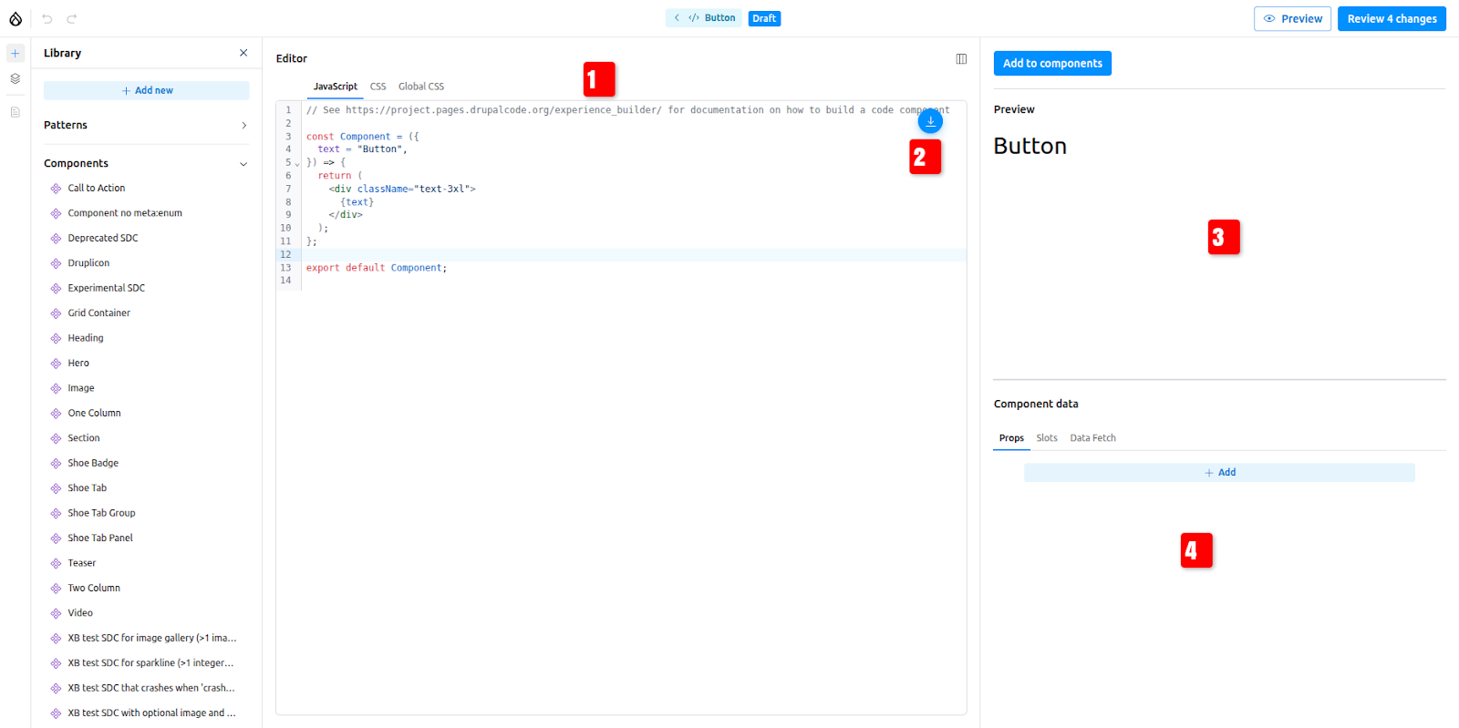
The code editor consists of 4 main sections
- A CodeMirror editor for writing the code.
- Options for importing and using other created code components.
- A preview section that renders a live preview of the component.
- A section to add props and slots for the component.
Update the boilerplate code with this
const Button = ({
  text = "Button",
  url = "#",
}) => {
  return (
    <a
      href={url}
      className="inline-block px-4 py-2 bg-gray-800 text-white text-base rounded hover:bg-gray-700"
    >
      {text}
    </a>
  );
};

export default Button;
Adding props to code components
Our button component uses two props, text and url. We need to be able to change these whenever the component is placed on a page. To do this, the props must be defined in the UI.
- Click ‘Add’ in the Component Data section.
- Use the same prop names as defined in the component code: text and url.
- For the text prop, select ‘Text’ as the type and add a default value.
- For the URL prop, select ‘Link’ as the type.

Promoting our component to the component library
The code component won't get added to the component library by default. To make the component available in the library, click ‘Add to component’. The Button component will now be listed in the Component Library.
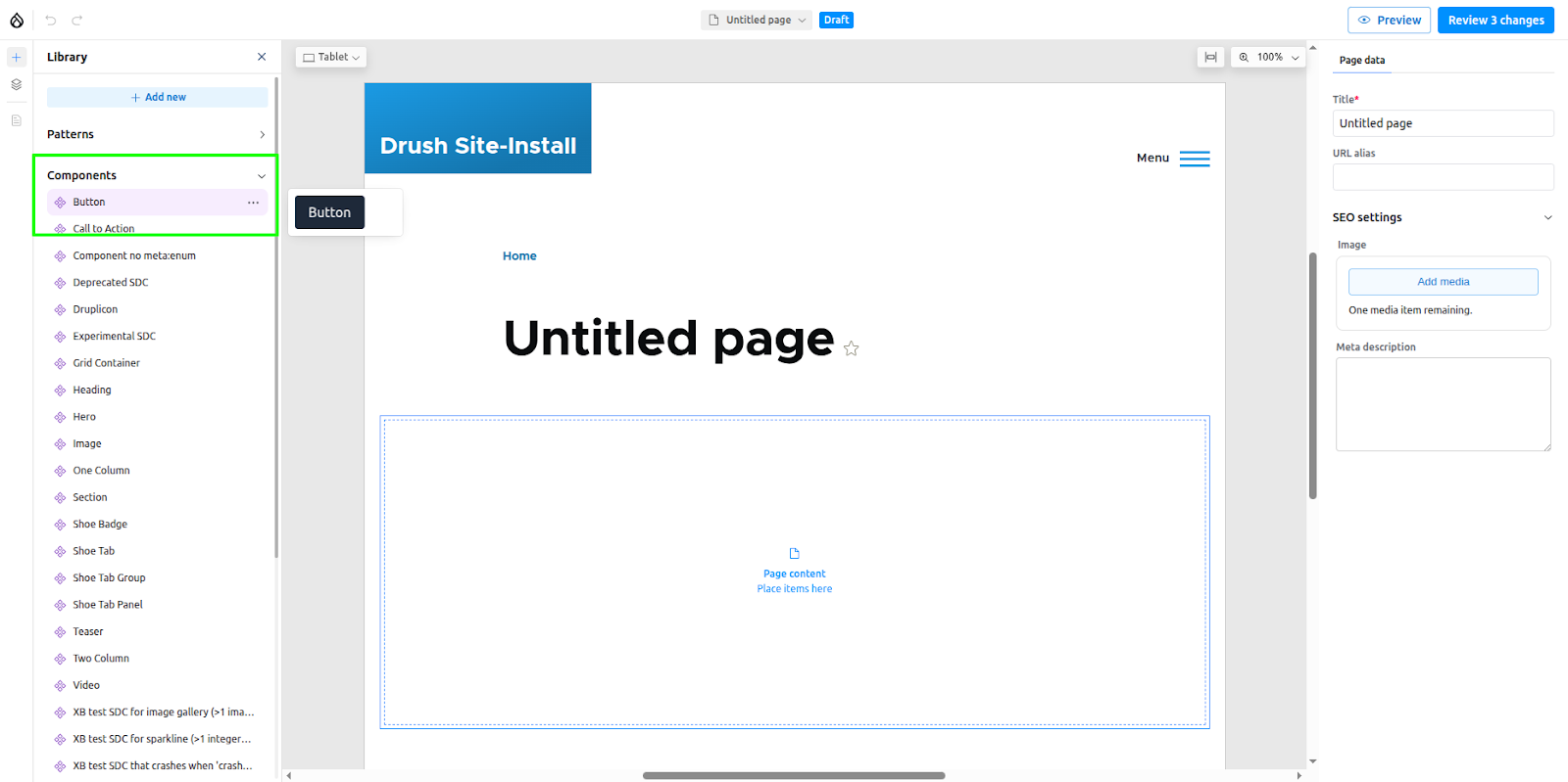
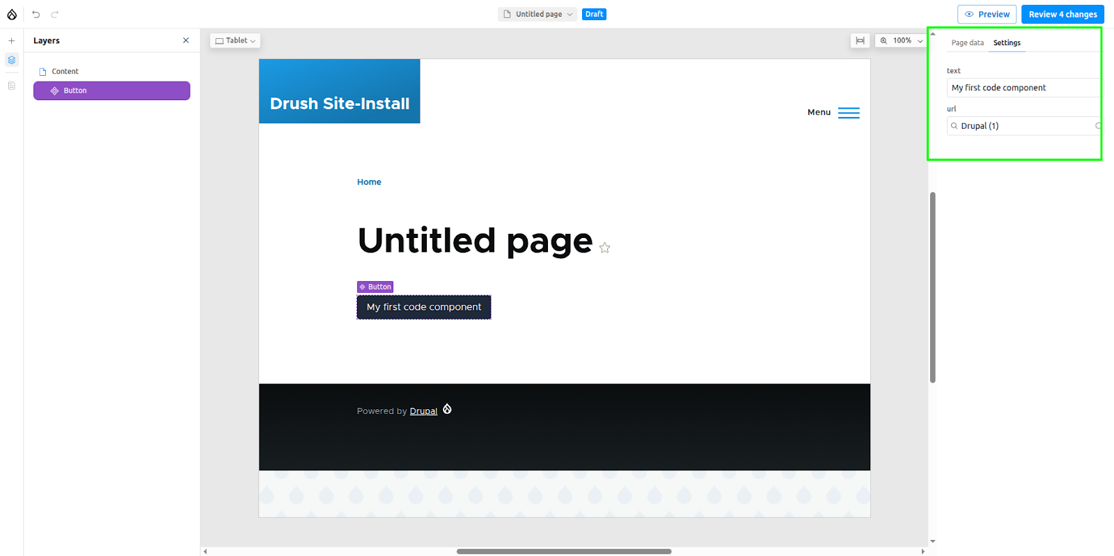
Click or drag the component to place it on the canvas. The component's props form will appear in the sidebar, where you can change the text and URL.
Publishing the assets
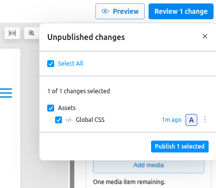
If you publish the page where the button component was placed and view it as an anonymous user, you will notice that the styles are not rendered. To render the styles, the assets must be explicitly published. To do this, go to the "Review Changes" section, select the asset, and click "Publish."
Read the official documentation to understand more advanced features of code components, such as data fetching
Experience Builder creates config entities for managing Page regions, Patterns, Assets, Code components, etc., just like Components.
AI features in Experience Builder
We are now in the era of AI, and Experience Builder also comes with many AI features. These are still in active development, but you could still try some of them. To try out the AI features, enable the xb_ai submodule. Remember, you have to set up an AI provider and install the AI Agents module (version 1.1) to try out these features.
Once the module is enabled, click the AI panel icon to open the chat widget.

Creating code components using AI
Code components can be created using a prompt or by uploading an image. Try the following prompt:
“Create a banner component with a black background, white text, and green rounded borders. Add a prop for the banner text.”
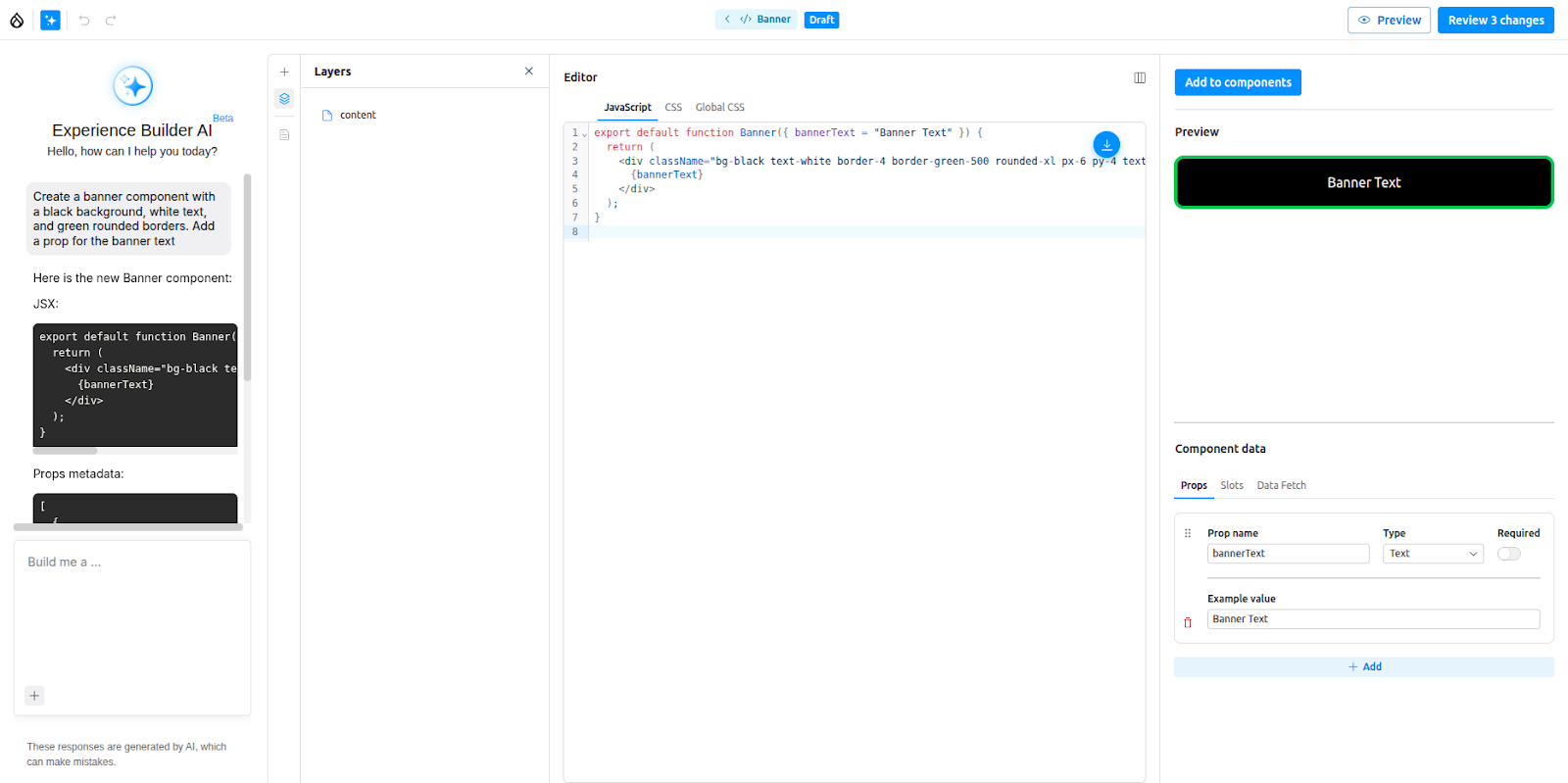
The component will be created, and the prop for the banner text will also be added. The same chat interface can be used to modify the created component as well, like changing colours, adding extra props, etc..
Page building with Experience Builder using AI
Experience Builder also supports AI-assisted page building using available components. For this to work properly, we first have to provide proper information about all the available components so the AI agent can understand how to use them. To do that:
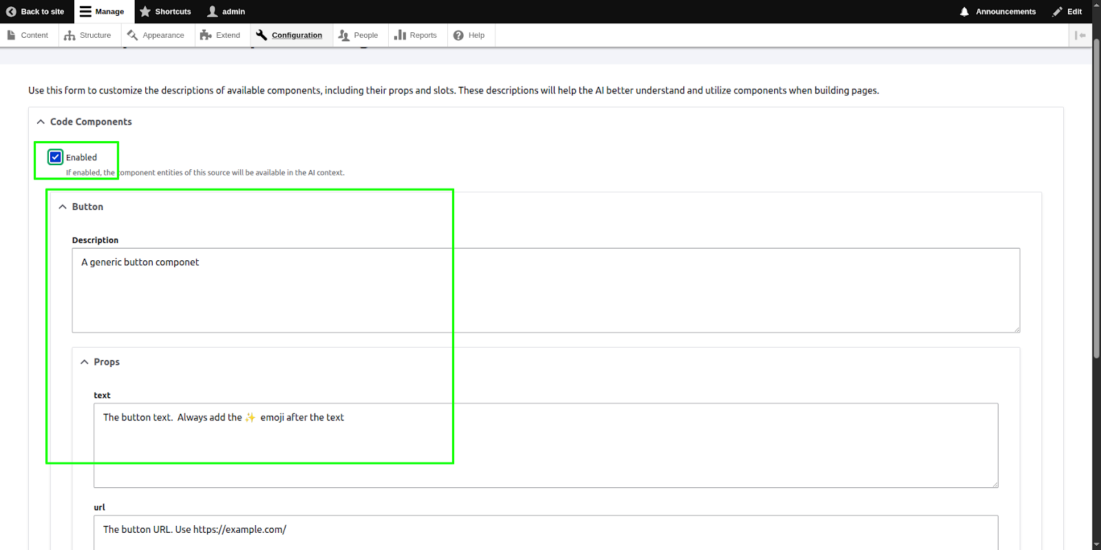
- Go to Configuration >> AI >> Xb AI Component Description Settings.
- By default, the AI agent will use all the available components (Blocks, SDCs, Code components). You can restrict this by enabling components from a specific source.
- Expand each component and provide proper descriptions for the component, its props, and its slots (e.g., when to use it, whether it's a standalone component or must be used in the slot of another component, best prop combinations, ideal components to place in slots, etc.).
Now, open a page and try the following prompt:
Add four button components to the page with the names of four programming languages and URLs pointing to their official documentation
The AI agent should add four button components (the code component we created earlier). It should also add the sparkle emoji ✨ after the button text, as we instructed in the component description form.

Depending on the available components, you could also try prompts such as:
“Create an ‘Our Specialities’ section for a restaurant page” or “Add a hero banner suitable for the homepage of a pizza shop.”
Note: AI-assisted page building is only supported in ‘XB page’ entities. It will not work with articles.
Adding page title and description using AI
AI can also be used to generate titles and descriptions for pages. Try the following prompt:
“Add a suitable title and description for a blog page about the role of AI in programming.”
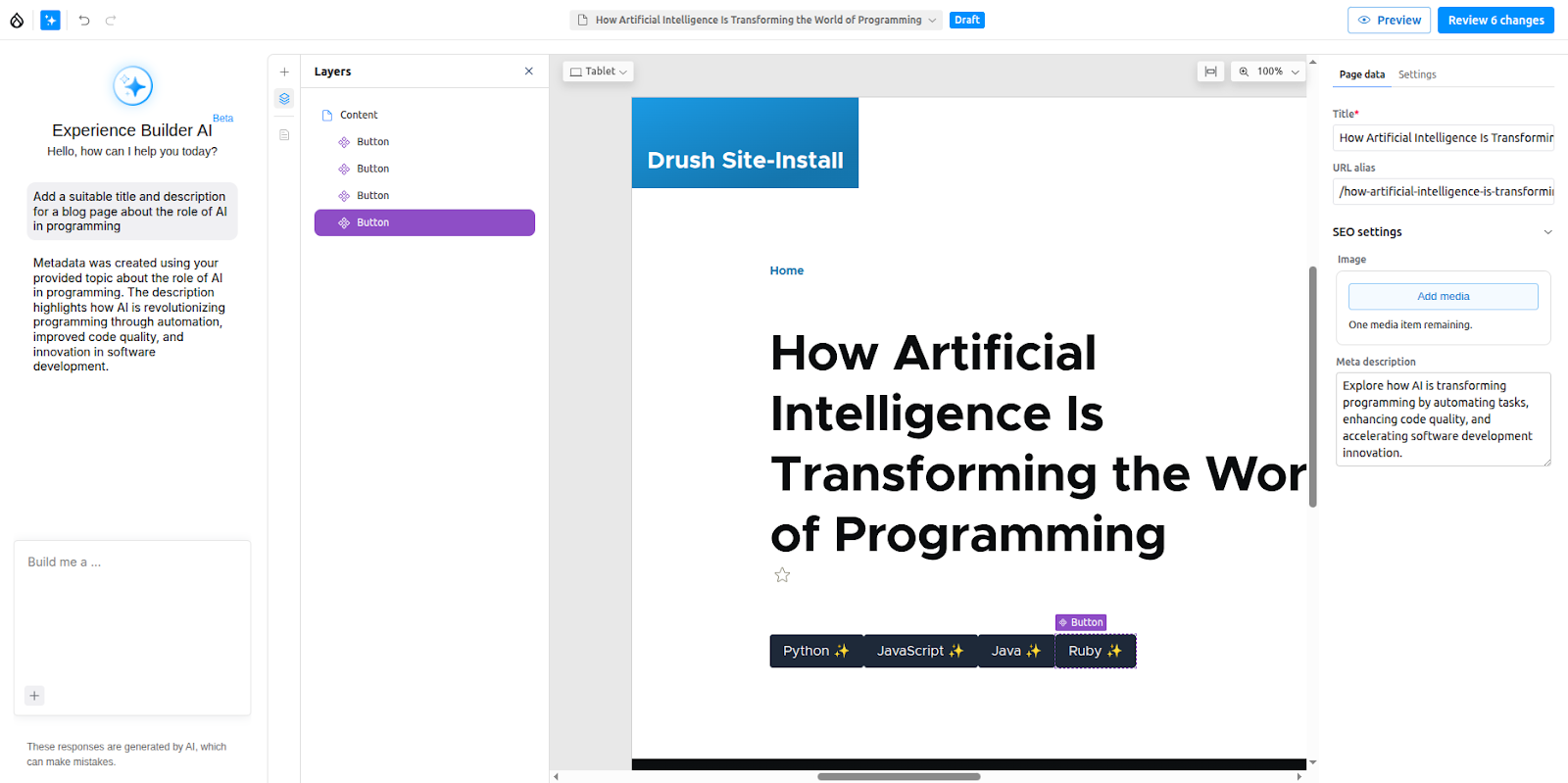
Note: This is also only supported in ‘XB page’ entities and will not work with articles.
These tools sit alongside other projects like Exploring Drupal’s AI Agents and AI-powered semantic search in Drupal.
Conclusion
Drupal Experience Builder gives teams a practical way to cut the delay between ideas and execution. Page updates that once required a developer can now be handled directly by content teams, keeping work moving without extra steps.
Its real impact will be seen in how organisations manage growth. As sites expand, the ability to reuse patterns, align layouts across regions, and publish quickly can reduce overhead and keep performance consistent.
The future is not about replacing developers but letting them focus on higher-value work while editors and marketers handle day-to-day changes. For organisations, that means faster delivery, fewer bottlenecks, and sites that stay aligned with business goals.
FAQs
Can I use Drupal Experience Builder today?
Yes. It can already be enabled for Articles, with a stable release expected after DrupalCon Vienna in October 2025.
Does it work with global regions like headers and footers?
Yes. Global regions can be enabled in your theme settings and edited in the Experience Builder UI.
Do non-technical users need developer support to use it?
No. Editors and marketers can create and publish pages directly without waiting for developers.
How is it different from Layout Builder?
Layout Builder is developer-oriented. Experience Builder provides a cleaner interface with reusable patterns, designed for editors and marketers.
Is it suitable for nonprofits or smaller teams?
Yes. Nonprofits and smaller organisations benefit by reducing IT effort and publishing faster. They can also combine it with Drupal AI translation modules to reach multilingual audiences.

