How Banyan Living built a digital guest experience as premium as their properties
.webp)

Focus
Partnered with Banyan Living to build a direct-booking platform that converted curious visitors into confirmed guests, growing monthly reservations by 580% in five months
Services
UX Strategy
User Experience Design
Decoupled build with Drupal 10 and Next.js
AWS GenAI Workflow
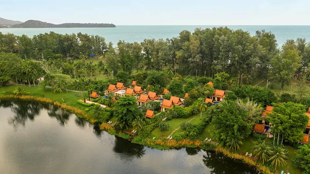
Banyan Living offers premium residences thoughtfully designed for professionals, families, and couples who value comfort, privacy, and leisure across Thailand's most sought-after destinations.
As part of Banyan Group, a multiple award recipient and one of Travel + Leisure's Top 25 Hotel Brands in the World, Banyan Living's properties reflect understated luxury rooted in local character, crafted for both short escapes and longer stays.
As the brand grew, so did the need for a digital presence that could match the quality and care of the physical experience, one that could bring guests closer to Banyan Living on their own terms.
We partnered with Banyan Living to design and build a platform that is intuitive, welcoming, and unmistakably Banyan.
.png)
.png)
.png)
Challenges
Like most premium hospitality brands entering the direct-booking space, Banyan Living faced a structural challenge: the off-the-shelf tools available for short-term rental management are built for listings at scale, not for brands with a distinct voice and a considered guest experience.
OTA platforms offered immediate distribution but came with trade-offs: commission on every reservation, limited control over brand presentation, and no ability to surface seasonal pricing or tailored promotions before a guest committed. A branded direct platform was the natural next step. The question was how to build one that matched the quality of the physical experience.
They needed a platform that could do what their properties already did: make guests feel genuinely looked after from the very first moment of contact.
.webp)
.png)
Approach
Our engagement began with collaborative workshops to understand how Banyan Living envisioned their guests experiencing the platform. To understand the brand, the guest, and the journey before anything else.
Those sessions helped to map the complete guest journey: discovery, comparison, decision, and booking. We studied what the leading OTAs do well and identified what a branded direct platform could offer that they could not: a genuine Banyan story, seasonal pricing surfaced upfront, and a compelling reason for guests to book direct.
With a clear picture of the brand and its guests, we aligned on a design direction rooted in Banyan Group's identity before a single component was built. The shared brief was clear: reduce effort, build familiarity, and let guests move at their own pace.
Solution
A booking experience guests want to complete
The platform guides guests naturally from discovery to confirmation. The homepage leads with destination hubs (Phuket, Krabi, Pattaya) and property categories (premium, family, luxury), the two filters that map most naturally to how leisure travellers think. Guests can search by location, dates, or number of guests from the landing view, without needing to log in.
Property detail pages surface location and pricing early, with amenity detail and cancellation policies available as interest deepens. A contextual map shows not just where a property sits but what is nearby, so guests can assess relevance as part of their decision. Seasonal pricing and promotions are visible before any booking decision is made. No hidden fees at checkout. No surprises.
.png)
A platform that looks and feels like the brand
Every part of the experience was designed in line with Banyan Group's brand guidelines. The visual language, the tone, the structure — all of it was built to feel like a natural extension of the properties themselves. Guests arriving on the site feel the same care and consideration they would expect on arrival at a Banyan property.
.png)
.png)
Full control for the team
Content teams can update listings, pricing, and promotions independently. No developer involvement needed for day-to-day operations. The platform is built on Drupal 10 as the content backend and Next.js as the frontend, giving teams a structured, reliable environment to publish and manage content with confidence.
GitHub Actions manages the release pipeline, giving non-technical teams a self-serve publishing workflow. The interface adapts as booking logic and pricing structures evolve, without disrupting the backend or slowing delivery.
Direct bookings, no commission
The platform gives Banyan Living a direct channel to its guests, independent of OTAs. Every booking through the site is a direct booking. No commission paid to third parties, full visibility into guest data, and complete control over how the brand is presented and how pricing is structured across seasons and promotions.
.png)
.png)
Infrastructure and delivery Integrations that run themselves
2C2P handles payments, with a two-way Guesty integration: availability is pulled in real time, and confirmed booking details are pushed back automatically on payment completion. Guests receive an instant payment confirmation. Google Translate is built in to serve international visitors across Banyan Living's key source markets. The entire operational layer connects and runs without manual intervention.
Outcome
Direct reservations grew 580% in five months. The new platform gave Banyan Living something they did not have before: a digital presence that reflects who they are. Guests now arrive at an experience that feels as considered as the properties themselves, moving naturally from discovery to booking without friction.
The team manages pricing, promotions, and listings independently, with no developer involvement needed. And every reservation through the site is a direct booking, with no commission, no intermediary, and full brand control.
QED42 was a strong partner throughout the Banyan Living website project. From onboarding to delivery, the team stayed organised, responsive, and consistently delivered on schedule. What stood out was their ability to translate ideas into working features quickly, while also suggesting practical improvements based on what is working elsewhere in the industry. The collaboration was smooth, and the result met our expectations
Marc-Antoine P.
Director, Marketing

Bring us your challenge
We’ll help you get clear on what needs solving,
that’s where we begin

.webp)
.webp)


.webp)
.png)
.png)

.avif)

.avif)
.avif)
.avif)


.avif)


.avif)
.avif)


.png)