All blogs

Enhancing Design Systems with Effective Color Selection
The first stage in creating a design system is building a solid foundation. This includes the core elements of a design system, such as colors, typography, layout, icons, and the like. Once the foundation is sorted, the next step is to define the components, patterns, and templates.
Colors form one of the key components of creating a Design System, other than typography. A graphical user interface may not necessarily contain icons, panels, or pictures, but it always contains text and color. This is why, picking out the correct set of tones, variations, and shades can be very important.
The process of generating a design system's color component is depicted below.
Naming nomenclature
Choosing the correct naming convention is the first step to building the color component. It should be done before defining the colors and numbers of tones. The names chosen for colors in the design system should be reflective of the purpose they will help solve. This is why they are given the names Primary, Secondary, and Tertiary instead of the usual red, green, blue, and yellow. This provides greater flexibility and ensures that even if a project goes through a phase of rebranding, the names of the colors stay consistent, in the UI library.
Primary colors
Primary colors are the core colors of a brand and they define the overall look and feel of a brand and product. They are the main brand colors and are used everywhere, including neutrals.
Primary colors are also the most frequently used ones across the UI to give a distinct identity to a brand. These colors are set by the brand to set apart its identity. Opting for brand colors as primary colors also helps strengthen a brand’s overall awareness.

Secondary colors
Secondary colors are used to complement and highlight the primary colors. They are mostly used sparingly to help specific UI elements stand out and are defined in brand guidelines. A brand often has around one to six secondary colors.
Secondary colors aid in section navigation for keyboard users. They also highlight titles or headings. Secondary colors also inform users about the active sections that are currently being viewed.

Neutral colors
Neutral colors include various shades of grey, right from white to black. They are mostly used for backgrounds, and text colors and aid in forming a majority of the UI.
Though neutral colors may not seem as vital as primary colors, they are used practically everywhere. Neutral colors serve as supporting colors by reducing eye strain.

Semantic colors
Semantic colors by definition are those colors that are used to communicate a specific purpose. They aid users to convey certain messages. For example, the colors used for the warning are generally red, for an alert is generally yellow, for success is generally green, etc.

Color palette
A color palette consists of a set of colors that are to be used in a design. It mostly consists of a group of colors that work well and gives a sense of uniformity in its use in design, creating a sense of consistency regarding how it is leveraged in certain products.
A color palette ties everything together and gives visual harmony to the colors being used to define a brand or product. Designers opt for color palettes to give a unified look and feel to a product while defining emotions and providing visual hierarchy. While a color palette usually consists of three to five colors, it might have more as well, depending on the requirements.
Once a color palette has been defined, it is equally important to test its accessibility and ensure that it matches the colors of the existing user interface.
Create swatches for colors (tint stack)
The best tint stacks envision more than a color combined with HEX codes, code variables as well as other indicators, like prohibited overlaid type. Create as many lighter and darker tints of the primary, secondary and semantic colors, as possible. This can be done with a quick scan. Stack colors are available in each hue, treating the stack as a visualization to be able to include necessary details concisely. To get light tones on Figma, choose the color and boost the brightness.
You can experiment with HSV and make a brand-new palette. (HSV-Hue, saturation, and brightness value).

Truncate the swatches
Users can choose colors more quickly with fewer alternatives.
As a responsible designer, selecting the tones and blending them to offer well-balanced color selections. Truncating the swatches aid in removing colors and shades that are quite close to each other.

Color theming
Color themes are conceptualized with the idea of being harmonious while being accessible and having distinguishable UI elements from each other. Theme colors are often applied to predictable accents throughout the UI, such as in the form of a button background color or as an active tab background color. However, theme colors should be designed to ensure that they do not alter the other bits and pieces, such as long-form type or a link color, making it go invisible.
Contrast and color accessibility
Focusing on the accessibility of color contrast needs to be a core practice when looking to set up the color component in a design system. It is necessary to utilise accessibility practices into a workflow to kindle and spread the values of accessibility across enterprises. It is imperative to ensure that all colors and their varied shades adhere to the WCAG (Web Content Accessibility Guidelines). It is crucial to keep in mind that color is critical to a design system, similar to how accessible color contrast is crucial to color.

How to change color accessibility?
A major drawback of WCAG guidelines is its obvious threshold: a color pair that might pass or fail. This often makes a designer crave more, leaving stakeholders bewildered over how badly a color pair is failing or how much is needed for it to change. Adjusting the hue, saturation, and value of colors to develop the right tone is the ideal solution.
A spectrum of choices along with a line indicating pass and fail should be fairly evident. This helps in transforming the whole process from trial and error to the organized tuning of a dial. A rational discussion focussed on balancing the visual tone, brand identity, and accessibility sensitivities ensure the result is perfect.
The final goal is to provide the optimum user experience by using soft color contrasts that are both pleasing to the eye and also create a positive outlook. It is of prime importance to adhere to the fact that anyone with a visual impairment can read the result just as easily.
Calling colors
The naming standard requires selecting a name that quickly associates itself with a specific category of colors. For instance, instead of naming the primary brand color red, call it a primary color instead. This is done to enable the making of quick adjustments for future changes.
With regard to the enlarged palette, pick a number and multiply it by 10s, 100s, or 1000s instead of labeling the colors ‘Primary light, Primary lighter, Primary lightest, Primary dark, Primary darker.’ This way of naming makes the various color variants in the palette simpler to understand and remember.

In conclusion
When looking to create a UI library for your Design System, it is important to set proper colors that are consistent and help in establishing a foundation of different shared styles. While the primary colors, make up the brand's core colors, secondary colors, go well with the primary colors and are used to highlight sections. Similarly, neutral colors, need to add depth and help to reduce strain, and semantic colors, serve a more general purpose because they are commonly accepted as the color of function.
When it comes to naming conventions, consider the purpose of the specific color and then plan adequately for all the additional tones. Make a tint stack after adjusting the HSV values. Limit options to develop a palette. Keep them in check. Name them now according to their purpose and tone number. Mention the hex value of the tint too. In this manner, it will be simple to access the color again.
_0.avif "Understanding Typography in Design Systems")
Understanding Typography in Design Systems
Regular digital interfaces come with a large variety of visuals, images, and graphics. What is common in all of these is that; they’re all made up of words. As teams consistently design and develop code for usable, frictionless interfaces using systems, it is necessary to ensure these words have a powerful foundation of typography backing them. Typography is inarguably one of the most essential aspects of a webpage and is one of the most basic building blocks of a UI. A successful design system needs to be built on a foundation of sound typographic understanding. Strategic typography makes content readable and legible.
In this blog, we will be discussing the basics of typography and asses the best ways of developing a font library that has adequate style to fit in both the present and future of a brand’s design system.
Typeface and Fonts

Before digging deep into further details, it is necessary to settle on the basics; fonts. Explore, compare, analyse and research to pick out the best options. It is important to pick a typeface that adds a personality to the app and aids in building brand awareness.
A typeface is the font family and fonts are the different members belonging to that family. Which is another way of saying that if a typeface is the name of the main text style, fonts are variations of that typeface. So, typefaces show a collection of related fonts whereas fonts depict the difference in the weight, width, and style of that particular typeface.
Also, while it may be tempting to use multiple typefaces in the UI library, it is best to stick to one or two font families at best; one for heading and the other for text styles. This helps to maintain consistency across the Design System.
Sizing typography
The correct use of typography requires using it invariably with an established well-defined hierarchy. Creating and enforcing this hierarchy requires a sizing scale that defines a base size and ratio that helps determine how size increases steadily, across different styles. This primarily works because, as the sizes increase, minor variations become unnoticeable. Instead, it is best to eliminate unnecessary similar sizes to ensure a broad range of usable sizes within the system.
Display font and Passage font
Display font is primarily for larger headings instead of body text. The body text used in passages or the content that comes under the display typeface is referred to as passage font. Body font or passage font is usually smaller in size because it is designed to be read and consumed in larger quantities.

Incorporating size and font together
Using both size and font together can help construct a system that looks somewhat like this -
- Headings
- Body Text
This method of giving a definitive size helps give the style count to a few specific core sizes. Titles, subtitles, body passages, and other elements can be arranged using a typography hierarchy to make it easier for readers to consume the information. This is more than enough to execute consistency, allowing flexibility in the design of UI components. Also, it is necessary to ensure that the size of the font is such that it doesn’t cause readability issues while maintaining its aesthetics.
A couple of key points to keep in mind when choosing display fonts and passage fonts are -
- Increase the font weight and size when selecting the display font to verify the character spacing.
- Stick to typefaces that go well with the display font and are readable in small text sizes when selecting passage fonts.
Font weight
Font weight helps to adjust how bulky or sleek a text is to appear on the screen. It is what determines whether the text is accessible as well as aesthetically appealing to the viewer/reader. Different font weights indicate important information and help in drawing attention to the same as well as help to maintain text hierarchy.

Also, extreme weights make a text difficult to read, especially if it's a body text. If the goal is to provide proper clarity of design, it is best to avoid weight-heavy texts, that are unnecessarily bulky and low on readability. However, in certain cases, boldening letters can help them stand out as well; depending on the size and font being implemented, such as for Heading I or Heading II.
Font Fallbacks
It is necessary to offer alternative options in chronological sequence if a font family is not accessible. They are referred to as "fallbacks.” In the event that a font family is unavailable, fallback options are available. The system runs smoothly because of the optional typefaces.

Text hierarchy and color
Text hierarchy is the order of arranging texts according to their size. It provides visual organization and makes the text easier for readers to skim. Titles, subtitles, body passages, and other elements can be arranged using a typography hierarchy to make it easier for readers to consume the information.

When smartly put, font color captures the reader's interest and directs them to read the content in random order.

Font Properties (Design Principles)
Line height: The entire height of all font letters, measured from top to bottom, is known as the "line height.”
Baseline: The horizontal line on which all the letters sit, that acts as a base.
Leading(line spacing): Leading is the space between two baselines.
Ascent: Some small letters are taller than others, and occasionally they are even taller than capital letters. Like l, b, and h. That extra top portion is ascent.
Descent: Some letters descend past the baseline. Like g, y, and q. This additional bottom portion is decent.
X-height: The height from the baseline to the tangent line where all small letters stand.
Cap-height: Cap-height is the height of the capital letter.
Letter spacing: Letter spacing is the distance between individual letters.
Line box: The line box is the box within which the font is placed with uniform paddings from both sides.
Tracking: For the content to flow in a rhythm, we use tracking. Tracking is done by checking letter alignment and character spacing.
Typography scaling
Typography scaling helps in creating a smooth and well balanced and friendly font sizing, using a wide range of type sizes related to each other, as they grow by a similar ratio. This helps in developing a typography system that is both adaptive as well as scalable. So, as scaling is carried out using ratios, we scale with 2x, 3x, etc. if size x is the smallest.

Typography scaling brings visual harmony. Scaling should be considered and tested when choosing specific typographies for a design system.
Responsive Typography
Design systems provide centrally-tuned responsive type sizes via a wide range of a predictable set of breakpoints. For body text, the size increases gradually. Similarly, large headings can also increase significantly across similar breakpoints.

However, it is best to avoid mixing up responsive typography with scaling. Scaling refers to the ranges that are available, while responsive typography refers to the capacity to adapt to various web settings.
Conclusion
The most important aspect when choosing typefaces for a design system should be its readability. Good typography serves its job by making the readers go through written content effortlessly. Readability is also how legible a typeface is in different sizes and proportions. When selecting a typeface, reflect on the kind of products the design system is going to serve. Think about the message the product is supposed to give. Browse through various websites and note the tone of voice. Check how it balances out with the chosen typography. A serious business such as the medical field cannot have a casual font. A product that has a friendly personality can go for a semi-decorative font. Don’t go overboard with the chosen typeface. Stick to what works.
Check the compatibility of the display font and text font, then pair them together. Give the font the hierarchy they deserve. Use Font Colors only when necessary. If working on creating an original typeface, check the font properties and apply the design principles. Always remember to give scales and present responsive typography. Then test it on real-time users and take feedback. Test as much as possible until you arrive at the number your team agrees upon.

Understanding Microinteractions
With the ever-growing realm of digitisation, most of us spend a significant amount of time on our phones and other similar devices (i.e. - laptops, tablets, computers, and the like). Our interactions include flipping pages of articles, swiping through social media profiles, tweeting, and sending texts and direct messages. However, what most of us don’t realise is that through the performance of such trivial tasks we are engaging with micro-interactions.
Microinteractions are everywhere. Whether it’s an app, a website, or even a regular feature, every well-designed device has it meticulously implemented. Smaller interactions and seamless detailing to well-structured information architecture help create delightful experiences. Even though these interactions often go unnoticed, they can convert a good experience into a great one!
So, what are micro-interactions and how do they help redefine user experiences?
What are micro-interactions?
As the name suggests, micro-interactions are little interactive moments incorporated into a design. They are minute captivating functional animations that are designed for applications and aid in stimulating a feeling of satisfaction when users interact. Micro-interactions are often overlooked because of how they’re seamlessly integrated into designs but hold the ability to not just increase customer satisfaction by making the product more enjoyable and easy to use but also amplify retention.
While micro-interactions consist of several digital elements, not every element is a micro-interaction. Many static elements present on the screen can’t be called micro-interactions as they don’t provide a distinct trigger. Similarly, flows that are composed of numerous actions aren’t micro-interactions.
Some of the most common trigger-feedback micro-interactions are -
— hovering over something
— liking, saving, or sharing a post
— gliding screens
— sliding menus
However, micro-interactions shouldn’t be confused with interactions as they’re quite different from each other.
— micro-interactions serve a single objective; delighting the user, by creating an engaging, human and welcoming moment.
— interactions primarily focus on the way a user interacts with a product. It uses the principles of good communication to provide preferred user experiences.
Microinteractions — The Mechanics of it
As is already evident, micro-interactions are trigger-feedback pairs. Now, what does that convey? We’ll elaborate.
The size and structure of micro-interactions are what make them more persuasive. Micro-interactions are based on a four-step structure, which includes —

Trigger
Indicates the start of micro-interactions and can be initiated by the system or the user. Micro-interactions that are user-initiated can include pressing a button, scrolling, swiping, and clicking. System-initiated triggers are when certain fixed criteria are met, the system gives out a trigger. This includes pop-up animations and notifications.
Rules
Determine what is to happen once the trigger has been initiated. When rules regulate what is to happen next, there is a need for a trigger for that specific interaction. For example, where there is an error prompt being triggered immediately after an error in the login attempt.
Feedback
Happens once the trigger has been initiated. It includes everything that a person hears, sees, and feels, which can be counted as feedback. Examples of feedback include a trigger that’s seen when a screen is swiped or the animation that’s noticed on the screen (changing colors, highlights, or simple abstract-like animations) when left idle.
Loops & Modes
Ascertain meta-rules related to micro-interactions. They determine how long the micro-interaction is set to last. They may also be used when a particular situation disturbs the normal flow of the micro-interaction. While they may not necessarily be a part of the initial design solutions, they’re equally important to overall user satisfaction.
Benefits of Microinteractions
Designing an amazing UX product and separating it from a mediocre one, requires attention to detail. Even though microinteractions are minuscule design elements, when given adequate attention and designed with good detailing, can help enhance the product's overall experience. They help improve the UX of the product by turning the UI less mechanical and more human-centric.
Given below is a list of reasons why micro-interactions are a necessity for every product design -
User-friendly Interfaces
Microinteractions help enhance the ease of using a product. They can be utilised on different platforms and are evident when looking to improve overall user-friendliness. For example, think of a website that has a tab bar that lights up every time you hover over the icons present in it. Some of the buttons even have other menus appearing when you hover over them. This is a useful micro-interaction that enables the user to know if the tab bar and icons are interactive.

When it comes to micro-interactions, the thought almost instantly goes towards visual. However, hearing is as essential as seeing. Often a notification when accompanied by a sound catches the user’s attention much more clearly, than otherwise, thus showing the importance of micro-interactions in creating user-friendly interfaces.
Delightful Experiences
Consider Snapchat’s bitmojis. It’s fun to see someone typing and interacting with you, almost as if it's a real-time conversation.

When chatting with someone on Snapchat, and the other person is typing something, their bitmoji immediately appears on top of the type bar, like a bobblehead with a cloud ellipsis. This is a fun and clever usage of microinteraction, which creates a unique experience for both users as they interact with each other.
More Human Interactions
Artificial intelligence isn’t always fun and games. Thus, efforts are always made to try and make apps and devices less intimidating, through decorated software and design. Human perception takes animated interactions as less grim to interact with, thus making them more human. Badly designed websites and interfaces can truly be torture and make the interaction robotic.

User Retention
A well-designed and good microinteraction have the ability to market a product really well. Microinteractions have the ability to attract users, no matter how small and unnoticeable they are. Along with attracting users, it also has the ability to retain them as they help make the overall user experience smooth and fun.

Conclusion
In UX design, micro-interactions hold the ability to provide macro solutions. Even though very small, minute moments, their effect on user experience is truly indisputable. A basic sound design and good animation can get a user absolutely hooked, something a bad design can reverse. And these small moments and instances hold marketing values too.
However, even though minute, they can be quite tricky too. Thus, it is necessary to know how to focus on their subtlety and make them relevant to the product at hand. Nonetheless, while the decision of that solely rests with a UX designer, it is undeniable that the power microinteractions hold in the digital realm is unquestionable.
_0.avif "10 Perfect Design Workshop Questions")
10 Perfect Design Workshop Questions
Designers face tough challenges every day. They are required to find design solutions that are capable of dealing with several business and technological limitations, ensuring they address every possible user need. As is well-known, design has the ability to provide universal solutions. However, these solutions are only possible when designers can truly grasp the extent of a problem, and user context right from its outset.
Design workshop questions act as a method of better understanding a product and its viability, along with the stakeholders involved. Given below is a set of 10 Design Workshop Questions that not just help get a better understanding of the client and the product but also help with a smooth transition to designing as well. Other than these, we’ve also curated a list of 80+ design workshop questions, depending on the different stages (from ice-breaker to hand-off) to help you right through the design workshop challenges.
When designing a new product
1. Why are we doing this?
This is the most important ‘why’ of designing a product. Asking about why a product is being designed gives clarity on its purpose. It gives a clearer understanding of those set to benefit from it, how, and why. Also, it gives clarity on why the existing product might not have worked and what specific changes are necessary.
2. For whom are we doing this?
This is a vital question that gives you much-needed insight into who your users are and why they’ll interact with your product. It’ll also give you an idea of how the user will interact with the product and the required user journey that’s expected of them. As every design is developed keeping the user at the center, this is a vital question that provides you specific data on how you’re going to device the whole product.
3. Are there specific company colors that need to be incorporated?
When you’ve got a sound knowledge of the specific requirements of the brand, including the colors associated with it, you’ll be in a better position to design the various components. Also, by having the company colors at hand, you can save valuable time as well, in trying to put together a color palette.
4. Are there related product designs you like or would want us to refer to?
Asking the client about designs or references will help them understand their requirement better. It will also give you a clear idea as to the specifications they’re looking for. Having references will also help to quicken the iteration and prototyping process. However, it is important to be very specific with the inspiration, so that you have adequate insight to take note of.
5. What are the goals of the product?
When you ask a stakeholder to define the goals they’re expecting to achieve of a product, you’re able to see their vision of it. It gives you a clear understanding of what the client is expecting. This is a vital question that needs to be asked when conducting design workshops with stakeholders as it gives better clarity on the product to be designed.
6. Would different sections of your products need different designs, coloring, and layouts?
This question will give clarity on the different versions you will have to create for a single product. The variation needed, the different sizes, layouts, colorings, and the multitude of designs necessary will also give clarity on how long you’ll take with the deliverable. Also, it eases the whole process of going back and forth with designs once you’ve got an idea of what are the exact requirements and why.
When re-designing an existing product
7. Are there any branding/visual styles currently developed and available?
If there are pre-existing branding and visual styles, then by asking to see those assets you’ll have a fair understanding of what the product was, what might have gone wrong, what changes are necessary, and why. Also, having access to previously worked on assets gives clarity on what’s to be avoided and what’s to be focussed on.
8. Is there a logo for the brand or would you need us to create one?
A logo is the face of a brand. It is what a user sees and almost instantly draws a connection with the brand. Thus, it must match the values, tonality, and colors of the brand. Often, users may unknowingly get put off by the logo and color palette of a brand, which is when you’ll know it requires rebranding.
9. Would there be any behaviors, conventions, and expectations that users might bring to this product basis their experience with similar such products?
The answer to this question gives an insight into why users choose to opt for a competitor site instead of the client’s. It helps in understanding the difficulty a user is facing when interacting with the client’s site. It also helps you understand what expectations your user has when they interact with your product.
10. Is there any other ad-hoc information you’d like to provide?
Every piece of information no matter how small holds value. It aids the designer in their understanding of the stakeholder, user, and product. Thus, it is necessary to ask for all data, findings, insights, and information that your client can provide, even if you’re setting to re-design an existing product.
In Conclusion
Design Workshops are a great way to understand how a designer’s mind works. It is also a great way for the client to interact with designers to understand their methods and processes. It gives clarity on the work undertaken. A good, fruitful, and interactive design workshop also helps in upholding the importance of a good design, to the client. However, it is imperative to keep in mind that the core of good design also requires the incorporation of accessibility into it. It acts like a hidden KPI for every project, something that simply has to be part of the project, irrespective of whether it’s a new project or a re-designing.
Design is the differentiating factor between a good user experience and a great user experience, and design workshops ensure that the outcome is always beneficial to both the user and the business. The design workshop questions mentioned above are some of the crucial questions that can be asked post fun icebreaking sessions to gather insights into both users and clients. Hopefully, they’ll come in handy for your next design workshop too!

Designing User Experience for the Metaverse
UX design is all about providing digital experiences that are holistic and immersive. Metaverse, on the other hand, is an evolving and shared virtual space that is immersive, interactive, and hyper-realistic. So, when design and metaverse blend, the end experience becomes different and unique.
In the Metaverse, a good design depicts an entirely immersive experience, while good UX can merge the gap that exists between the user and technology. The changing dynamics of the digital world have managed to bring forth the rise of cutting-edge technology and developments that have managed to set a new path for design, through the rise of AR and VR; both of which thrive in the Metaverse.
With the help of UX design, the Metaverse is slowly moving towards the creation of realistic virtual experiences. While UX is going to focus on the experience as a whole, Metaverse will be the digital platform that’ll enhance the virtual realm’s very existence into something never before experienced.
How UX Design will benefit the Metaverse
UX is an influential tool. It possesses the ability to create satisfying user journeys and experiences that leave an everlasting impact. Good UX design assures Metaverse users of a satisfying start. UX designers ensure the familiarity of icons and elements in their designs so that users can relate to and recognise the objects and facilities in the real world. This would ensure they spend a lesser amount of time trying to accustom themselves to the comparatively unknown realm of the Metaverse.
Humane
Good user experience is also humane. UX designers create designs that are for people and not robots. The Metaverse will have a representation of real people. So, by incorporating a good and strong UX in the Metaverse, the interaction within the virtual realm can seem a lot more realistic. It will help enhance the immersive experience.
Accessible and Inclusive
One of the key functions of good UX in the metaverse is its ability to enhance accessibility. It ensures every user irrespective of any form of disability can enjoy a similar experience. For example - for users with visual impairments, UX designers can enhance accessibility with color and typography. By increasing or decreasing color contrast, changing font size, and improving the layout.
Even though these experiences might seem expensive, UX designers can find alternatives too. Opting to build user personas through research, will help close the gap of an accessible Metaverse experience. As the Metaverse is completely virtual, the immersive design will aid with accessibility.
Privacy and Ethics

Privacy is always a key concern when it comes to the web and good UX is one of the key ways of cushioning it. Information sharing systems can aid with this. This will help users effortlessly choose which information and document they’d want to share and with whom.
Guiding principles for UX designers in the Metaverse
Designing for the Metaverse will require a mental shift of their methods, experiences, and skills, as the medium too will change. This shift will require UX designers to stop thinking about people who interact with their designs as ‘users’ and instead be considered as ‘players’ that occupy and exist within a virtual realm. They’ll have to work around active design for passive consumption. One that would encourage people to blur the line between real and virtual.
Designing great experiences will require the creation of an entirely immersive design. One that would enable people to exist within the virtual world instead of simply experiencing it. The experience of immersion should be such that it’ll make people want to pursue even the simplest of goals instead of abandoning it after accomplishment.
Importance of storytelling

Designing for the Metaverse will require a good understanding of storytelling and the ability to implement it, end-to-end. As the Metaverse will be an amalgamation of multiple experiences, UX designers will have to work their way around connecting them. Storytelling and user journeys are anyway integral to authentic and good design but it’ll be much more crucial in regards to the Metaverse.
Use of 3D tools

Metaverse being a completely virtual world, UX designers will have to move from 2D sketching tools such as Figma and Sketch to 3D modeling tools such as Gravity Sketch and Tvori. These will help with 3D designing, prototyping, and modeling, as will be necessary when creating design elements for the Metaverse.
Focussing on field research

On-field observation will be an important skill to design an excellent immersive realm. To provide a satisfying user experience designers will have to draw insights into whether the physical space in which the person will interact with the product affects its usability. It will help designers to have a good understanding of how different elements behave in different surroundings. Thus, the observational skills of UX designers will hold immense value.
In conclusion
The rise of Metaverse and immersive design, albeit slow and gradual is here to stay. UX designers can best have themselves ready for it, by tapping into their expertise and skills learned from the digital world such as accessibility, inclusivity, humanity, and ethical design. Leveraging pre-existing knowledge of the past decade, where user experience design too has seen massive growth will lead to enhanced empathy, collaboration as well as user advocacy. Even though the future of the Metaverse is still unclear, one thing is for sure, the scope for UX design is aplenty.

10 More Questions to Ask at Stakeholder Interviews
While client specifications are always incoming and give insights on what they expect from a project, conducting stakeholder interviews helps you to gain an extra bit of information that may have been missed otherwise. It helps you in doing what design does best, i.e. - solve problems, one question at a time!
Whether it is for making iterations of an existing product or for a new product, stakeholder interview questions provide designers with invaluable insights. These insights can help in either building a new product suitable to the vision of the client and user or help in modifying a product to better suit user needs and client satisfaction. Thus, conducting a stakeholder interview during the discovery phase becomes critical to the overall future of the design process of the product.
Our previous blog on stakeholder interview questions enabled us to get valuable insights irrespective of whether the product was new or pre-existing. The questions gave designers a deeper understanding of who the client was, what they were hoping to achieve in a given timeframe, who the target users were, and whether there was any available research.
For pre-existing products, the questions mainly revolve around what problems users currently face when using the product, and current assets that the stakeholder might want to share. For new products, questions focus on how stakeholders might define the success of the product, and possible challenges users might face when using the product.
Staying in tune with our previous blog on 10 crucial questions to ask during stakeholder interviews, here’s a list of 10 more questions that you should ask your stakeholders when starting out with a new project. The questions given below are a combination of those that are asked to stakeholders to better understand a pre-existing product as well as a new product.
1. What problems do customers currently have with the product you’re offering?
Knowing the current bandwidth of the product you will be working on, will help in understanding what customers are lacking in experience and requirements. Asking stakeholders what problems their customers face when interacting with the current version of a product or service helps in finding the loopholes that are already present. This ensures quick work because then the design process can start off by eliminating the pre-existing problems. This helps get a wider scope into the specific pain points of the user and why those pain points exist.
2. How would you define the success of the project/service?
The point of this question is to understand how the effort fits into the business’s plan of action. Understanding the definite parameter of success will aid in feeding into a concrete product vision as well. A definitive definition of the success of a project/service will enable a clear idea as to the efforts a segment might need, what changes would be needed in the existing state of the project, and so on. This is a vital question that needs to be asked during every stakeholder interview.
3. What actions do you want/expect users to take?
By knowing the expected action and reaction of the user, we get a clearer idea of the product and the path to be designed. This also gives a clearer take on who are the target users. Also, knowing the path of action ensures the impact of the product is real and whole, with little to no glitches during task completion.
4. What are the metrics you’re currently focussing on and would want to work on first?
Often people seek to find improvements in whatever they are measured by. Thus, by asking for those specific metrics, you will get a better understanding of the motivations that drive your stakeholder. Irrespective of how creative your ideas may be, it’ll be difficult to achieve client goals unless you’ve got a clear understanding of who they are. If you’re able to create a positive impact on them, then you’ll be better equipped to help them achieve their product’s success.
5. Are there possible challenges that might prevent the success of the project?
Accurately asking the stakeholder about what they perceive as possible challenges within the organisation would be a great heads up for potential threats to the smooth running of the project. There can be precise industry regulations or specific brand guidelines that are to be followed. Having a clear idea of such things well in advance helps save unnecessary wastage of time and also ensures better organisation of ideas and data.
6. What assets currently exist, that you’d be willing to share?
It wouldn’t make sense to reinvent assets that a client already possesses. Thus, before starting on a project, it would make sense to ask for specific insights, data, visuals, and/or whatever there is, that could provide help along the way. Having such vital information prior to starting with the project, ensures you’re able to spend more time on creative aspects of the process that are crucial and that matter.
7. What possible assumptions are you making about your users?
We often make biases even without realising and it's quite normal too. Knowing what are the biases that are preventing your client from achieving desired results from users will give clarity on the changes that are needed on a project.
8. What extent of collaboration would you like to work on?
Every client has a different way of working. While there are some that prefer being a part of the project right from inception to closure, there are also those that prefer leaving you to work on your own and are only focused on the final result. Having a concrete answer to this question will help to ensure that you’ve managed to tailor your project work in tune with the work of the client.
9. How quickly will you be able to provide feedback?
Feedback is crucial to the work that’s being done. It helps in knowing whether the project is going in the direction as is envisioned by the client. However, delayed and untimely feedback can also lead to delays in completion and hand-off. Thus, it helps to know how soon would the client be able to provide feedback and ensure that they’re able to stick to the given deadline. This way, you won’t be left waiting hopeless, without an end in sight.
10. Are there any reference examples that you’d like to share?
While clients don’t like to feel that they’re copying competitors and brands from other industries, there may be certain specifications that they’re comparing your work with. This is a vital question to ask because unless they give clarity on the same, you wouldn’t clearly know what’s in their mind. Also, having an answer to this question will also give you insight into the kind of style your client is looking for and help you improve on it too.
Conclusion
A stakeholder interview is like the initial step on the long road of the complete UX process. Thus, it helps in ensuring that the very first step happens in a well-organised and planned manner. Every project comes with its own set of specifications. Having answers to the questions mentioned above and many similar ones, ensures you’re on the right track when getting started with it.
While client specifications are always incoming and give insights on what they expect from a project, conducting stakeholder interviews helps you to gain an extra bit of information that may have been missed otherwise. It helps you in doing what design does best, i.e. - solve problems, one question at a time!

Remote UX Research — Methods, Tips, and Tools
The rise of remote work has led many companies and people to use digital research methods for better insights to make design decisions.
But is it really working?
The answer isn't very simple, remote research requires strong organizational skills, effective communication strategies, and adaptability to diverse time zones and work settings, along with the necessary software and platforms. The downsides could include a lack of subject focus, potential prototype misuse, and limited technological control.
Despite these challenges, remote research provides access to participants from diverse geographic locations, reduces bias, and offers flexibility, time efficiency, and cost-effectiveness.
In this blog, we'll discuss remote UX research strategies and effective ways to overcome challenges that may arise during the process.
What is remote UX research and how does it help?

Remote UX research involves a multidimensional process utilizing digital tools and technology to conduct user experience research without in-person interaction. It comprises various methodologies to investigate, analyze, and reveal important user-centred data and insights.
It is quick, easy to monitor, and highly reliable if you have the necessary software and platforms. A remote UX research process allows you to conduct extensive research in a short period, all while your audience remains in their comfortable space.
The primary reason behind this approach is its efficiency, as it is a time-saving process with minimal set-up requirements. There are more:
- Agility — It offers flexibility and adaptability to changing project needs and priorities.
- Cost-effectiveness — Remote research reduces expenses associated with travel, venue rentals, and equipment.
- Expert outcomes — Access to skilled researchers and specialists regardless of geographic location.
- Diversity — Remote methods enable broader participation from diverse user groups worldwide.
- Scalability — It facilitates the conduct of larger studies with a wider participant pool.
- Data accuracy — Digital tracking and recording capabilities improve the precision of data collection.
- Environmental impact — Eliminating the need for travel reduces carbon footprint and environmental strain.
When Is Remote Research A Preferable Option?

Remote UX research is helpful in most project scenarios, but if you are looking to transition from traditional to remote UX research, consider the following points to begin with:
- Distance — When seeking to connect with customers spread across the globe or analyze people from multiple markets.
- Time — If you intend to include participants who have limited availability and may require research conducted outside of regular working hours.
- Ethnographic approach — This approach is preferable if you wish to observe participants' responses in their cultural context. It allows for studying participants' natural environments within specific cultural settings.
- Budget — When managing budget constraints becomes challenging, conducting research remotely can help mitigate additional costs associated with lab or in-person settings.
- Research objective — Consider the primary purpose of your research. If it requires a controlled environment, remote research may not be the most suitable approach.
Ask these questions when defining your remote UX research project

Define clear objectives, methodologies, and logistics to ensure that you know what you are trying to achieve for success. Asking the right questions during the project planning phase can help guide your efforts and set a solid foundation for effective research. Here are 21 questions to consider when defining your remote UX research project:
- What is the overarching goal of the research project?
- How will the insights gained from the research be used to inform product or service design decisions?
- Who are the primary stakeholders or decision-makers involved in the research project?
- What specific problems or challenges are we seeking to address through the research?
- What is the target demographic or user group for the research?
- How will participants be recruited for remote research sessions?
- What criteria will be used to select participants for the research?
- What remote research methods or techniques will be employed (e.g., interviews, surveys, usability testing)?
- How will the research methods be tailored to meet the unique needs and preferences of remote participants?
- What tools or platforms will be used to facilitate remote research sessions (e.g., video conferencing software, online survey platforms)?
- How will remote participants be compensated or incentivized for their participation?
- What measures will be taken to ensure the privacy and security of participant data during remote research sessions?
- How will potential biases or limitations in remote research methodologies be addressed?
- What logistical considerations need to be taken into account when scheduling remote research sessions (e.g., time zones, availability)?
- How will data collected during remote research sessions be analyzed and synthesized into actionable insights?
- What are the anticipated challenges or obstacles that may arise during remote research, and how will they be mitigated?
- How will the findings of the research be communicated to stakeholders and integrated into the product development process?
- What metrics will be used to evaluate the success of the research project?
- How will the research project be documented and archived for future reference?
- What resources, including budget and personnel, are available to support the research project?
- How will the research project be managed and coordinated to ensure timely completion and adherence to objectives?
By addressing these questions upfront, one can ensure that your remote UX research project is well-defined, purposeful, and aligned with the timeline, needs and goals of the project.
Preparing a detailed research plan

Before starting your research, a detailed plan is crucial to ensure a structured approach and avoid missing important steps. It should include:
- Background information
- Objectives
- Methodologies
- Contingency plans
- Expected outcomes
Understanding your audience is key to research success. Consider their preferences and comfort levels with different methods to encourage engagement. Stay focused during sessions to gauge results accurately.
Provide technical assistance to participants to prevent delays caused by tech issues. Clear, concise instructions are essential, especially for participants with limited tech knowledge.
Documenting sessions is essential for remote research. Take thorough notes and record sessions to capture all details accurately.
Engage participants with visual aids like videos or presentations to enhance the research experience and gather more insights.
Review and refine questionnaires to ensure clarity and encourage meaningful responses from participants. Simplify questions to ensure they are easily understood and elicit clear answers.
Remote UX research limitations and solutions

While there are countless benefits of conducting remote UX research, it's important to acknowledge and address its limitations. The good news is, that there are solutions to overcome these challenges.
- Limited access to non-verbal cues: While remote tools can facilitate observation, nuances might still be missed, preventing the moderator from fully capturing participant expressions, gestures, and body language.Solution: Consider recording a video or using specialized software that can help observe and analyze these subtle cues.
- Potential distractions and interruptions: Participants may face distractions or interruptions in their remote settings, impacting their focus and engagement during research sessions.Solution: Provide guidelines in advance for participants to choose a quiet, uninterrupted space for the duration of the session. Encourage them to silence their devices and inform the people around them about the importance of their participation.
- Limited control over participants' technology setup: Variations in participants' devices and software configurations can impact the research process and results.Solution: Communicate software requirements during participant recruitment, ensuring compatibility with research tools. Offer guidance on optimizing their setup to minimize potential disruptions.
- Working with diverse participants: Conducting research remotely may pose challenges with diverse participants, such as language barriers.Solution: Get to know your participants beforehand and assist them with utilizing translation software or multilingual moderators to accommodate language diversity.
- Technical issues and connectivity problems: Participants may encounter technical difficulties or connectivity issues, disrupting the research process.
Solution: Conduct pre-session technical checks to ensure participants' equipment and internet connection meet the requirements. Have contingency plans in place, such as providing alternative communication channels or rescheduling sessions if technical issues arise.
Wrap Up
This is just the beginning of how UX research will take shape in the coming years. With AI tools easily available (something that we will talk about real soon), UX research methods that started in some shape and form in the 1900s are now reaching new heights, revolutionizing how experiences are shaped.
In the end, whatever way you choose—be it in person, remote methodologies, or leveraging AI— just make sure not to skip this important step of the design process because, without a thorough understanding of user needs and pain points, products risk failing to resonate with their intended audience, ultimately impacting business success.
TL;DR
Why is remote UX research helpful?
With the entire world transitioning to the remote work landscape, remote UX research has gained significant dominance in product and design research. The approach is agile, flexible, and cost-effective. Apart from removing time and location barriers, it ensures a comfortable environment for the customers and better observation opportunities for the examiner.
How to conduct remote UX research?
When it comes to conducting the research, you must start by defining the main objectives. Doing this will help you lay the roadmap and decide between the different options like asynchronous and synchronous research and moderated and unmoderated usability tests. Once you have a plan in place, understand your audience, ensure tech support, and prepare your materials beforehand.
Does remote UX research have any disadvantages?
Irrespective of its countless perks, know that this technique does have its set of downsides like limited control over technology, challenges in monitoring customer reactions, and barriers to understanding the participant’s context.
How to overcome remote UX research challenges?
You can easily opt for solutions like webcam, screen sharing tools, and other latest technologies. Some of the most common tools used for remote UX research include Zoom, Slack, Google Hangout, and Mural.
Why remote UX research for business?
Letting the end consumer test the product first-hand allows you to spot the limitations effortlessly and remote UX research makes it all possible.

Understanding Interaction Design
In today’s digital landscape, where every experience happens at the click of a button, a person’s interaction with a product or service, tends to hold prime importance. Designers look to include the interaction design approach to fluid life-like user experiences by ensuring people have a wholesome understanding of what they’re interacting with.
So, what exactly is interaction design? Let’s have a look.
Interaction Design
While the roots of interaction design lie in web and graphic design, it has successfully managed to develop into a realm of its own. Good interaction designs contain clearly defined goals that are simple, have a strong purpose, and have an intuitive screen interface. Instead of only concentrating on the format and design technology for its usage, interaction design also incorporates a strategic approach to how users engage in an experience and how it may be handled.
Interaction designers design digital products for consumers. A good interaction designer usually possesses computer software acumen, technical knowledge, effective communication, interpersonal skills, analytical thinking, and attention to detail.
Interaction as a part of UX Design
Although interaction design is often used interchangeably with UX design due to its overlapping characteristic, they aren’t really synonymous. While UX designers are responsible for all components of a product or system that users interact with, interaction designers are primarily concerned with the interaction between people and computers, often referred to as 'human-computer interaction.’
However, UX design and interaction design are somewhat connected, as well, since it is almost impossible to create a good interaction design in seclusion of UX. Interaction design is an integral part of UX. It explores the idea of whether a user will interact with a product or not, by echoing journey maps, customer insights, and user personas. UX design is what eventually paves the way for interaction design.
Interaction design makes use of insights from UX to design mock-ups, prototypes, and blueprints and ensures that the product being designed is user-friendly, learnable, and helpful.
At the end of it, everything is a user experience and interaction design is a subset of UX hence UX designers could be interaction designers as well.
Five Dimensions of a Good Interaction Design
The more efficient and understandable the content, the greater would be the satisfaction of the user. Understanding interaction design language requires familiarity with its five dimensions. These are methodologies that almost every interactive designer depends on.
By taking into consideration these five dimensions, interaction designers can create a holistic experience for users to interact with the service or product being designed for them. The five dimensions of a good interaction design include - words, visual representations, physical objects/space, time, and behavior.
Words — contain text that help in conveying an adequate amount of information to users. Words that are used for interaction, such as CTVs, buttons, labels, status messages, etc need to be meaningful and easy to understand. They need to be able to convey to users without overpowering them with excess details. Often, words have the ability to ease the experience for a user, when interacting with a product.

Source: Baunfire Portfolio Review ‘22
Visual Interactions — contain icons, typography, images as well as other graphics that a user interacts with. These usually supplement the words used to convey facts to users. Visual interactions are mostly intuitive in nature and enable users to interact with designs just as seamlessly. These help to grab the attention of the user and ensure they interact with the motion design or words that follow.
.gif)
Source: Viverse
Physical objects/space —appears in every device and comes in different dimensions as well. While having a good visual is a necessity, the wrong placement of it holds minimal impact. Cluttered designs tend to harm interactions and make it difficult for people to interact with an app/website. These tools enable a user to engage with the product and achieve the end goal. A person’s physical environment too can affect how they interact with a website, which is why businesses should make these considerations in designing interactive experiences as well.
Time —helps people understand the visual changes in a UI while enabling users to follow their progress. It helps in referring to the view that media might change over a period of time and that sound does play a crucial role in how a person might navigate and interact with a design. Also, time as a key factor helps in understanding how much time a user spends interacting with a product and how quickly they’re able to pick up on the interactions at a later point in time.
Behaviour —consists of both actions as well as reactions of people. It is what describes the relationship of the interaction with users. In other words, how do the other four components work jointly to influence a user’s interaction with a product? The behavioral dimension also considers emotional feedback from users and forms new recommendations from the given feedback to provide an enhanced user experience.
Conclusion
Interaction design is an iterative process in itself and it focuses on creating comfortable media interactions between humans and software and product designs. A solid understanding of end-users will aid in this regard, even though it is difficult to be certain about how a user will interact with a product. That being said, staying true to the attributes mentioned here leads to a good interaction design.
Design is a dialogue in itself and it happens in-between a user and the web product being used by them. When a person interacts with a service, they prefer having frictionless interactions and that becomes possible when a designer designs a comfortable interactive experience. However, it is imperative to keep the experience as narrative and restructured as possible to ensure the interaction is engaging and not uncomfortable. While good design in itself gives a very intuitive experience, it is the ability to freely interact with it that makes the whole experience complete.

Merging Low-Code & No-Code with Design Systems
Companies have been using low code and no code tools for software development. These technologies have become popular as they help modern development teams build applications faster and require little or no coding. Although these tools offer great flexibility, utilizing them for enhancing user experience design is not straightforward. UX designers struggle to maintain a consistent UI across devices and face limited layout facilities and customization issues. To overcome these issues, merging standardized design and development practices might be the answer. So, modern design platforms are trying to accommodate design systems and testing tools to reduce LCNC issues.
To understand this better, let’s dive into the challenges of LCNC tools with UX design and the possible developments of the same in the future.
What is low-code and no-code development?
Low code and no-code development tools emerged when organizations required faster app deployment.
These tools facilitate the development of applications with less supervision and programming. Hence, the companies enjoyed better productivity and deployment rates. But, both platforms have limitations when it comes to UX.
Low-code development
Using low code development tools, teams have become more efficient in building visual tools without substantial coding. Being a visual development approach allows a UX designer to automate steps of the application lifecycle.
Although very useful, low code tools have a few issues. Applications designed using these tools aren't scalable. This is because the apps are limited to the low code platform's functionalities.
Nevertheless, it is expected that by 2025, 70% of modern applications will utilize low code tools. This might lead to more low-code full-time and part-time developers. Additionally, these low-code developers might be proficient in building the best UIs. This means that UX designs will seem restricted and of low quality.
No-code development
Similar to low code, no code platforms require no coding. So, these platforms enable even non-technical professionals to develop software without writing a single line of code.
As such, they are extremely user-friendly and provide drag and drop tools, making the implementation process convenient. Furthermore, these tools reduce development costs and improve the company's productivity.
They also enable professionals to focus more on the application's functionality instead of understanding complicated programming constructs. However, some complications may arise while using them.
This can be because while developing UI designs, professionals might work independently with no-code tools. The situation reduces the opportunity for design experts to supervise the projects.
So, the apps developed by non-technical professionals might have security, data storage, and scalability issues.
Measuring the value of user experience design
Customers expect apps with UIs to simplify their lives and help them fulfill their objectives. Designers keep these points in mind during development. However, an app that satisfies a user might not impress another. Analyzing or measuring an app’s UI becomes vital here. As UX design will not necessarily depend upon the opinions of a particular user, KPIs become crucial for measuring the app’s success. Additionally, not every UX project will be feasible for a company.
To elaborate, the next section will focus on two KPIs– revenue generation and reduced development costs.
Reduced cost
If you're a UX developer, you must first consider if the project requires end-user training. So, focus on the amount of customer support associated with the app or UX project.
Secondly, you need to evaluate the bugs, code modifications, and associated expenses. Whether the project is based on low code or not, it's essential to focus on the code's functionality.
Lastly, you have to analyze the costs and time it will require to market the project (app). If the cumulative expenses of all these considerations seem feasible for your company, you can consider starting the project.
Higher revenue
The next vital metric to consider for the project is the expected revenue. Revenue will depend upon multiple factors related to the project. These include usability, credibility, customer satisfaction, and conversions.
Additionally, analyze the application to answer these questions:
- Is the application practical and fulfills its objective, like messaging or file sharing?
- Does the application deliver what it promises and builds among the users?
- How well do you think the app will rank in customer satisfaction?
Remember, obtaining the answers to these questions will offer you clarity on whether you can move ahead with the project. In addition, you will also gauge the number of conversions the app might receive.
Challenges of low-code and no-code development approaches
Low code and no-code development tools shorten the path from ideation to app launch. But designers face multiple issues like limited layout, limited UX processes, and scalability.
Limited layout and design process
Most low-code tools have limited functionality and might follow a template-driven approach for creating apps. Additionally, these limitations make enhancing the application difficult.
So, if you want to develop a responsive application with a consistent UX, low code tools might hinder the process.
Minimal custom integrations with design tools
If you are a first-time developer on these platforms, integration is a challenge you might come across. While connecting the UX application with third-party services, you'll require a connector for the API.
Additionally, you need to ensure that the low code tool has inbuilt integrations to support the third-party software. As most low-code platforms lack proper integrations, the development process might become difficult for your team.
Limited or no UX process
Due to restrictions on functionality and templates, low code tools suffer from a lack of UX processes. In addition, there are limited functionalities for app customization and screen design.
This creates problems while developing mobile apps, as most applications aim to deliver a seamless experience across all devices. So, developers might not receive the best assistance from low code. It also hampers a brand’s image and intended customer experience.
Inadequate theming and branding capability
These platforms do not have much flexibility to change themes according to your brand requirements. Low code tools usually have pre-built themes and designs, making it difficult for customization.
As developers don't receive many themes to experiment with, these tools might not be useful in modifying an app frequently. For example, if you want to modify the app according to the special occasion using the theme, it wouldn’t be easy.
Poor scalability
These tools don’t produce scalable apps. And it isn’t easy to include them in a private cloud. Since there are limited layouts available, it is difficult for organizations and businesses to scale digital experiences for their users.
This leads to stagnation in terms of layout options and eventually, the websites of different organizations appear the same. Scalability is a top priority for vendors and users alike.
Security and risks
Applications containing sensitive customer information might not be secure when developed using low code tools. Even if these tools have some security functionalities, they might not pass corporate security standards.
Moreover, this might lead to risks to your internal systems and company data. So, given that you need to depend on the low code providers for security, addressing security issues might prove to be challenging.
The future of low-code & no-code
The future of low code depends upon the platform's capabilities to provide better customization and flexibility. However, the multiple design challenges remain a concern.
To that account, a new technological platform has emerged to overcome the various challenges of low code tools. These are called digital product design platforms, which aim to improve customer experience and low code capabilities by merging standardized development practices with standard design strategies.
What is a digital product design platform?
A digital product design platform strives to combine practices like UI kits and design tooling with code generation and developer IDE. So, it will provide digital teams with a unified platform to utilize all functions needed for app development.
These functionalities or steps include user testing, prototyping, and code generation. However, these steps are divided into two teams- design and development.
Additionally, the platform provides maximum integration and convenience to make the development process smooth. You can utilize HTML, TypeScript, and CSS or the code according to your requirements.
Elements of a digital product design platform
Design systems are the core of any digital product design platform. It provides an inventory of multiple UX patterns and styles. You can utilize them for building and refining your applications. However, any design platform has other vital components. These are:
Screen design
Screen design is the layout or graphical design of any app's UI. In this process, the developers focus on enhancing user experience and usability. So, the screen design needs to be attractive and seamless. Some digital product design platforms improve app development by integrating user interface designs from other platforms like Adobe.
User flows
These are diagrams depicting the path any user takes while using an application or a product. They map out every user interaction, from the beginning to the exit.
Prototyping
Prototyping allows developers to create a mock-up of the application. It will consist of the entire view and interactions they want to offer to their end-user. So, designers and developers understand what the application will look like after deployment.
User testing
After developing the prototype, you need to test the applications. This is where user testing becomes important as they allow you to test your designs and prototypes in front of real customers. The process provides you with valuable insights into user experience and usability. You can also modify your application based on these insights or testing results.
Collaboration and co-editing
This is the process where developers, designers, and product managers collaborate to analyze the application or UX project. It is a real-time process where these professionals will upgrade and co-edit the app's functionalities to satisfy the user. It might occur during various stages of the design phase to understand the final UX.
App building
App building is probably the most critical process when the application is built. Developers prepare their testable code for the app with the help of low code tools. They also utilize other components, including a convenient IDE, UI kits, configuration editor panels, themes, and hierarchical views of master pages.
Code generation
This is the process or stage where developers convert the prototypes and screen designs into executable code. You can consider this the final stage of the application development process. So, the developers will prepare the presentation layer code for deployment.
The bottom line
Although low-code and no-code have specific challenges, digital product design platforms can help tackle them. These platforms will enable designers to speed up the development process and focus on user satisfaction. Moreover, developers can save time and money tackling low code issues.
So, organizations can utilize the time to enhance their application functionalities. It will ultimately elevate the company's image and enable it to expand its customer base. But, always keep in mind that collaboration is important to develop better applications.

Building Abstract — Brand Language for QED42 Cover Arts
Illustrations are what give shape to the visual identity of a brand. It is the company's public face and is the way people perceive the brand. Illustrators in order to incorporate diversity often opt for a generic portrayal of people and figures. This often lacks experimentation and misses an abstract presentation of a wide array of ideas and concepts.
Like most illustrators, we too followed the same path, but over time realised, that there was a need for a unified design language. We knew that designing it would require a strategic approach, to help create an exclusive identity that reflects the brand and its growth. Our aim was to build a visual language that would be unique to our work and what we at QED42 wished to convey. One that was relatable and more than just some generic design content.
Defining a visual language
Visual storytelling is an art in itself. Whether it was shapes, forms, textures, perspectives, and elements with a distinct color palette, the aim is a complete narration through visuals. Giving a voice to our brand, so to speak. This voice would convey company values and communicate a product to prospective users too. It would focus on how users feel interacting with our company and eventually lead to building a strong connection between user and product.
We wanted to establish a clear distinction between foreground and background and layers and depth. This was to generate unanticipated and well-structured interactions between lines and forms to accentuate the message within the story.
To define a visual language, we first focused on outlining our brand. The focus was on drawing out the brand’s core personality and ensuring that it was reflected in all our illustrations. We wanted to try to shift the focus away from representing generic human diversity. Instead, the idea was to use the expression of abstract shapes to alleviate what was to be conveyed.
In order to achieve this, we at QED42 decided to opt for a meaningful abstract approach, wherein the least elements and abstracts would convey the complete story.

Why the Abstract Approach?
The Abstract approach at QED42 was inspired by the ‘bird’s view of things.’ According to this approach, when a bird is in flight and looks down, it sees everything as scattered and not concrete. Similar to what a person might see from an airplane, at a higher altitude. The vision below is unclear and blurry. However, as the flight begins to descend, and reaches closer to landing one can clearly see all that lies below.
This metaphorical understanding of things from a bird's eye view is also incorporated into our approach to our cover art collection abstract. So, the more closely one examines a topic, all possible keywords, insights, and data related to the topic, the more expansive one's views on possible outcomes.
We have a predetermined color palette and a series of abstract shapes and sizes that are customised based on different content categories. This not only helps us unify a design concept but also adds to its appeal. It helps to create an atmosphere by arranging different shapes and controlling the colors.
The goal of creating shapes was to reuse them to make something entirely new. We developed an illustration system that allows us to freely construct and remix forms while communicating stories or concepts through beautiful abstract artworks. As a result, the artwork has a significant impact on the emotional appeal of the interface. It effectively raises brand awareness, narrative, and brand recognition while making content more memorable and engaging.

Process
Similar to every design process, the branding of cover arts and design language also has a set process that we stick to. The steps for the same are as follows.
Brainstorm
The very first step to creative reinforcement is to get into an imaginative mindset. To do this, we try to understand the topic at hand and figure out the possibilities and explorations around it. The idea is to look into all possible outcomes on the topic. Whether they’re shapes or a color palette or creating mood boards, drawing out inspiration for the task at hand.
During brainstorming, there are design discussions too with fellow visual designers, to get in an array of insights. This helps ease out the iteration, as different views provide different concrete insights.

Creative Research/Visual Research
Once we have a topic and an adequate understanding of it, we read up further to have a broader sense of it and perform keyword research to try to grasp it. Simultaneously, we strive to come up with and formulate ideas for possible shapes and forms relevant to the topic.
We run creative research on the topic using the keywords we have in hand. This study aids in the design of abstract forms relating to the keywords, and the creation of a mood board. We also construct a shape library with numerous abstracts prepared.

Style Direction
Then with the help of the mood, we have set for the topic we move on to creating a style direction for the topic. When working on style direction we explore the color palette and create 100s of design elements and abstract shapes for that topic. Style direction is an extensive process and once it is complete, it makes further processes easier for us.


Creating Composition
With the help of the 100s of abstracts we have created and the color palette, we work on the style direction process. Once that’s completed, we are just left with the process of creating a composition. Thus, whenever the need arises, we create combinations of those abstractions from our shape repository and have cover art ready in no time with the help of the principle of design.

Conclusion
A brand’s identity depends largely on how users remember it. While this has a lot to do with the services provided, it is also because of the branding image associated with it. By following distinct branding principles, brands can tap into the motivations and values of the customer and leave a lasting impression on them.
At QED42, our team of visual designers follows a well-defined process of designing branding principles by putting together all that represents the company’s vision and image to prospective customers and users alike.
Super thanks! to Aslam, Siddhi, and Prerna for bringing abstract together and providing excerpts for this blog.

The Process of Product Design
The Product Design process acts as an essential framework that designers utilise to solve issues. The ideas and abilities necessary for a product designer are varied and keep changing depending on the stage in which the process is at. Product designers don multiple hats all at once, ensuring no two days ever look the same. Their daily work schedule includes problem-solving, researching, designing, and being product managers.
However, before diving into the product design process, it is necessary to ask oneself and their team why they’re building a particular product. Having a clear vision provides a purpose and gives a solid definition of what is to be built. It also helps to focus on the needs of the users and consider the expectations of the stakeholder.
The product design process is a well-detailed intricate process wherein the designer discovers and accordingly develops a product, keeping the user and the business perspective in mind.
Brainstorming
The stage is when everyone in the team sits to discuss the potential launch of a new product. The discussions revolve around target users’ requirements and their pain and pleasure points, business needs, and specifications. During this stage, all sorts of ideas and suggestions, no matter how unattainable they sound, are put forth. All sorts of criticisms and possible difficulties are also considered. Simply put, this is the stage of collecting all the raw data available, before diving into the specifics.
The brainstorming stage gives a definitive definition of the problem at hand and leads to idea generation using the most creative approach. Among the ideas suggested, the most viable ideas are taken into consideration.
Empathising with the user
Empathy is defined as the ability to clearly envision a world from another’s perspective and try to understand their emotions and feelings. When it comes to product design, empathising refers to a clear understanding of what your user expectations are from the product being built. It is important to evaluate whether there is a good demand for the product, before starting to work on the design and development process. A product-market fit is often validated by conducting user research.
Some of the most preferred user research methods include:
User interviews — a qualitative research technique that can be conducted both remotely and in person. It helps to uncover insights directly from users instead of analysing surveys and research.
Contextual inquiry — a method of observing people do their day-to-day tasks in a natural setting. It aids in empathising with the user by putting oneself in the user’s shoes.
Online surveys — a quantitative method that provides a huge amount of data in a short period.
Market research — a method that helps to understand competitor approaches towards similar problems to gather insights from their design patterns and learn from their mistakes.
User analysis
After collecting insights from user research the data is synthesised and findings are grouped into common themes. This allows to form insights from the raw data available and also aids in decision making. These insights are also known as affinity mapping.
Affinity mapping helps us, not only understand the user better but also aids in categorising them under specific user personas. Persona mapping aids in forming dependable and practical representations of primary audience segments that helps focus on empathising with users.
Defining the problem
After gaining a good understanding of the problems, the focus is shifted to specific user issues. The issues are turned into definitive problem statements and are important in understanding the goals of the design project with a clear path to work on. This stage concerns making use of the data gathered during brainstorming, synthesising it, and then setting a single goal to solve while figuring out ‘How’, ‘What’, and ‘Why’.
The define stage often referred to as the discovery phase helps us gather insights to refine previous assumptions. We start to focus on the core problem to be solved and then look to draw out a potential field of action around it. Having a defined problem statement also helps steer focus in the right direction for all those involved with the product and draw a direction on the final achievements and deliverables.
Ideating
After the problem statement is defined, comes ideation. Ideation is when all teammates sit to brainstorm over a range of creative ideas with solutions that help in addressing the problem statement. It begins with a good and clear understanding of project goals and narrowing down the focus on what we are looking to solve at first.
The product ideation phase is effectively a strategy session/sessions that act as a formalising part of the product development process. It brings forth ideas, solutions, and suggestions from the entire team to be able to leverage insights and experiences. Ideation is a valuable step because it helps to build trust with the stakeholders and ensures the future vision of the product is well aligned.
Competitor Analysis
Competitors are used as a reference to understand the market and to learn from the mistakes and methods. Product designers often look into design offerings, visual designs, and overall user experience in the competitors' product offerings.
Mapping user journeys
Mapping of user journeys is the process that a user follows to achieve a goal. It is usually presented in a sequence of steps in the form of a timeline skeleton. This layout makes it easy for all teammates to follow the user chronology.
Solution sketching
Sketching is valuable in the sense that it allows stakeholders to align on the vision of the product. It is a drawing exercise that also motivates non-designers to come forward with ideas that foster collaboration of creative ideas.
During sketching, product designers often refer to the problem statement and the user journey map to be able to frame the problem and define the scope of work better.
Design principles
Design principles aid in providing solutions that help establish what is envisioned for the product while ensuring it doesn’t turn into what isn’t expected of it. They act as the north star towards which one works.
Having set design principles helps stay focussed on the task at hand and ensures timely outcomes as well.
Prototyping
Once the solutions have been worked on and you’re satisfied with the results, they are designed to create clickable prototypes. It is considered a vital step in the product design process. Prototyping is the experimentation stage wherein designers look to implement the test designs on actual users to see how they interact and react with the product. It helps them understand the possible difficulties one might face when using a product and also make necessary changes.
Designing components
Components aid in speeding up the design workflow. A master component is created when a UI element is first turned into a component. It helps to define the properties of that particular component. Similarly, an instance is the copy of the master component that can be reused across designs.
Utilising a design system
Opting for a design system acts as an effective way to speed up the design workflow. It consists of a collection of elements that are combined and reused in order to build and rebuild new and pre-existing products. It helps to maintain consistency across designs.
Previewing
Building prototypes also requires refining them. Feedback is an essential step to building a great product. Previewing helps to test a prototype and its interactions. It is done through queries and comments and on the basis of which final solutions are developed and set together for validation. Previewing helps to create transitions and interaction states between screens, connecting them with the help of nodes.
Solution testing and validating
Usability testing is a central part of the design process. It enables the product designer to get feedback from end-users during the ideation stage, before designing the end product. It is a crucial step to identifying usability issues upfront before putting in further time and investment into developing further solutions.
While the initial solution testing requires the building of low-fidelity prototypes. Once the ideas get approved and we look into further solutions, high-fidelity prototypes are built.
Estimating Success Post-Launch
Once a product has been designed, and ready to be put out in the world for use, it is important to track its performance, at the hands of users. Some of the key metrics to monitor are - adoption, activation, drop-off, retention rates and churn.
It is also necessary to get into the habit of performing A/B testing regularly, on the design changes and iterations before rolling them out. Along with analytics, user feedback from surveys, and in-product questionnaires also provide valuable insights regarding the success of the product.
Conclusion
While the launching of a viable product seems like a job is done, it is often far from it. The process of product design is a constant process, wherein testing and designing are constantly done to better it. Improvements are a key to a good human-centered product and to guarantee its continued success.
The key takeaways of the product design process are to ensure that it is user-focused, and applies the steps of design thinking while being executed as a non-linear and iterative process. The idea is to design with people and for them, which is why it is essential that they stay at the center of all product design decisions, always.

Understanding Product Design
Good design has the ability to solve problems. However, unlike art, design isn’t able to stand on its own, albeit it does help reach a conclusive end. Product designers are specifically interested in the experiences a product is able to provide. The scope of work for a product designer is constantly evolving and is much more than what meets the eye.
What is Product Design?
Product design is a whole process in itself. It covers the end-to-end creation and designing of goods that effectively help to solve user problems while leaving a lasting impact on them.
For a good product design timeline, the final product should successfully help build the brand, ensure profit, meet all specifications of the business and solve end-user problems. This, while ensuring the product is able to provide aesthetic appeal, wherever necessary.
In order to have a good product design come through, it is necessary to have a thorough understanding of the user. The better a product designer is able to gauge the user while having a clear understanding of business needs, the better will be the outcome.
The scope of a product designer is quite big, to say the least. They identify, analyse, validate and then simultaneously design, test, and finally ship the end product.
To get a better understanding of what product design is, it is necessary to look into the different design forms that come together to make it happen. A product designer brings forth the knowledge and expertise of -
UX Design
UX design looks into the behavioral patterns and focuses on different ways in which an app might be able to solve a pre-defined user problem. UX designers have the ability to provide quick iterations and swift solutions.
Visual Design
Visual design is all about creating stunning works of color and depth while balancing positive and negative space. Visual designers work with pixels and provide comprehensive brand imagery.
Animation Design
Animation design is focused on providing visual effects that leave an everlasting impact. Animation designers are responsible for providing excellent motion images and videos, sleek transitions, and swift changes that leave users amazed.
User Research
User Research helps in understanding the user’s mind. The focus is always on the user and all the information they provide; good, bad, and ugly. User researchers help with all possible insights that might otherwise go unnoticed.
Business Strategy
Business strategy is all about answering the question ‘why.’ ‘why are we building this product?’ ‘why might it be successful?’ ‘why might users opt for it instead of opting for competitor products?’ and so on. In order to ensure a successful product, it is important to understand why it’s being built.
Data Analysis
Data analysis is the science behind product design. Data analysts look into the collection of data, A/B testing, and the like. Data analysts help with finalising the winning concept. They help decide what is most likely to be preferred by users and why.
Prototype
Prototyping is the crafting of quick and easy interfaces. It is integral to the product design process. Prototyping enables quick, cheap, and easy iteration of ideas.
Why Product Design?
In an ever-evolving world, change happens to be the only constant. What might find acceptance today might lose relevance tomorrow. Design in itself is flexible and timeless. It is adaptive.
Product design is always in a state of motion. It is ever-evolving, trying to meet the growing and changing demands of the user. A good product designer knows this, which is why they employ all the above-mentioned design versions to create an impactful experience. One that resonates with the user looks into business goals and is aesthetically pleasing while being accessible.
Product design gives life to a brand’s vision and product designers are effectively the gatekeepers of good user experience.
Conclusion
Product designing is an amalgamation of a lot of different factors that include and aren’t limited to UX/UI design, information architecture, interaction design, and visual design. And product designers create experiences through familiarity with these different aspects.
The ultimate job of a product designer is to design products that not just shape the future but is also easy for people to use. Good product design has the ability to change and empower how society thinks and feels. While a product designer is often seen donning several hats at once, it is the final outcome that leaves a lasting impact.

Understanding Buttons in Design System
The presence of any website or application has a purpose. It either provides solutions, services, products, entertainment, or knowledge. To avail or add to these, it generally requires a user to click on a component called ‘Buttons’. Buttons help us do things. It helps us complete tasks and aids in interacting with the web.
Buttons are one of the most versatile components in a design system; they initiate actions such as adding, removing, confirming, jumping to pages and completing tasks. Buttons help make important decisions and are often suggestive of options to choose from. Buttons tell users what they can do and help them interact with a product. Buttons aid users in taking control and interacting with a platform.
Buttons are where one implements a design language's foundational attributes in ways that sweep through more complex components later.
Buttons are interactive components that allow users to take an action.
When setting up the foundation for buttons in a design system, it is crucial to make it easily identifiable. Each button serves a specific purpose. To build a strong foundation for buttons in the design system it's important to understand the various types of buttons. The different types of buttons depict the nature and the function of the button respectively.
Primary buttons
These are default buttons. Primary buttons are those buttons that the user is likely to select or a website is likely to suggest. It includes primary actions that a user is expected to take most often. These buttons will reflect the brand’s voice which will have a domino effect on the rest of the buttons and hence, the overall look. They should have good visibility and should be an expression of a system’s style.
Secondary buttons
Secondary buttons are those buttons that are presented to the user, should the user choose not to go with the primary button. These are optional buttons that need to be placed next to primary buttons. The idea is to give this button a minimalistic essence of the brand’s color. These buttons should not be saturated with the choice of the brand’s color.
Link buttons
Link buttons help users to navigate to different pages. They are either underlined or depicted in a different color or both. We generally place these buttons where additional information cannot be displayed. This is done to avoid the users from getting overwhelmed. Additionally, it redirects users to a different page.

Ghost buttons
Some buttons do the job that other buttons cannot. Ghost buttons are positioned in places that help users easily eye-track for extra information. It is a clean UI that declutters real estate and informs the users of potentially possible options that lurk in the background. They are versatile and should be used tactfully.

Floating action buttons
These buttons are used as primary action buttons and do not contain text. They are widely recognised as round-shaped buttons with an icon on them. Sometimes, they are static buttons that appear on-screen even if the users scroll through the application or website. These buttons do the necessary conversions. They are positioned in convenient visible spots.

Specifications of Buttons
Sizes
The future is uncertain but for now, we can make responsive buttons that can adapt themselves to the change in the environment. Creating a range of buttons to accommodate different screen sizes and proportions helps to easily adapt.
It is also important to space buttons properly. You do not want to tap on a button only to find the neighboring button has been clicked. So, space and size them out well.
Hierarchy
The hierarchy of buttons depicts in which format the buttons are arranged in the design system. They could be arranged according to their use, depending on the products they are going to serve (if known), simple to complex, or according to their preferences.
Example: For an online grocery store, the button hierarchy will dictate two kinds of buttons, i.e - One is adding to a cart, second is checking out. Based on this use case, the template will have buttons presented according to their usage preference.
Variants
Variants are the different versions of the same button that are available to the users. Sometimes design patterns warrant a light or dark theme. Based on this, an alternative button is available that increases accessibility.

States
When documenting buttons in a design system, it is essential to add additional appearance details such as the state of the button. This makes for a seamless user experience as it gives the idea to the user about the button’s state. It depicts the various ways a button is represented in different forms. It can be expressed in different ways - by altering colors, shadows, icons, etc.
The state of the button informs users of what a button looks like in a hover state, the appearance of a button when it is inactive, how to know if a button has been activated, and whether the action is taking time to process aka the loading or the in-progress state.
There are different states of buttons and they are depicted the following way:
Default state — State of the button when idle or no interaction has taken place.
Hover state — State of the button when users hover the mouse on it. The hover state is not applicable on tablets or mobile phones.
Focused state — It denotes the active state of the button when users click on it.
Inactive state — State of the button when it is unavailable to the user for interaction. When a page requires a user’s attention for payment or confirmation, inactive state draws attention by asking users to confirm an action before proceeding. The inactive buttons are disabled states that get active only after the user has confirmed an action. These are present to give a decision time to users that prevent future mishaps. They are crucial buttons that prevent mistakes from occurring.
For example: If I ordered 10 items from an apparel website and the total amount exceeds my budget, an inactive button gives the users a small window to decide what to do - Remove some items or continue with the payment.
Progress state — State of the button when an action is triggered and in the process of being completed.
Shadows & Gradients
Adding shadows and gradients to buttons helps make it more realistic and aids in making it stand out from the background. It makes users feel at ease and gives a layered effect. This is called skeuomorphism wherein a design mimics its real-world counterparts.

Buttoning it up
Buttons are the quintessential component of a design system. For a button to serve its purpose, it should be designed to be easily identifiable, placed in view where they are quickly discoverable, and adaptable with different design attributes and devices.
When documenting and designing buttons in a design system, mention the types of buttons available, their functions, and other detailed specifications mentioned above.
It is of great significance to keep in mind that buttons are the first of the simpler components that cover the niche brand attributes. These help to define the initial style of a product.
Buttons are where you cross the bridge from basic to refined elements. A button, when designed properly, boosts the overall financial health of the system. When designing buttons, we reckon with both the existence and identity of the same.

Why Design Systems are a Necessity for Universities
The brand is the story of every product. That’s why high-growth enterprises invest in a design system to develop a unique and memorable brand to attract consumers. Design systems help create a consistent user experience across their products and streamline their product development process.
Product-focused companies like Google, Salesforce, and Spotify use customized design systems to deliver exceptional digital experiences. Similarly, we have custom-built design systems for multiple businesses in retail, e-commerce, legal, technology, and other industries, to create or reinvent their branding and provide consistent customer experiences across all digital touchpoints.
What about higher education? Do universities need a brand? After all, education is their story. Right? Wrong! Universities are a complex system of students, educators, and administrators with individual departments, schools, and leadership. To present themselves as an integrated front, universities need to deliver unique experiences that satisfy the demands of the varied audience and align those experiences to the overall institution.
Branding is essential for universities to create a distinct identity among competition while delivering a consistent experience for their audience. We have crafted design systems for universities as well. Our live case studies prove that universities can benefit greatly from design systems in building a unique brand to tell their story. Let’s first understand what is a design system and then learn why it is a necessity for universities.
Design Systems - Brand in Action
A design system is a collection of reusable components and guidelines for designing and building digital products. Businesses use design systems to create consistent, scalable, and cohesive user interfaces.
A design system helps reduce the time and cost of design and development by providing a library of components that can be reused and customized. They can also improve the quality of products by ensuring that they are consistent and meet user needs.
Why Universities face Brand Inconsistency
Brand consistency is one of the biggest challenges facing universities today. Inconsistent branding impacts the university's reputation negatively and brings down credibility. Let's consider three significant reasons for brand inconsistency at universities.
Complex Institutions
With multiple campuses and a statewide university system, it can be demanding to keep track of all the different branding elements and ensure they are consistent across the university. It can lead to confusion and frustration for students, faculty, staff, and potential students trying to learn more about the university.
Decentralized Decisions
Different departments and schools within the university may have varying goals and objectives, making it hard to maintain a consistent brand identity. Additionally, the ever-changing landscape of education and the constantly evolving needs of students can make it tough to keep the brand relevant and consistent over time.
Dislike towards Marketing
University administrators and faculty think that marketing their brand is wasteful in terms of financial resources. Many universities feel that they are not getting a return on their investment in marketing and that the resources should be spent on other priorities. Moreover, university self-promotion often fails to reach its target audience and is often ineffective in persuading students to enroll in a university.
How Design Systems Build Brand for Universities
Create a Memorable Brand
Design systems can provide universities with a memorable brand identity. By creating a set of guidelines that cover all aspects of the university's visual communications, from the logo and color palette to the typography and photography style, a design system ensures that the university's brand is consistent and recognizable across all channels.
It can be a valuable asset in today's competitive marketplace, where potential students have a wide range of options when choosing a university. Building a recognizable brand can help a university stand out from the crowd and attract the attention of the best and brightest students.
Deliver Structure and Freedom of Expression
Design systems provide a framework for universities to create cohesive and expressive visual identities. These systems offer both structure and freedom of expression, allowing universities to build unique and differentiated branding that can be applied across a wide range of applications.
Design systems can help streamline the process of creating and maintaining a visual identity and provide a valuable resource for university marketing and communications teams.
Promote Brand Consistency
By establishing a set of design standards, universities can ensure that their branding is applied consistently across their websites. It helps create a powerful brand identity that is easily recognized by students, staff, and the general public.
By using pre-approved design elements, universities can create communications quickly and easily, ensuring brand consistency across multiple channels.
Focus on Long-Term Goals
A design system is a valuable tool for achieving long-term goals. By centralizing design resources and establishing clear guidelines, a design system enables universities to focus on solving problems rather than spending more time on design and branding.
Design systems also connect internal apps, such as an intranet, mobile applications, and course research. Every department can access a centralized resource center to set the design and functionality of new digital initiatives or solutions instead of trying to secure additional time and resources.
Align Everyone on the Same Page
Design systems in universities provide a shared source of truth for designers and stakeholders, which help to collaborate efficiently and make decisions faster. This methodology enables quicker updates of UI and components across the digital ecosystem.
Multiple content editors can access the latest versions and stay on the same page by having a central repository for design assets and guidelines. It speeds up the design process and helps university departments to work together more effectively.
Rollout Experiences Faster
Design systems improve digital assets’ (websites, webpages, portals & mobile apps) development speed and efficiency. By documenting and standardizing design elements, design systems provide a roadmap for universities to follow, which can help them move faster and avoid making mistakes.
Additionally, design systems help protect universities' valuable resources, such as time and money, by reducing the need for custom designs and ensuring that new features are developed consistently and reliably.
Enable Better Collaboration
Design systems provide a shared language and set of standards for teams to use when collaborating on digital experiences. By establishing a common foundation, design systems can help streamline communication and improve efficiencies between dev and business teams and within dev teams.
Design systems are not a panacea, but when used correctly, they can be a powerful tool for teams to collaborate easily and avoid duplication of effort.
Promote Blended Learning
Design systems are an essential part of blended learning at universities. By incorporating design thinking into the curriculum, universities can better prepare students for the workforce. Design systems help students to think critically and creatively, as well as to collaborate effectively. In addition, design systems can promote a more personal and engaging learning experience.
Universities that Realized the Potential of Design Systems
Stanford Graduate School of Business

The Stanford Graduate School of Business uses a design system built by QED42. Based on users’ preferences and usage patterns across all its applications, including its mobile app, GSB provides a consistent and personalized experience to all students. GSB also uses interconnected platforms to help students navigate through different courses, build a course schedule, and register for selected courses effortlessly.
University of Edinburgh

The University of Edinburgh has implemented a university-wide design system so that prospective students can navigate easily between the main website, school website pages, degree finder page, and accommodation services page. The university website offers a consistent and coordinated digital experience for all those who navigate its website.
West Virginia University

West Virginia University adopted a design system to remove the inconsistencies across the WVU websites. The system was created with input from designers across its campus meeting their needs and providing a robust pattern library with ample flexibility to build branding with new style elements.
Why University Branding is Essential
University branding helps communicate the values of higher education to students and their families. The unique and branded visual identity sets the expectation of the university experience for students and prospects.
- Brand consistency builds trust and recognition in universities
- Branding creates value for universities
- Branding boosts enrollment
A design system helps standardize the look and feel of university websites and applications, making it easier for students and staff to use them. It also speeds up the development process, as designers and developers can reuse components from the system instead of having to start from scratch each time. In short, a design system can save universities time and money and create a more consistent and user-friendly experience for students and staff.
.avif "Unwrapping the Metaverse")
Unwrapping the Metaverse
Metaverse — a term that became viral in 2021, courtesy of the name change of a social networking site, was first used back in the 80s in a well-known novel. So, what exactly does it mean? A concrete meaning might still be debatable as it is still growing and evolving. But, an explanation of it could be attempted as — "a virtual creative space on the internet that is accessible to anyone looking to build or experience it. It draws on the experiences of AR, VR, NFTs, Bitcoin, and Cryptocurrency to create a universe that lies beyond the realm of what’s seen around."
Let’s look a little deeper into what the Metaverse was thought to have meant back then and what it signifies now; in an ever-evolving and rapidly increasing digital world.
What is the Metaverse
The definition of the Metaverse has been quite fleeting. There are different people and organisations who’ve put together their understanding of it. Gartner defines a metaverse ‘as a collective virtual shared space, created by the convergence of virtually enhanced physical and digital reality. It is persistent, providing enhanced immersive experiences, as well as device-independent and accessible through any type of device, from tablets to head-mounted displays.’
Eric Redmond, the Global Director, of Technology Innovations at Nike suggests that ‘The Metaverse crosses the physical/digital divide between actual and virtual realities.’
While the exact meaning of metaverse continues to change courtesy of its ever-evolving spectrum, the fact that it’s here to provide holistic digitised experiences stays true.
The History of Metaverse
Neal Stephenson, the author of the 1992 book Snow Crash, was the first to coin the term metaverse. The book is about dealing with the spread of malware that has the ability to cause brain damage to real people existing in the real world. Stephenson visioned Metaverse to be the successor of the internet.
And going by where Metaverse or the experience of it is headed, it’s safe to say, he envisioned it quite right.
What happens in the Metaverse?
We have experiences that are augmented and virtual. Metaverse provides the experience of a world within a world. So, one gets to enjoy, visualise and understand a world that is beyond boundaries. A world that transports you into a different place, time, and experience, without having to move from where you’re at.
However, the immersive world within the metaverse isn’t just for consumer-facing businesses. Instead, there have been multiple business apps within the metaverse range, right from imparting knowledge to product demonstrations to collaborations and the like. The overall digital landscape has particularly seen a shift of sorts. One that has been necessitated by intellectual curiosity and a desire to go forth with the ‘test-and-learn’ mindset. In fact, the metaverse could soon evolve the way people connect, interact, view, and transact on the internet.
The Future of Metaverse
According to a study conducted by Gartner Inc., by the year 2026, around 25% of people online will be spending at least an hour on the Metaverse, and around 30% of organizations would provide services that were Metaverse ready. This can be for several different purposes, right from education, and entertainment to shopping and work.
In the last year, the metaverse hype has provoked several tech giants like Microsoft, Google, Shopify, and Infosys to go ahead with massive investments. Facebook too went for a rebranding and went with a Metaverse theme. Similarly, in the cryptocurrency space, metaverse tokens are seen to be some of the better performing coins in the market, managing to outperform Ethereum and Bitcoin too.
While the metaverse has the capability to actually replace several aspects of the real world, it’s not all glittery. With the fascination and experiences revolving around it, the addiction might be detrimental too. With people looking to spend hours surrounded by AR and VR, investing not just time but substantial money too, it’s necessary to wait and see its viability, in the long term.
In Conclusion
The metaverse will bring forth a new era of digitisation by creating experiences that’ll make people believe they’re actually in it and these experiences will always be in a state of flux. It’ll be an open-source, i.e., not open to being designed by just one individual or organisation, as it would contradict the very basis of its being. For the metaverse to exist, several VR worlds must co-exist and collide, ensuring multiple entrants participate and continue their growth and recreation.
Whether good or bad, it promises to bring forth a new era of digitisation that’s previously been unmatched and is sure to find a lot of takers; in businesses and individuals. Now whether the experiences it seeks to deliver are for the good of the world, only time and its use will be able to decipher.

Words Lead User Experience
Words are the quintessence of experience design. Copies that emerge from the process of UX Writing are useful design elements. These design elements help the users interact, communicate and understand the product. Words bring clarity and make products more accessible. Words are how people make sense of the product they use. In the end, one could say that UX writing was invented for the sake of experience design.
Shape-shifted by the pandemic, as more and more people move online for most of their daily needs. As people lean on all that is digital, the power of words drives this transformation towards a new and better user experience. People understand better, tasks get done faster, and they stay for that experience and come back for more. Isn’t that exactly the purpose of a good UX?
More broadly, the process of UX writing provides a strategic map of the emerging emotions and UX shifts that will determine the upcoming years of UX design, equipping businesses with the right features to adapt, innovate, thrive, and resonate.
Briefing down the action points to 6 small points to inspire the process of UX writing —
- Use UX writing as one of the most important parts of the user experience design process.
- Implement the process of UX writing for a good experience - this in return will instigate feelings of comfort, calm, and security through the right words, tone, and voice.
- Think long-term with UX writing — with the help of research, analysis, and synthesis take into consideration the legacy of the product and focus on leaving behind positive impacts for people and the planet.
- Drive micro-goals for and through UX Writing — distinguish micro-goals, to live up to your product’s commitments. This helps to reach the goal consistently and establish the trust you need between your product and people.
- Co-creation — Create a “co-creation” environment between UX writers and other members of the design team, encouraging each person to participate in product designing. A deeper, more intimate relationship and empathy within the team always "always" results in a more empathetic, better product for people.
- As a writer or designer redefine the role of words in design and how each designer could be a part of copy creation, enable the right expression and ideas that emerge from teamwork to benefit people and businesses alike.
Words lead UX, in the digital world where people should no more be addressed as users. Though we may chase metaverse and run towards AI blurring the lines between real and virtual, it’s the right words that will always connect us all. We should move fast and embrace change but as far as we go it should be with human-centered experiences.

Design Workshops at QED42
Design Workshops translate into collaborative sessions that encourage strategic creative problem solving and encourage interdisciplinary ideation from different members of the team.
Design workshops can be customized in terms of duration and location. These workshops might last anywhere from a few hours to a week, depending on the nature of the challenge and the goals and needs of the participants.
They help to come up with viable solutions and foster a culture of innovation within the organisation. The workshops also focus on empathising and reducing the risk of failure during iterations and testing.
Design workshops are an unavoidable step in the process of design and affect the success of a project. Like every design team, we at QED42 also have our way of conducting design Workshops. These design workshops help to get everyone on the page through an inclusive approach, create a live document through the creative summary and determine the accurate problem statement.
Process of Design Workshop at QED42
We usually conduct design workshops in two scenarios -
- To generate fresh ideas, features, and designs for a new project
- For validation of designs already made in an ongoing project (also known as Design Validation Workshops)
Understanding the purpose of the workshop helps to focus on its goal. Whether we are looking to uncover new possibilities, improve an existing product or feature, solve user problems, and the like. Having it well defined in advance helps bring everyone on the same page, right from the start.
Design Workshops usually have an organiser or facilitator who acts as the host of the workshop. This person ensures the whole process is adhered to and members stay engaged throughout. The workshop organisation team also consists of a workshop assistant who ensures the smooth running of the workshop, keeps a track of the timer, helps to set up the FIGJAM board in order, and makes sure that the stakeholders don’t lose track when working on activities.

Workshop agenda
The workshop agenda is of prime importance. It helps us focus on the outcomes of the workshop. It usually consists of a multitude of activities that are put together keeping in mind adequate time planning (mostly on assumption), spontaneity, unlimited discussion, creativity, and sufficient breaks.
Our workshop agenda also includes enough time for reflection and debriefing, once activities are over so that we are aware of any possible flaws that might have occurred during the workshop. This helps us ensure similar slips don’t occur when similar workshops are conducted with external stakeholders and clients.
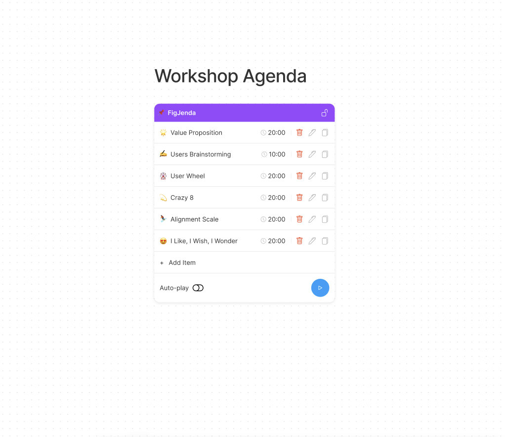
We prepare introductory slides about the process, what we plan on achieving from the workshop and how we intend on achieving the goals listed in the slides, and so on. This gives stakeholders a clear idea behind the purpose of the workshop, and why their participation will help in designing a product that’ll go focus on user needs and meet business requirements as well.

Empathising with the user
We encourage all the participants in the workshop to put themselves in the shoes of the user. It aids us in assessing the current user personas that team members are using and seeing whether they’re accurate. If not, changes are made accordingly. Activities such as empathy map and role-playing help the participants to understand the wants, needs and goals of the users and get a better understanding of the user needs.
Defining the problem statement
With empathy exercises, participants are able to better know the users’ needs and the problems they face. Based on the understanding of the problems of the user, participants are asked to define the problem statement that we aim to solve over the rest of the workshop.
Based on the problem statement, an outline of activities is decided. We opt for empathy maps, Q/A sessions, card sorting, interviews, and the ‘how might be’ methods to encourage everyone to step into the shoes of the user and consider user wants, needs, and feelings when working on the activities charted out.
Ideation session
During the ideation stage, theoretical solutions are looked into and ideas come in from the problem statement at hand. We use various activities ranging from value proposition mapping to crazy 8’s, empathy mapping, and many such activities which help us understand the business requirements/problems better and to bring as many solutions as possible. If the suggestions seem too divergent, everyone in the team votes for the most suitable solution using sticky voting to help choose the most viable solution.
Along with traditional brainstorming, we also opt for rapid ideation and reverse brainstorming.
- Reverse brainstorming is when you focus on the causes of the problem instead of the solution
- Rapid ideation is when each person writes down multiple ideas within a set time frame
By the end of the ideation session, we’ve all settled on a plausible solution and take to work on it, for the next step.
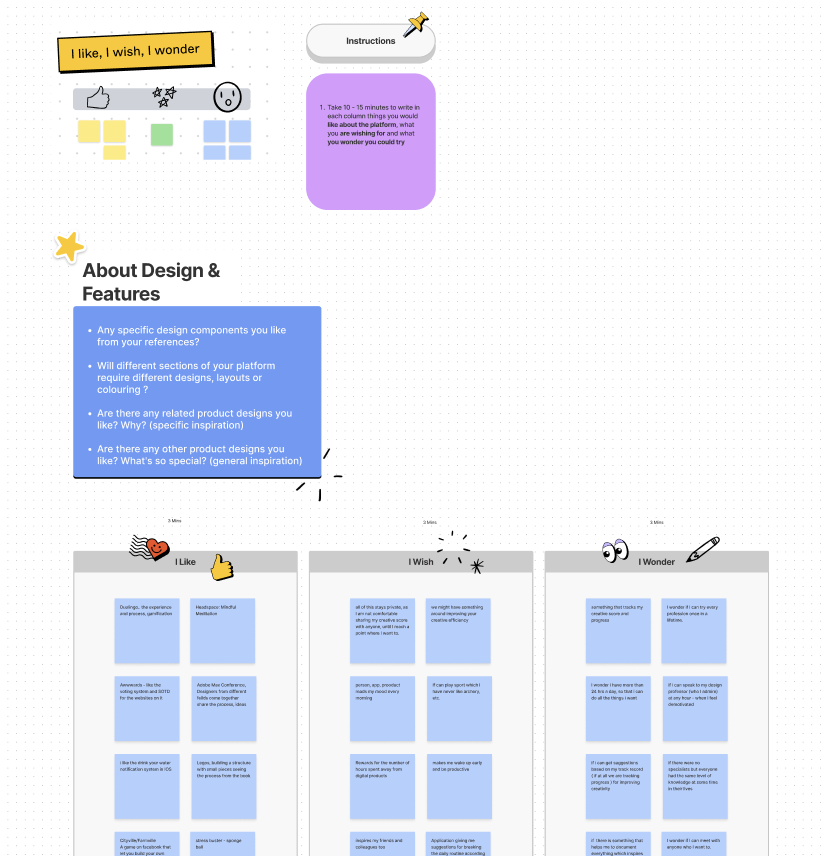
Mapping out user journeys
The user journey map provides a visual representation of the process that will be followed by the user to accomplish a goal. With a solution in hand, we work on mapping out each step the user will need to take to achieve the final goal.
Design Jam
Designers are encouraged to develop low-fidelity rapid-prototype solutions in the workshop.
For the rapid-prototyping stage, we begin to create a prototype of the most ideal solution. This may entail testing out specific user flows that provide the best usability outcomes for the solution's user journey maps. In this stage, the steps mapped out from the user journey are used to create separate interfaces and screens. These include working on buttons, points of functionality as well as other interaction points.
The solutions that are found to provide the best user experience while keeping usability and accessibility in mind are enhanced with high-fidelity features.
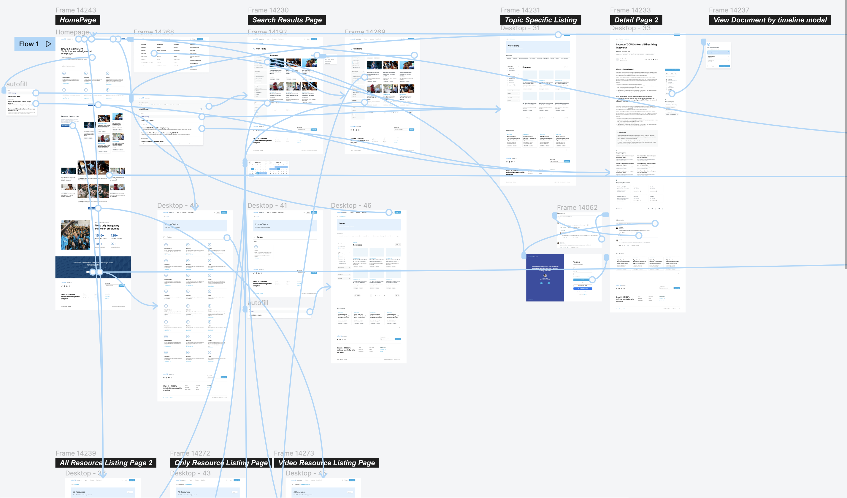
Conclusion
Design Workshops are an interactive way of bringing teams together to work on projects. They help us to stay focussed on the specific challenge at hand. The Design Workshops at QED42 help all designers gain insights to brainstorm on projects, and back that up with facts. It allows for some intensive and engaging ideation sessions that lead to viable solutions using best practices and keeping end-users as the center. We try to create a solid agenda around every design workshop that we host, irrespective of whether it is done with internal teams or with external clients and stakeholders.
Super thanks! to Tarkesh Deva our UX/UI designer for collaborating as a co-author on this blog.

Building Better Experiences with Content Design
Good content design leads to great products with a purposeful user experience. Having a content-first design and development process ensures the achievement of product goals and efficiency. That’s why the design-driven big brands of the world, Airbnb, Apple, Uber, Zomato, Nike, etc all have positioned themselves as content-first companies.
Content design is building better experiences through all forms of content.
Content design is the outcome of the UX design process combined with content accessibility. It looks beyond a text-oriented mindset, which is why content design isn’t necessarily always text. Hence the outcome is also an amalgamation of excerpts from UX, communications, SEO, design, strategising, branding, and copywriting processes.
The process of content design revolves around attention to details of users’ needs and not just their wants — and this means identifying their needs through research, data analysis, and synthesis. It focuses on content-specific design to create a good user experience. It is a realisation of what form of content would serve the users best, visuals, audio, videos, words, infographics, charts, or a mixed assortment of the same.
The success or failure of content design projects depends on the real needs of the user, and the needs want, and motivations of the site visitors. The content design process helps to make good sense of the problem and assists the outcome before going straight into the solution.
Content Design Process
The content design process consists of alignment, research, strategy, ideation, execution, and iterations.
Alignment
The content design process begins with the alignment or the kick-off. In this phase, a thorough understanding of the client’s needs is done through a stakeholders’ questionnaire. Content designers, UX designers, and developers understand the purpose, constraint, and objective of the project to decide the scope and guide research in the next step.
Research
The research or discovery phase is the most crucial part of the content design process. This phase is all about conducting a thorough research roadmap, getting a grasp of target users, finding a connection between the two, and synthesising the research. The research phase helps to uncover the problem statement and the underlying needs of the problem statement.
Research can be conducted in the form of workshops, usability research, content audit, desk research, expert research as well as any other form of qualitative and quantitative research where there is adequate data and evidence of what people want, need, and expect from a product.
Strategy
After going through the alignment and research phase, a strategy document is created. This document contains all the details that will help towards designing the product, keeping in mind the business goals and users’ needs.
Putting together a strategy document guides and proofs the entire product design and development. It ensures that the end product has a human touch to it. It ensures the outcome and helps to build a product that people are comfortable interacting with, irrespective of the communication channel they choose to opt for. Some of the key steps in the content design strategy phase are -
1. Understanding user needs and mapping user journeys
Content designers create content strategies for a brand in a way best suited to serve users. The user journey provides a detailed view of where the communication with the user needs to take place. Every individual touch-point on the user journey requires some form of content to help the user meet their requirements.
Figuring out user needs includes not just having an idea of who the users are but also understanding how they behave. This is formalised with the data from the research stage. In this stage, we try to understand the problems and work towards solving them same. The idea is not to simply increase the overall traffic of a page. Instead, it is to ensure successful long-lasting design and interactions with people.
The user journey on the other hand shows the user’s relationship with a brand or product, over a period of time and across various communication channels. This usually consists of all the steps that the user follows when communicating with the product. User journeys can either be B2B (business to business), B2C (business to consumer), or as Larry Ellison reiterated — the future of the enterprise depends on humanizing the customer and employee experience. Human capital management and customer service are the foundation of a successful modern enterprise. That future is not “B2C” or “B2B.” It’s B2H (Business to human).
2. Information architecture and navigation mapping
When information regarding an app/product is given too early/late, it leads to frustration for the user and makes them leave the interaction midway. Thus, understanding audience needs and when they have those needs can be a crucial differentiating factor between failure and success of the content created.
Identification of the content and its functionality through research synthesis and defining the relationship between the website’s content and usability. Information architecture and navigation plans help to identify how users would find information seamlessly and increase the possibility of encouraging them to take desirable actions.
It helps them to set their workflow, priorities, and language requirements in order.
3. Strategising for emotions, tone, and voice
Emotions are crucial to the shaping of content design strategy. Emotion is the layer that comes before setting ups the tone and voice. It is used to create informed and each word with rationale for the user to interact with, and helps right till the end of their product usage journey. Emotions are crucial to content design because voice changes according to the mood of people. Thus, it is important to figure out what concerns users might have when interacting with a product and that’s exactly what this part of the content design strategy addresses.
The tone and voice understood by users are of utmost importance in content design. The simple reason behind this is that it helps users trust and connect with us. Users are bound to abandon a product/app when the words used in it don’t align with their sentiments.
The language and design put together by writers and content designers aren’t for machines. Instead, they’re designed keeping in mind the people who sit behind those machines. The tone and voice used to define a well-designed product must be reflective of the user’s vocabulary and changing user mindsets. Opting for conversational design helps put together the right content, at the right place and time and in the right order.
Content creation
After content design strategy and putting together all the necessary insights about the users and their needs, comes the execution stage. The fundamental principle here is the needs of the user. Then comes the format of the content. Both the writing as well as structuring hold equal importance in content design.
Content designers don’t work in isolation and content design isn’t simply writing. Instead, it is a collaborative venture between multiple teams to figure out the best possible solutions for end-users, ensuring their needs are looked into. Thus, content designers work together with researchers, UX designers, engineers, and product owners to execute the best possible solution hence, words.
Sharing and feedback
One of the most important steps to content designing is gaining feedback through a crit (short for content critique). It is the phase where all that’s been worked on is shared for honest feedback. Performing a crit helps gain newer insights that enable to work on the piece of content and make it even better. Crit is invaluable for reminding the content designer why the content would work and to understand whether the solution is in sync with the strategy.
Although most often people feel nervous and uncomfortable getting feedback for the work done, it is a necessary step in creating the best possible content. Content designers should keep this process polite and make sure to offer a possible solution to the problem being addressed in the feedback.
Post feedback stage, necessary changes if any, are made and that’s what leads to the final step of content design — Iteration.
Iteration
Content is never fully done. It is necessary to check whether the requirements for a piece of content are met, to ensure success. Content designers are constantly iterating to see whether something is clicking with the user. Iteration helps to review content strategies and delete information that isn’t satisfying user needs.
By keeping a track of how content design is doing after publishing and setting live, necessary adjustments as is deemed fit, are made. Taking in feedback from stakeholders and users not just helps to make the content design better but also improves the overall experience of the user, when interacting with it.
Conclusion
The content design process is really useful in creating content that people truly need and use. It Includes UX writing, content strategy, and content communication. For any work that requires understanding the user and putting their needs into content that is relatable and easy to use, the content design comes in handy.
The content design process ensures easy experiences for users and is an absolute necessity in today’s digital world. With brands working hard to provide easy interactions following a content design process enhances the overall user experience, helps to achieve business goals, and creates long-lasting design solutions.