All blogs

UI Design Guided by Gestalt Principles.
The whole of a visual is the first thing the human mind perceives before focusing on the individual parts that create a design. Our brain has it's own ways of perceiving shapes and form, grouping information and fill in the gaps to draw a whole picture. The simplest example of the gestalt principles is the familiar shapes we see within the clouds.

“Gestalt” is German for “unified whole”. A clear understanding of these principles helps determine the effective visual elements which influence perception, direct attention toward the focused elements and cause perception change in consumers. Gestalt principles are particularly helpful when it comes to goal-oriented, problem solving and intuitive user interface design.
As we now understand that these principles assist the way we perceive the world and human minds always try to create order within chaos, our attempt is to create web designs and applications guided by the gestalt principles.
Proximity
The gestalt principle of proximity explains that elements that are closer together are perceived to be more related than elements that are farther apart. When objects are close, they tend to be perceived as one group. Proximity is essential to our perception and is more relative than shape and form in visual designs. White space plays an essential role in the principle. It influences the relation between different elements.
The principle of proximity is applied in UI as grouping similar information, organising content and decluttering layouts.

Common Fate
When elements move in the same direction they are perceived as part of the same group by the human brain. The principle of common fate is fundamental in motion design. In animation, it helps connect content and trigger the movement and capture attention intentionally from one element to another. It is also used to bring elements into the foreground, indicating the interaction of importance.
In UI design the common fate applies to the elements like nested menus, dropdown or accordions, It helps to bring clarity in menu options and is always applied in animation.

Continuity
The principle of continuity is applied when the eyes have to be deliberately guided to move from one object to another since the elements arranged in a line or a soft curve are perceived to be more related than those arranged randomly or in a harsh line.
In user interface design the principle of continuity can be applied to components containing tabs or dropdown selections with a partial option within view provides an affordance that there are additional options or interactions.

Similarity
Elements which share similar visual attributes are perceived to be more related than those that do not share similar attributes.
The main characteristics which influence the impression of similarity are size, shape, and color. In the group of “similar” elements, We tend to see objects with the similarity of colors first, then size and tend to notice the similarity of shapes at the end.
It's how the people recognise a particular pattern in UI they categorize them as particular patterns. This is why it is so crucial for the primary buttons to look the same on every page.

Closure
When an object is incomplete, but enough of the item is indicated, the mind fills in the gap to create a closed pattern itself. Even with incomplete elements, the objects are usually considered as a whole form.
In UI design the principle of closure is used by just showing a bit of another element to influence scrolling. This also helps in decreasing the number of elements to increase simplicity. It helps to decrease visual noise and influence engagement is required in loading states, completion meters. The principle of closure is also applied in logos and iconography to increase readability.

Common Region
Elements which are placed within the same region are perceived as one group. In UI design the principle of the common region is applied elements like navigation bars, tables, menus, form sections, etc.
It guides in grouping information and organising content but also assists in content separation, this principle simply boots hierarchy, scalability and highlights information as needed.

Symmetry
Elements put in symmetrical order are perceived as they belong together regardless of their distance and give a feeling a systematic sequence to eliminate confusion. Symmetry is also used to evoke simplicity and create a balanced pattern where information can be absorbed more quickly and efficiently.
UI Elements that are symmetrical to each other help in recognizing a definitive pattern. Symmetrical navigation menus are perceived to be more stable. Symmetry is beneficial when used in portfolios, photo galleries, product display bars and pages, listings, navigation, banners, and on pages with heavy content.

In Conclusion
A design that doesn't confuse people and assists visually to the right options is considered a good design. User Interface is about quick and easy communication of information and the Gestalt law helps in achieving this goal. Gestalt creates a sense of UI design discipline. These rules may also come intuitive to designers and making a conscious choice to follow gestalt's laws to create clutter-free design driving brand identification and consumer-friendly businesses.

From Hue to Color Story - A Basic Understanding of Colors
If we begin to understand colors in the way science describes than it would be that "color are the light wavelengths that the human eye receives and processes from a reflected source". Complicated right? Well at least to speak about, In design, a good color palette is what looks good to the eye and how it makes you feel when you see a particular composition of colors. So let's speak of it and also obviously look at it since we are speaking about colors from the implementation point of view.
Understanding different kind of colors is crucial to effective composition in interface design and having a rational understanding of color creates a color story that speaks for itself.
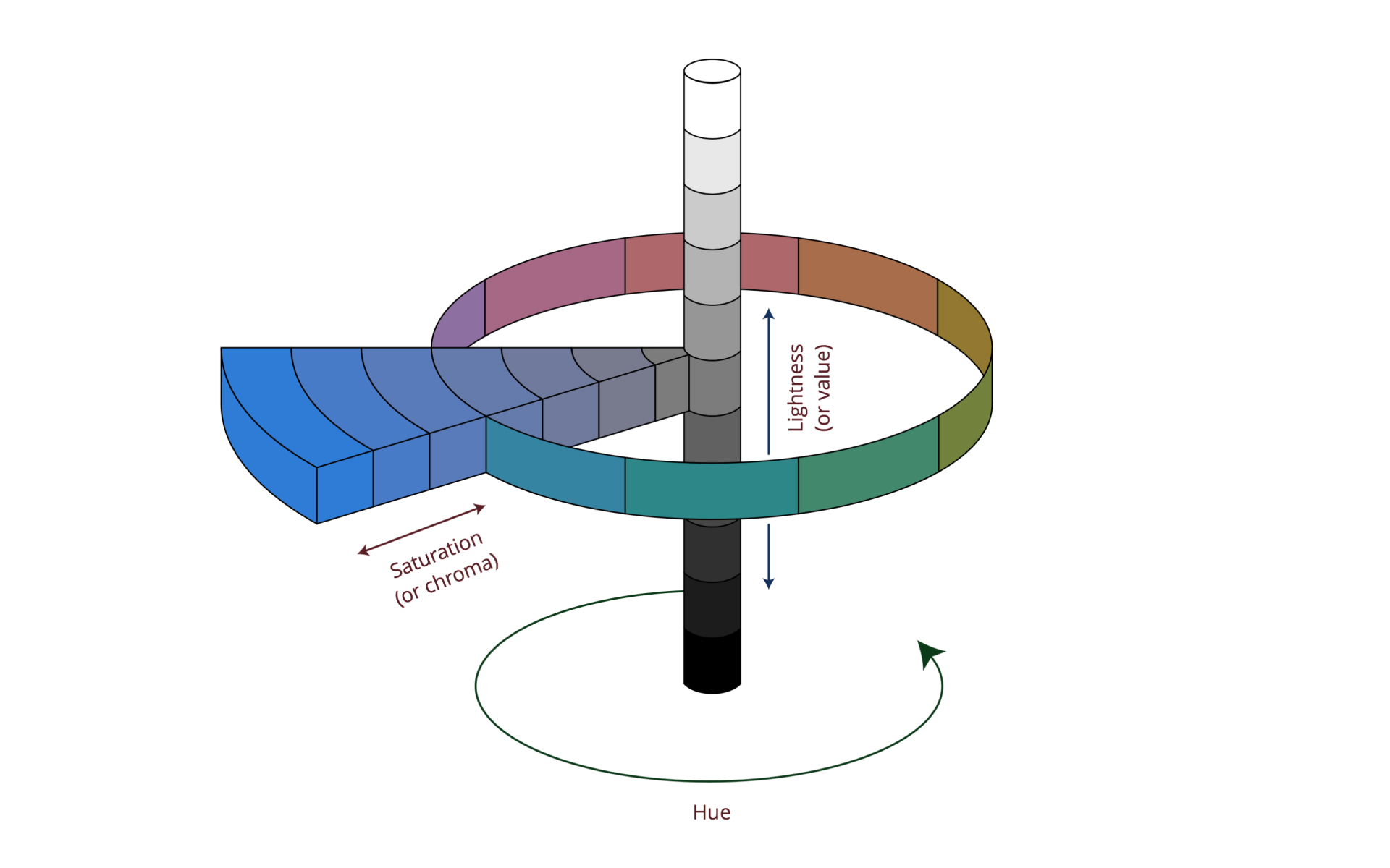
Hue

Hue is how it looks. It's the identification of color as it appears on the classical color wheel "its the purest form and essentially refers to a color having full saturation"
The pure spectrum colors commonly referred by the color names are- red, orange, yellow, blue, green violet. All hues can be mixed from three basic hues, known as primaries — red, green and blue. Colors with the same hue are distinguished with adjectives referring to their saturation and lightness.
Value

A value of color is the first step in further defining a color beyond its hue. It is described as the relative lightness and darkness of a color. The value also indicates the quantity of light reflected. When referring to pigments, dark values are called “shades” of a particular hue. Light values with white pigment added are called “tints” of one specific hue. The contrast of value separates objects in space, while gradation of value suggests mass and contour of a surface.
Designing with color schemes based on varying color values helps to create a balanced color palette.
Intensity
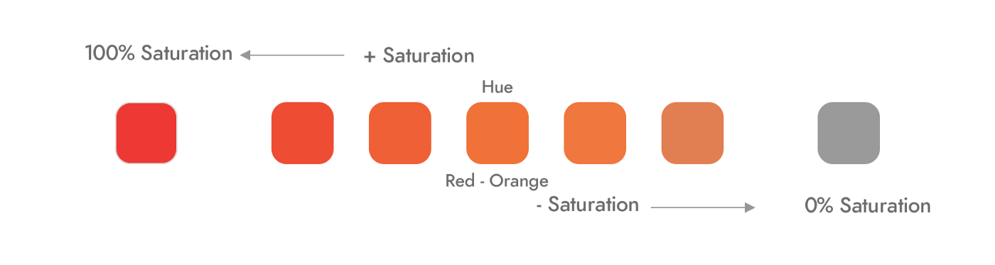
Intensity, on a definitive level, is the amount of purity in the hue itself. Primary colors are considered to be the most “pure” in intensity. Saturation is the intensity of color and the intensity of a color also refers to its saturation level. Highly intense colors are bright and low-intensity colors are muted. The intensity of a color is adjusted by adding additional colors to the pure hue.
Temperature
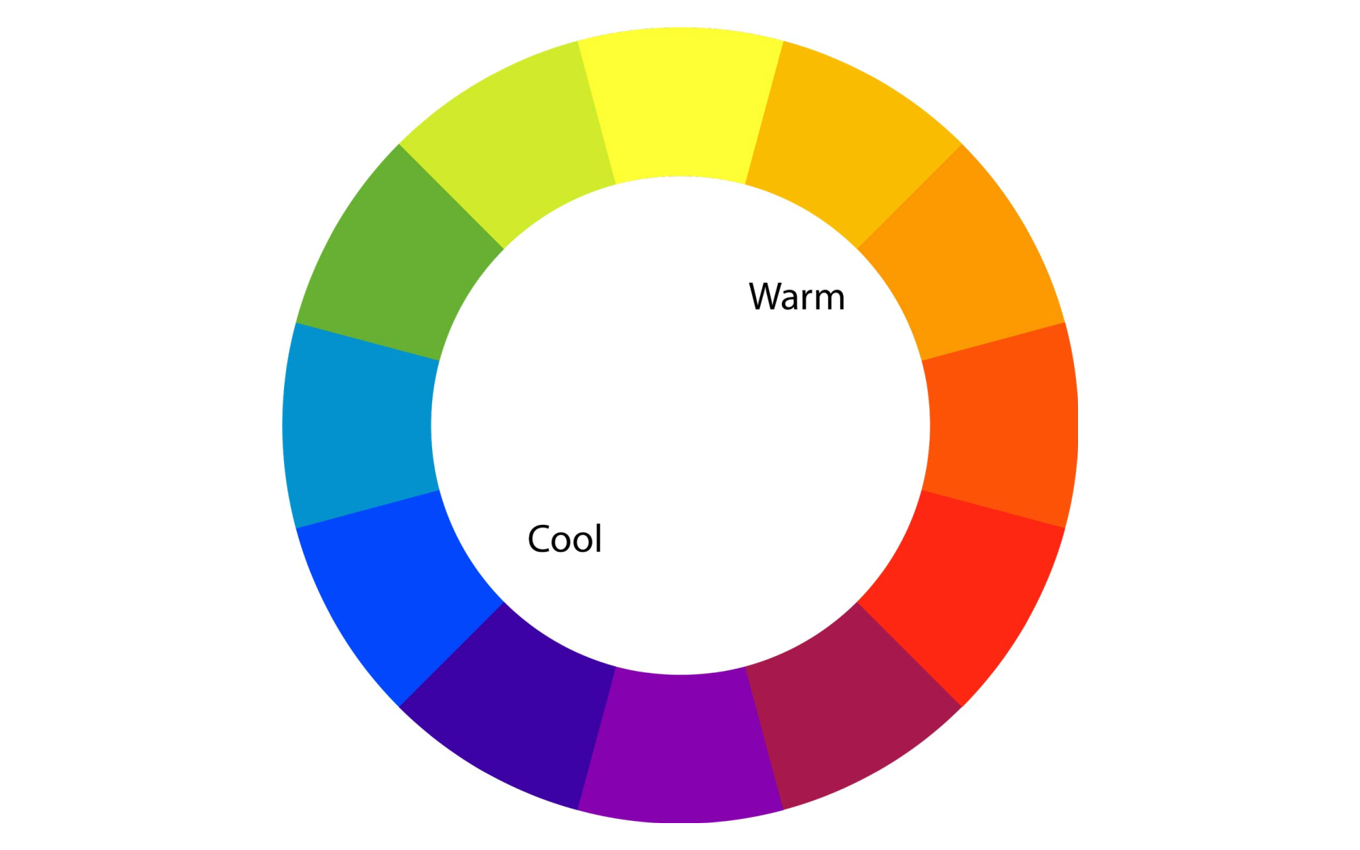
The color temperature is the most subjective and visceral way of describing colors. It refers to how “warm” or “cool” a color is, reds, oranges and yellows are considered as warm colors, and blues and greens are considered as cool colors which are triggered usually by psychological influences — as water, ice and clear blue sky are associated with the calmness of blue and red is associated with environments and objects that influence warmth such as fire, blood and sunsets.
The temperature of light plays a determining factor in the color temperature. The hue we see under a warm light is vastly different from how we see in under cool lights. Creating color palettes based on color temperature is a way of evoking feelings which are more tactile than visual.
Color Pigment
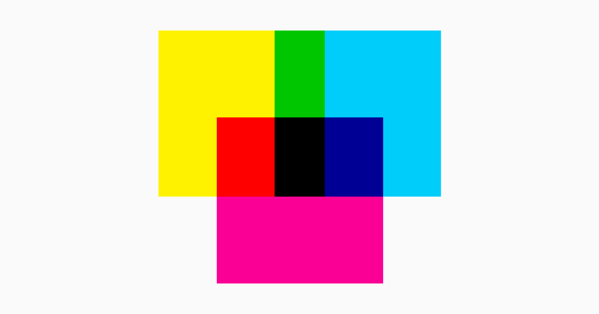
An important system of colors that needs focus pigments. Usually, the design process involves drawing on paper and converting the same into a computer screen. The same design could also be converted into an object or a printing on paper. It's difficult and sometimes nearly impossible to get the exact similar colour from one medium after another. Here is why, the computer screen exhibits colors in RGB mode which is — red, green and blue whereas printing utilises and works on the CMYK mode which is an abbreviation for four inks used in the paper printing process — cyan, magenta, yellow and key or key of the Black key plate.
One of the most difficult aspects of this conversion is properly converting RGB colors to CMYK colors so that what gets printed looks the same as what appears on the computer screens.
Color Trend
Colors are a form of expression. Forecasters create color trends based on details analysis of consumer psychographic, demographic and other details which usually takes about a year or more to get created and is always way ahead of a particular season or year. What's set to become a standout colour for the season — the saturated and intense hue of orchid flower or is there a shift to optimist brights? Which colors are likely to gain a strong appeal inciting feelings of positivity and vitality? All the answers to curious questions about colors can be found in the forecast studies and selection of color trends should be studied, perceived and used as per the industry involved.
Digital platforms provide new meanings and possibilities for brands. These platforms are a huge way of consumption for the consumer now than ever. A consumer's entire perception of a brand can change over the right and on-trend use of colors which also saves the market from unexpected directions.
Setting up a Color Story
A perfect color story is precise and created by using the language of the concept. Pay close attention to perennial and carry-over colors – especially between earthy hues, blues, brights and pastels. Think closely about which archive shades can be revisited and will best support the final design. Look to fresh interpretations around your season of launch. Work into commercial core and speak for the brand inclusively.
While presenting the color story there has to be an understanding of colors from the screen to sample, colors should be presented on a neutral background in the context of the total color treatment. This certainly allows the final product to completely reflect the colour intended to use in design. The impact of colors is also relative to the area it covers, so color chips on screen and on paper should be presented in the proportion of their usage.
Creating a color story that makes the interface look nice, clean and elegant isn't always easy but is easy with one step at a time. The following sites can be used to help create a balanced color palette. These great help tools use images and designs to illustrate how different colors work together.
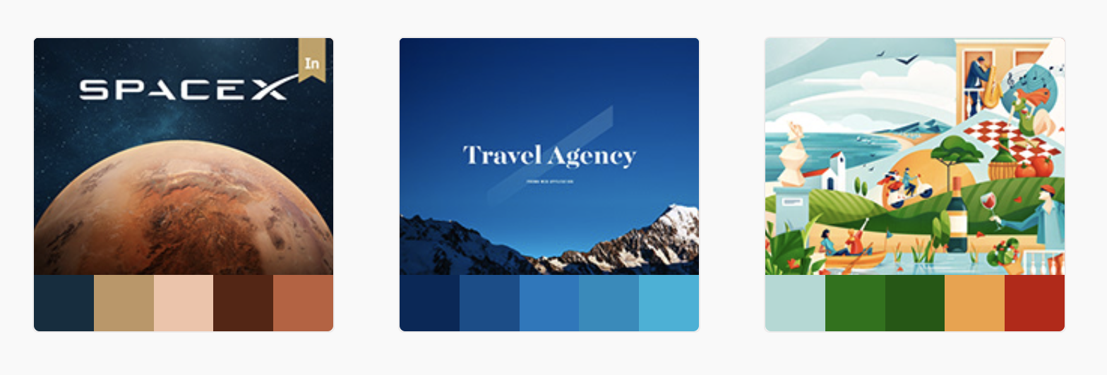
https://color.adobe.com/trends
Color is a powerful tool to communicate a specific mood and evoke feelings in consumers and if used in the right way it can increase brand recognition. The right use of colors makes a website or an application look more natural and put together. Since we have spoken about the basics here we hope it helps you create an impactful color story. There is more to color theory and we will make sure we post more about it.
Happy Designing!

Who came first, Design or Design Research? — Part 3
Our Design Process has positively increased its impact through research. The intention of our 3 part series dedicated to design research is to conclusively influence that impact and make research actionable for design teams, project managers and decision-makers. The key strategy of research is to collaborate with the stakeholders and systematically bring in all research together to address common solutions.
In Part 1 we looked at the importance of Design Research and also understood that the right use of time through Design Research saves time and efforts at the end. It paves way for reasonable and logical answers from the start of your presentations to the end of your product. The second article in the series Part 2 explains the steps to conduct successful research through systematic and time-saving methods. It also describes how good research contributes to the overall company's growth.

Let’s take all that context to break down and conclude who came first Design or Design Research?
It's Design research, anything that creates actionable insights for the rest of the project to follow should take the lead. Creation, criticism, and inquiry are all integral parts of the Design Process and Design Research is really doing evidence-based design. Let's understand that through a bulleted list from our insights.
- Design is an exchange of value. You have to ask what people really need and value and what business value you expect to get in return, before putting anything at all into the world.
- Design research allows us to understand complex human behaviour by getting to the root of a problem. Overall, the data we collect through design research allows us to make decisions.
- We’re all about people! design researchers are to improve people’s experience with our product by understanding their goals and values.
- Partnerships among researchers and designers distribute and unify knowledge about the product and the people who use it, making our team more efficient in the long run.
- Design research is more impactful when it’s done earlier rather than later in the production process. By that time you’ve already invested a lot of resources into assuming what you’re building is correct and there is a little less time to be doing anything otherwise.
Design research is a persistent process. It's also a way to empathize and create good user experience by thoroughly understanding people's goals, values and behavioural patterns. It's a positive way of interaction with the stakeholders. The right amount of curiosity during the design process leads to successfully systematic research and with those influential designs we never miss out the process that leads to it.
Stay Home. Stay Safe.

The Design Process - All Work, All Play
The Design Process is designing with a systematic approach empowered with ideas. Every project is a new game with the same rules, applied differently. We intend to explain the basic operational understanding of the Design Process that may be applied to any discipline. Deep understanding of these seven stages empowers to find solutions to most complex problems helping the designers as those who coordinate with the design teams.
Introduction
The Design Process is primarily concerned with solving problems. The process where an idea unravels to become a product in an organised, timely fashion, evolving through each step, keeping the original purpose and vision intact.
The Design Process is not always clearly stated and has no comfort zones, it oscillates. As soon as you master one series of steps, a new project brings in new challenges, forcing to rethink and start with a whole new series within the process.
However, the basics remain the same and you eventually learn how to play with them. Map out the process, the choices and steps to take at the beginning based on the requirement of the project.
We say it's — All Work, All Play. Can you solve the problem? Are you following all the steps or did you deduce? can you beat the clock? can you make it more fun? how much did you learn today? and did you learn to move on?
Yes, move on because deadlines are important.
Call it creative procrastination. If it fits between the deadlines, go ahead and add to your knowledge anything that you find on your way to designing a perfect product but if it doesn't fit your vision and you don't have time. Move on.
Over and above if we have to fit Design Process into a definitive definition — The Design Process is designing with a systematic approach empowered with ideas.
The basic stages of Design Process regardless of the discipline
Before we begin with the Design Process consider "documentation" - Some processes explain the benefits of documentation at the end but since the Design Process is a controlled continuous curation of multiple interactions which requires systematic documentation.
As system-thinkers start documenting from the very beginning of the project. Play around and make it look good. Good documentation inspires many to come and helps you with the presentations rolling at all stages.
Keep all data from the beginning organised and add as many pictures. Pictures aren’t a magic wand but they make documentation more appealing and also make it easy to navigate through the process.
It really helps!

Inspiration
Inspiration is the energy behind creativity — driving it — not leading it.
Inspiration is an energy that drives people to be creative and infuses creation with life. The inspiration takes form based on the needs of the project. Seeking Inspiration, Starts with research, new stimulations, new challenges and a new approach to old problems. At this stage dig everything there is to know-Research.
Begin with the client and understand the project, product and people you will be surrounding yourself with. Hear out everything that the client has to say, ask valid questions, then ask more questions and create a human-level understanding over each other's point of view. Set a real-time expectation bar and instead of showing up after weeks, keep in touch often and send out important information about the growth and plans on the project.
It's all for the people in the end. Seek inspiration in their needs, demands and behavioural patterns. By understanding people who are likely to use the product, you can get a clearer perspective on the solutions that your design should provide.
Team opinions are important and so do the opinions of project managers and decision-makers, fuel your research with design discussions to serve the purpose.
We do it with post-its. The objective of this exercise is to immerse completely in the project and welcome ideas with an open mind. This defines relevance, value, impact, purpose, role and contribution from everyone involved.

Identification
Identifying the solution to a problem is another step in moving ahead with the Design Process. Identify the plans for overcoming obstacles. The problem can be simple or complex, and the solution can be practical or whimsical — or even both at once.
Each problem has its own set of constraints, while some are more fixed than others — they can be either inherent or imposed.
To work within the constraints and recognise all intentional and unintentional consequences consider all the function, form, materials, budget, time, production, accessibility and environment impact of the end product. Constraints are helpful as they create support and challenge the designer to use solutions that may have otherwise had never been considered.
Conceptualization

Once the design constraints are identified the conceptualization begins, the next step is to come up with as many creative solutions with the needs and vision of the project. The more ideas are the better.
The stage of conceptualization clarifies inner workings of an idea so that it can be played with and reworked on, rearranged or changed without altering the core of the concept. Create the visual vocabulary of your work through mood-boards, colour-palettes and other visual representations.
Concepts are a push to do something other than the obvious. Create an aesthetic language by brainstorming, sketch, whiteboard and marker, mixed media techniques, software or use anything that solves the purpose to create a wholly formed concept from the parts that have been assembled until now and fill in the gaps left by partial information. The Gestalt perception can be applied to fill in those gaps and create a systematic, logical ground for the concept.
This is a stage where you collaborate with the client and present possible potential solutions to avoid surprises later and come to common deliverables.
Exploration and Refinement

In the stage of exploration and refinement, the brainstorming process segues into a more focused and solution-oriented state. This is a task of testing a concept's viability before committing to the specifics.
It’s possible to explore at different phases of a project, from the most abstract idea to the tiny details of the final product. Keep it all documented to be refined post conceptualisation. Ideas are not something to get attached with, keep spaces for changes to come.
While examining the capabilities of the design - try substituting one idea with another. Play with all principles of design with line, shape, texture and forms and work on the functionality of your design, look at colour trend reports - follow them or go radically against them. Consider ergonomics issues and wasteful practices. It's very important to also consider a design's life cycle in terms of environmental impact and enhance recycling, reuse and repair.
When you explore and refine go to extremes and switch things around - work against symmetry or rearrange the asymmetrical, Convert the angular design to curved or increase the length of what is short. Whatever you can change, change. Do not shy away from re-thinking or re-creating at this stage. These small changes make a bigger contribution while you prototype.
Definition

This stage is a transition from explorations to defining a concept. It's going back to constraints of the design and keeping a reality check on the context of the needs. Does the design do what it's supposed to do? Does it fulfil the most basic requirement of functionality?
Examine the design by all the things that could go wrong. Usability is about the experience of design. How easy is it to use? How does it become a part of the user's life over time?
It's important to also address any new problems that may have surfaced and find a satisfactory solution to the same. This is where you give attention to detail and check for creativity, proficiency, usability, reliability, functionality, accessibility and sustainability
Communication

Design is as good as its communication and is presented to different audiences with diverse needs and expectations.
The language of design communication changes as does the audience - Team, Client, fellow Designers, Corporations, Production staff, The Manufacturers, other Associates, End-user, Publicity and Salespeople.
Each element in the presentation must have a point-to-point relationship between conceptual thinking and reality. Explain to the client the reasoning backing up the idea. Listen as much as you speak. The ideas evolved in the design world need to be articulated through the project and explaining the issues and solutions in hand. The aim is to inform and inform well in a timely, concise and organized manner.
Listen to comments and critiques carefully. Feedback both negative and positive is valuable information.
Prototyping and Production

At this stage, as much as a designer delivers, it's time to absorb from the knowledge and expertise of the production team. Prototyping is useful to test the fidelity of functionality. Consider the important features to emphasise such as functionality, usability, aesthetics and current needs and trend.
A prototype/sample clears the way for the final production and stamps materials, structural elements, detailing, colors, final budget points and a sustainable future. Careful planning in early stages pays off, amends at this stage are made quickly. A product must be tested and tested again to avoid unexpected puzzle. Designers and the team should be ready to respond quickly, efficiently and to client's and user's satisfaction.
A great Design Process needs to serve the overall design strategies in play and constantly adjust. Every project is a learning experience for another one to come. Set realistic timelines and expectations and ensure you have enough time to get the task completed.
Research - as we say it again. Time spent researching is never time wasted. Get detailed insights about the research strategies in our posts - who came first Design or Design Research part 1 and part 2.
Keep it light it's All work, All Play.

Who came first, Design or Design Research? — Part 2
Design Research is a process that inculcates sense into a project. It is a fundamental part of solving relevant problems. The research revolves around users and understanding the needs of people and how the products or services we develop will help them.
In our first post - Who came first, Design or Design Research? — Part 1 - we wrote about the importance of design research. We believe "Jumping right to the product without understanding the client brief, the target audience or the end-user, competitor landscape, product-related trends and analysing the data that's collected, your design process will be mostly guesswork. Overall it will be an inefficient way to design."
Making research logical and dominant is a problem we all share, and there are countless approaches to solving it. Let's make it work. Shall we?
Steps to Design Research
1. Primary Research
1.1 Understand what the Client Needs

Understanding client expectations continues to be a critical capability. Listen first, It all starts with hearing out your client. They rely on our experience and expertise to guide them through the solution to their problem that is why it's very important to ask the right questions. Keep asking “why?” and keep digging until you get to the root of the problem. Learn their business, listen to what they tell you and take lots of notes. This will allow you to visualise the information and understanding expectations leads to increased performance.
Understand the client intensively and then start to work.
1.2 Understand the Users

A designer should see the value in an instant end-user. Who are the users of the product? What are their behaviours, goals, motivations and needs? Reassess your assumptions and keep going back to the facts.
According to a survey by Inc.com, 92% of respondents checked social media on the phone in the past month, 31% stayed in the bathroom longer than necessary to finish the activity on their phone.
It is important to research all scenarios of our users while designing a digital product. Human needs and concerns change over time, to stay relevant in the development of digital products, we need to think at a higher level than screens and devices only then we can end up with something that is more flexible and usable.
Having an extreme user analysis is like digging in the right spot. The goal is to build up a deep understanding of the user's life, their daily challenges, understanding their decision making and build empathy.
1.3 Define a Timeline

Timing is everything but it shouldn’t be scary, it should just be realistic and comprised of spacers. The most credible projects that get the best of interest where design is concerned come along with an unexpectedly short deadline.
The fast design does not equal a good product. Create an outline for the entire project and pick a timeline for research within the same frame. Keep breathers in between - good research always takes a longer time than you plan, Just saying.
1.4 Get Consistent Feedback

Get feedback early and often. Now isn't just the time to go to your client yet but is to engage everyone in your team with the research through agile retrospectives. It’s easier to make small adjustments instead of correcting big mistakes when a lot of time and effort has gone into it. Create a space to reflect, review, analyse, and course-correct. Keep coming back for feedbacks at all stages of your research.
Encourage actions with a problem-solving approach rather than rehashing issues over and over again. Consistent feedback also promotes continuous learning and improvement for the project and built long term positive relationships within designers and project managers or decision-makers.
2. Secondary Research

Good research is specific, actionable, and practical and it's cant only be conducted at a desk. It works its way from paper to the real world.
There are many methodologies that are effective in producing research, If you are clear and candid about your goals and questions, reach out to the right source of the information, find studies, blogs, publications online, go outside during lunch and observe people, read books, get out in the field, attend meetups and mixers. Also, it's important that competitor analysis becomes a key part throughout the secondary research.
Secondary research is used as a way to validate user insights and create a stronger case for an overall design. The practicalities of the research need to be carefully considered at each part of the research.
Keep track of time and the impact of the research and don't let any step hold you back from the feedback loop because the whole point of using research is to make sure our work agrees with reality. Once the right data is in hand it's time to shortlist and implement. It's time to get creative with your research.
3. Evaluations and Explorations

Evaluative research is assessing the problems identified. The evaluation seeks to understand the outcomes of research than the process itself.
Finances - Is the research cost-effective as per the time it consumes.
Potential - Is the research substantial enough to stand its ground in terms of knowledge and impact.
Impact - This is where the research is evaluated in broad effects, positive and negative impacts.
Outcomes - To evaluate if you are achieving desired results or there is still a need to dig deeper into the subject.
Credibility - Evaluating the source of research.
Potential - How implementable is the research and the outcomes of it.
A clear part of the research involves explorations of the possible and unexplored possibilities. Here brainstorming becomes a tailored tool toward creating a specific result which helps gain deep insights of the inner working of an Idea and by observing it from different angles, we begin to see in an angle that we initially didn’t.
Explorations are the refinement of ideas and exploring an idea's potential, through clear explorations it becomes possible to both expand and refine at the same time.
During every stage of research keep up with the feedback loop, be open to comment and critique and make changes as they come across valid.
Most importantly stay focused on your vision and refine the idea until it is exactly how you want your product to be.
Each stage of research is personalised learning of methods, sources and materiel when something works well for us, we begin to rely on it and doing so again. Good habits are essential but patterns don't work well for creativity. Break those purposeless habits when starting a new project by keeping in mind the certain requirements of your industry standards.
Convincing the Decision-Makers
This may come easy with some and may not for most of us. As a Designer/Researcher or Writer you have to have the same empathy for the client, project managers, decision-makers and your team as you have for the users.
It's important to explain why good research contributes to the company's growth and stay focused on why is the research necessary while articulating the same.
Design can't be easily put into metrics but the points that can be covered quantitatively are revolved around how long it takes one/team to complete certain research?
If you are a system thinker this should come easy. Move quickly with the feedback loop, present your research in a well-documented form and as scheduled.
In the first part of "Who came first, Design or Design Research?" we mentioned a metaphorical example about how every profession needs its own set of systematic research. Such examples while you make your case tend to be helpful.
Find ways to work research into the company’s process with small steps, and be purposeful about it, simply initiating a series of movements that proceed without any further influence.
Thank you, for reading. Hopefully, we were helpful. In the 3 part of the same series, we will be sharing out our final conclusion on who came to first Design or Design Research?
Until then! Stay Home, Stay Safe.

Accessibility is Making Things Simple with Simpler Efforts
Why would you want to make something that some people can’t use? Digital accessibility is the ability of a website, mobile application or any electronic document to be easily perceived, understood, navigate by a wide range of users, including users with disabilities.
"If it's not usable, it's not a good design."
Accessibility brings a better experience for everyone. Every time you dictate an email while you are driving a car when you ask Siri to make a call when you find yourself using the YouTube captions and the ability to use a menu under poor light conditions you are simply using the features exclusively designed for disabled users.
Not just that, clients and employees of companies that prioritize accessibility experience long term benefits. As per Web Accessibility Initiative - accessibility drives innovation, enhances brand value, extends the market reach, and minimizes legal risks. It will be fair to say that digital accessibility is a sustainable business practice.
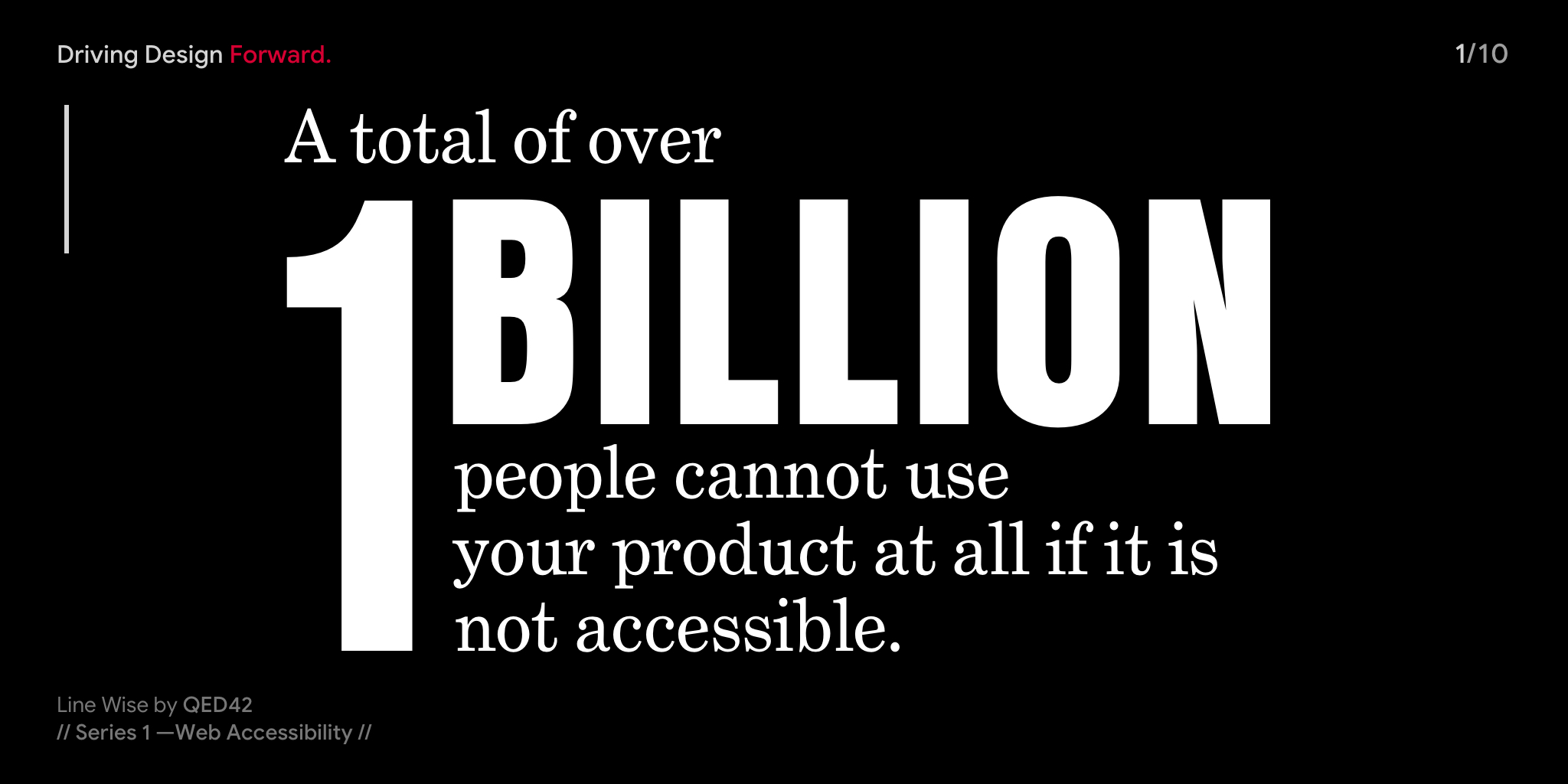
The World Health Organization estimates that 15% of the world’s population—over 1 billion people- has a disability.
The Guidelines
The Web Content Accessibility Guidelines are part of a series of web accessibility guidelines published by the Web Accessibility Initiative of the World Wide Web Consortium.
The WCAG is built upon the following four foundational principles of accessibility - Perceivable, Operable, Understandable, and Robust.
Perceivable refers to that users must be able to comprehend the information being depicted: It can't be invisible to all their senses.
User interface components and navigation must be operable: The interface cannot require interaction that a user cannot perform.
Information and the operation of a user interface must be understandable: Users must be able to understand the information as well as the operation of the user interface.
Content must be robust enough that it can be interpreted reliably by a wide variety of user agents, including assistive technologies.
Elements of Accessibility
| Color Contrast
Color contrast concerns each one of the users at some point. For text to be readable and every other element to be visible and identifiable there needs to be an adequate amount of contrast between the foreground and the background. Colour contrast guidelines do not limit color palette and impede creativity, its aesthetic consideration, and a problem-solving way to design.
Adequate color contrast helps the user get a clear understanding of content.
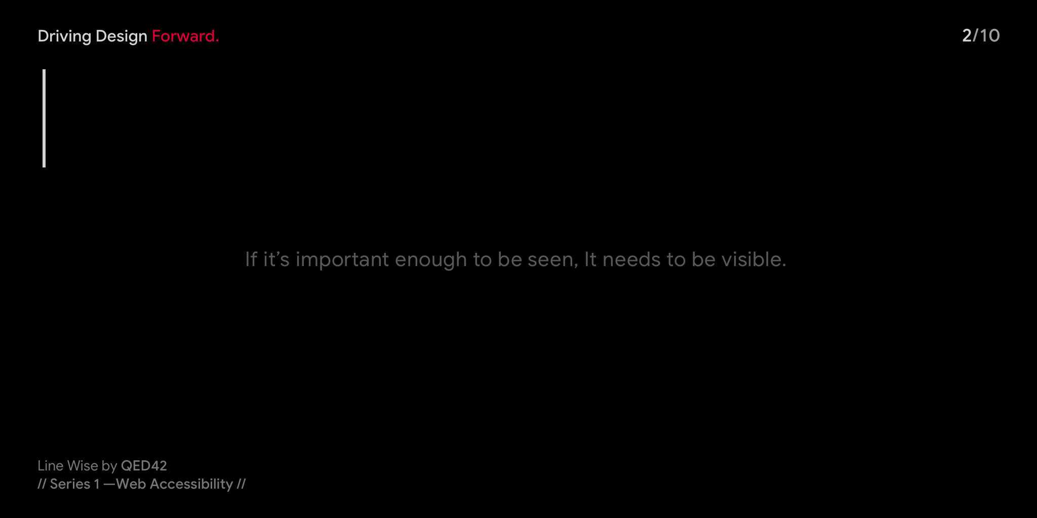
The right amount of color contrast between the foreground and the background makes the web accessible for people with low contrast sensitivity and everyone else under different lighting conditions.
| Video Captions
Video captions are essentially subtitles, which are dialogues combined with all other meaningful sounds like thunder, laughing, or depiction of thoughts of a character. Accurate video captions and a full, descriptive text transcript are the way to make your video accessible and ADA compliant.
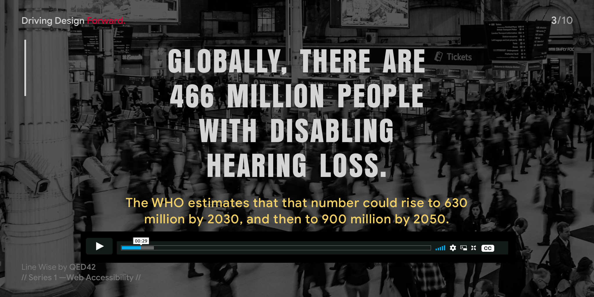
Captioning makes videos accessible to people with hearing loss while making it engaging for everyone. Captions turn a video into searchable text and help people watch videos in very loud as well as a quiet environment.
| Voice Recognition
A voice recognition system is designed to identify a user’s voice. It is enabling people with the right tools to become more independent. Speaking is a more naturalistic way of interacting. With products like Alexa entering the marketplace, voice recognition has now been augmented with artificial intelligence in the smart speakers which potentially reduces the technological barriers for a lot of people.
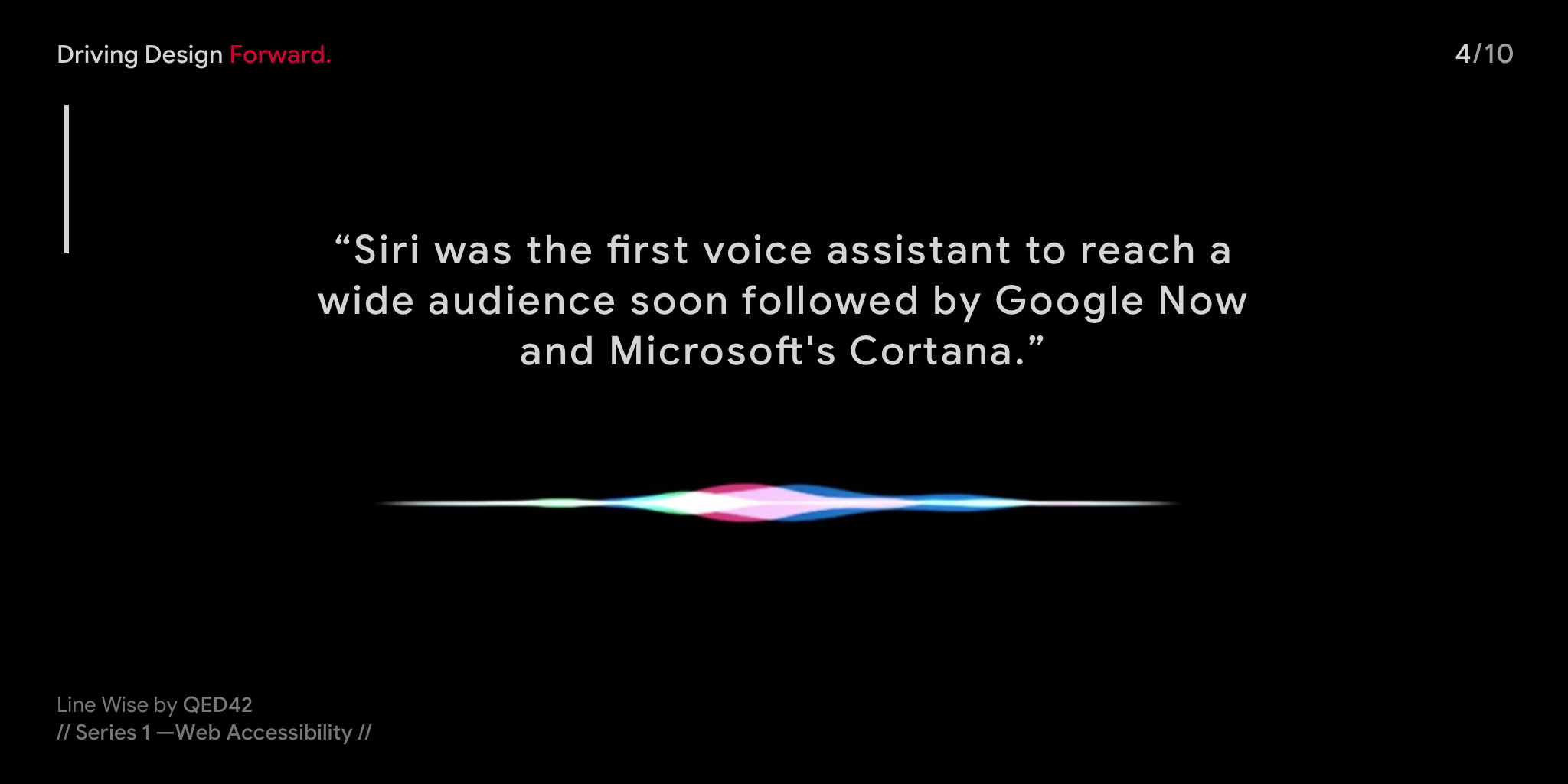
Most people with physical disabilities rely on voice recognition while searching the web, dictating emails, or controlling a navigation app. It also makes web accessible for people simply preferring voice.
| Text to Speech
TTS gives access to content to more users, such as those with literacy difficulties, learning disabilities, reduced vision, and those learning a language. It also opens doors to anyone else looking for easier ways to access digital content.
The elderly population depends on this technology. In the US alone, 59% of senior citizens use the Internet daily. Text to speech turns any digital content into a multimedia experience and people can listen to a news or blog article, a PDF document, or an e-book on the go.
https://youtu.be/Qj2X33T1zE0
Text to Speech is a technology that blind people have been relying on for years. It is also useful for dyslexics and for some who just like to multitask. This has the added benefit to help website search content better.
| Clear layout and Design
Deduce - remove all unnecessary elements from the design, content, and code. This includes navigation menus, links, and text sections. Clutter-free designs website designs can be a great solution to navigation usability problems. Simple Designs Load Faster, faster loading and faster-responding websites improve user experience.
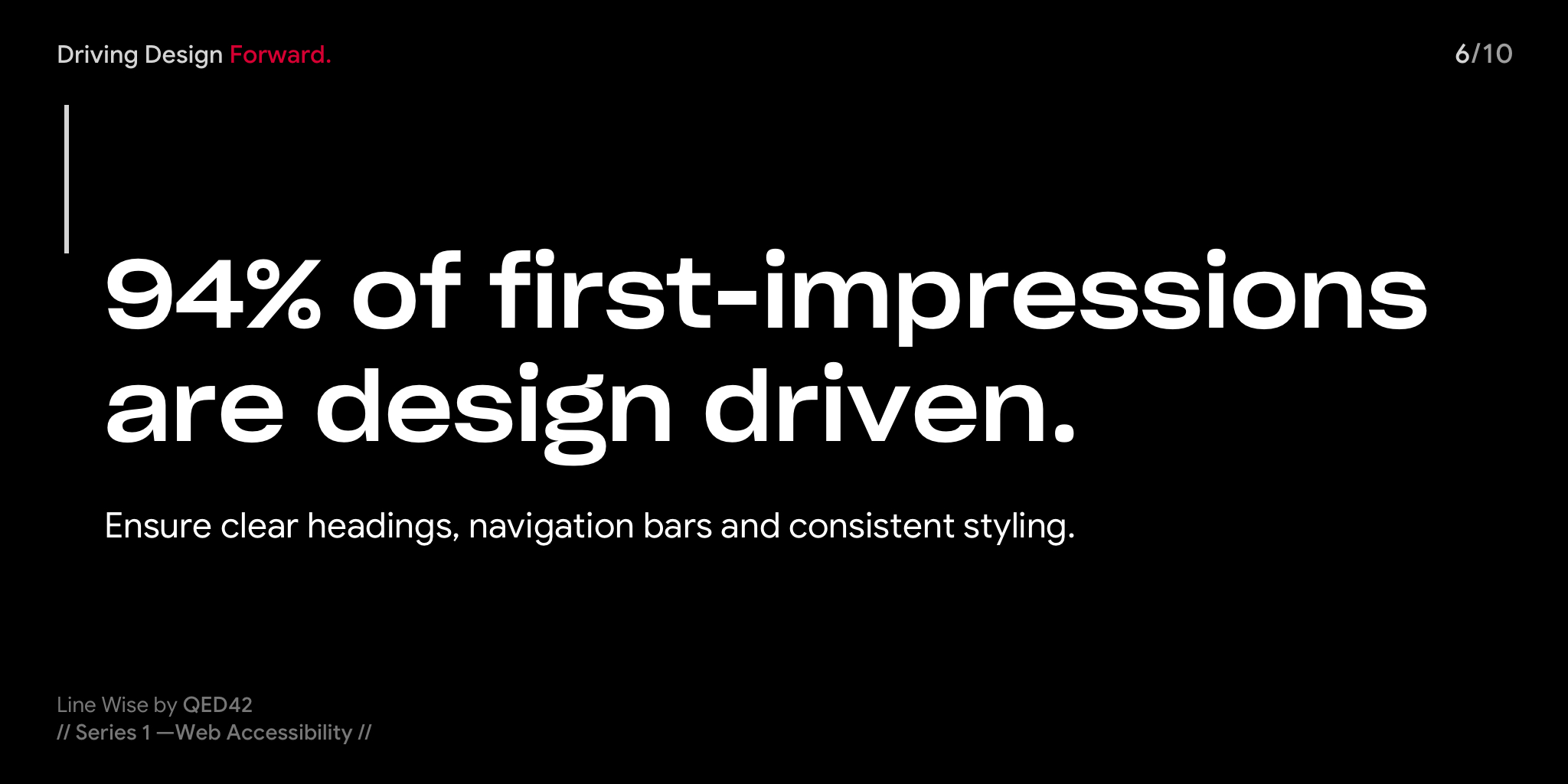
Complex layouts make finding information difficult and impossible for people with visual, learning, and cognitive disabilities.
| Response, Notification, and Feedback
Providing clear instructions, response, notifications, and feedback accessibly help users submit data more accurately and reduce the chance for error. All inputs should provide simple guiding points on how the problems can be resolved.
Notifications have to be concise and clear. Error messages must provide clear inputs in the right direction. Success messages are also important to confirm task completion.

Clear responses, notifications, and feedback make websites predictable, understandable, accessible for people with cognitive and learning disabilities, and more usable for people with lower computer skills.
| Buttons and controls
While creating a button design for priority, use color contrast, the right size, and actionable title text to improve accessibility and readability. Use buttons to signal clickable actions, such as “download,” “sign up,” or “log out.”
Creating a consistent design language throughout the website or web application can help to click and tapping easier for the users with a disability or limited digital knowledge.
Creating areas for clicking and tapping larger makes it accessible for people with for users with reduced dexterity and also makes the web handy on mobile devices and while moving.
Conclusion
Accessibility is consistent practice. We still have a lot to learn about it. It's not tedious if accessible choices should be made from the beginning of the project.
The problems while designing for accessibility are solved while keeping empathy in mind, thinking like a user, and understanding their needs. Check your design under different light conditions, watch the videos with noisy backgrounds or quiet backgrounds like libraries to make sure the captions are apt, ditch the mouse and make sure that everything works with the keyboard, listen to the content of your website using the text to speech, make sure all the functions are accessible, readable and visible and all the buttons clickable, apply filters to see your content as someone who is color-blind will see it.
Consider the W3G guidelines and make them a part of your process. As designers, developers, content creators, copywriters, and decision-makers it is our responsibility to create accessible products. It's our simple efforts that can create simpler yet exceptional experiences for the users.

Who came first, Design or Design Research? — Part 1
This is a typical chicken and egg situation, does anyone still know who came first?
At your workplace, you might have to research to explain why do you need research. Wait, seriously? Who came first, the design or the research?
Is it worth carving out time for research? It's a difficult argument in the time of augmented reality and agile development in an era we’ve all learnt to value answers and fear questions and where we want to be perceived as having answers, not as knowing what questions to ask.
In this chapter, we’ll give an overview of why Design Research can create a better Design Process.
Design Research is not what starts on Google search and ends on a Wikipedia page. It's an analysation of what the users want. It's a process of systematic query based on observation from credible resources and experimentation of the same. The more inquisitive your research is the more reasonable your end product gets. Design research is an understanding that backs up design decision making of the product that hasn't reached the market yet.
Why do we need a systematic approach to research in Design?
Imagine if you are a lawyer, and a client comes to see you with a legal case of copyright infringement.
I'm no law expert, but I think a fair approach would be:
- Letting your client share his side of the story.
- Asking the client relevant questions regarding the case.
- Researching within the bounds of the law.
- Presenting the case with valid evidence and data.
- Inform in case of decisions, changes, delays and setbacks.
- Prepare the client for a trial and so on.
Without the right investigation, evidence and detailed research of the case that stands a chance might not reach lead to a fair judgement.
Jumping right to the product without understanding the client brief, the target audience or the end-user, competitor landscape, product-related trends and analysing the data that's collected, your design process will be mostly guesswork. Overall it will be an inefficient way to design.
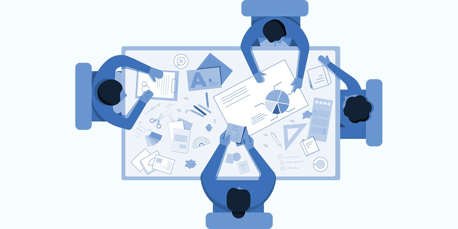
The right use of time through Design Research saves time and efforts at the end. It paves way for reasonable and logical answers from the start of your presentations to the end of your product.
Systemic research helps you understand the below dynamics.
- Understanding the client's brief, expectations and timelines.
- Understanding that there is a competition and who are your real competitors.
- Getting a detailed insight of the end-user.
- Brand Voice and identity.
- Primary solutions and secondary solutions.
- Use case.
- Product life cycle.
Good designers are systems-thinkers and should embrace the ways that design research influences the broader product ecosystem. It overtones the degree to which design and designers are believed while understanding the people for whom they design most importantly design research answers the very fundamental questions that come across during the design process.
Problems? What are the boundaries of problems? Solutions? What is the correct product or service to design? what should we focus on? What characteristics should it have, and is it working as intended?
Research doesn’t need to be scary, intimidating, or something that consumes a lot of your time without giving out any concrete results. Design Research is an indispensable part of the design process with some forethought and logistical planning research can be conducted within and outside the team parameters.
Expect next part soon!
Stay Happy, that's what we do.
|basic_html

Design Thinking, How does it work?
Design is more than just the physical appearance of it, aesthetics do make a fair enough difference but above all, Design solves a problem.
How to create a better design for everyone?
Once we have gained a sense of meaning from the world around based on research and experiences we begin to think of exclusivity in design. The challenge is to slow down and think who you are designing for and why are you doing it? Design thinking comes together with deliberate efforts. Being empathetic toward each other is important to think broadly about how can we come together as a team to solve challenging problems.
To get your team from where it is today to where you see it tomorrow requires shared goals and a similar vision followed through a design thinking process created for the team and with the team. Broadly “Design Thinking could be fairly described as an understanding of its inclusive process and therefore all people involved, no matter their role, are responsible for creating a product that is useful, functional, accessible, aesthetically appealing, affordable and also profitable.”
The Practitioners
In 1990 the term design thinking was ideated by Tim Brown and David M. Kelly.
"Design thinking is a human-centred approach to innovation that draws from the designer’s toolkit to integrate the needs of people, the possibilities of technology, and the requirements for business success"
- Tim Brown
Design thinking goes way beyond its ceremonial naming phase. It has been practised by designers and implemented the midst of workflow for creating extraordinary products. In order to know where we are moving in the future, we must first understand from where in the past we have evolved.
Let us go through some history which proves that Design Thinking was religiously and rigorously followed and practised through structured ways of unique unravelling minds even before the term "Design Thinking" was coined.
I don't even like the word 'fashion' very much. I always said that the word 'fashion' should be used in its original sense… as a verb, 'to fashion', meaning 'to make.'
- Jean Muir
Known to the world as a British fashion designer from the late 1900s, Jean Muir, saw herself as a dressmaker. Miss Muir has been described as bringing common sense to clothing design to the pitch of genius. She cared about how her clothes felt to wear as well as how they looked to others.
Her work wasn't just some airy-fairy notion of creativity. They are an incredibly valuable piece of art.
"You don’t go about being in fashion in Jean Muir, you go about being in Jean Muir, which is kind of beyond fashion, you know."
- Joanna Lumley.
Design Thinking is simply "Thinking like a Designer"
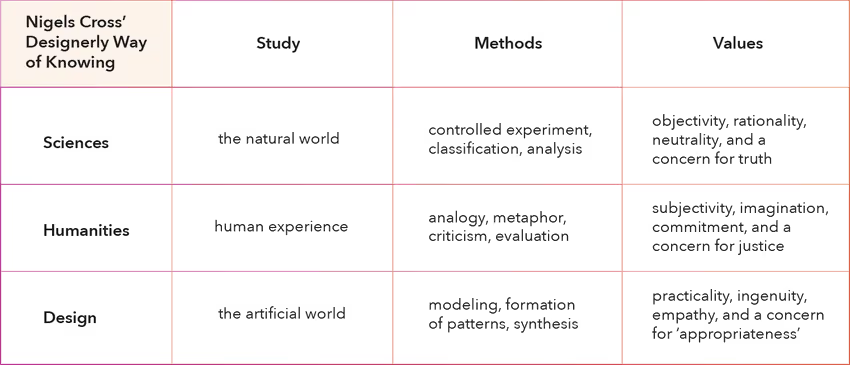
In 1982 Nigel Cross, a researcher in the field of Human-computer interaction before he began investigating design methodology launched his seminal book "Designerly Ways of Knowing" which looks at what makes the way designers think and make decisions different to other professions a great influence which helped in the construction of design thinking. Throughout history, good designers have applied a human-centric creative process to build meaningful and effective solutions.
“Everyone can — and does — design. We all design when we plan for something new to happen, whether that might be a new version of a recipe, a new arrangement of the living room furniture, or a new lay tour of a personal web page. So design thinking is something inherent within human cognition; it is a key part of what makes us human.”
- Nigel Cross.
Thinking ahead made Steve Jobs successful. His ideas were unique and they to an extent changed the way design was perceived in that particular period. Jobs not only conveyed to people what he was selling, but he also showed them why they needed it.
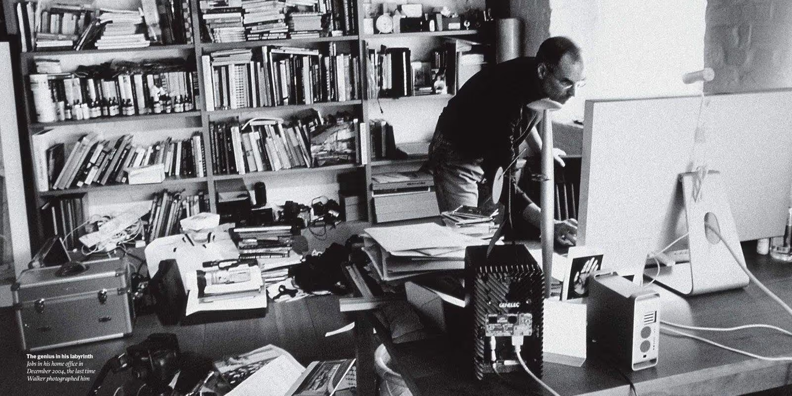
Jobs in his home office. No public photos have surfaced of his office at Apple's headquarters in Cupertino. Photo: Diana Walker
History has many more examples just like these but its only fair to make a detailed document of the same in a separate article. They created their own systems and observed the behaviour of the users to create products we can't deny we love and accept till date. They created their own set of Design Thinking and implemented it successfully. So can we?
”Design Thinking goes above and beyond the principles. It is something that has to be built within a company for over a time through successfully tested and failed methodologies. Its the structure that comes to being after trying one process after another until you know what works for you. Everything that any profession does—from research and development to strategy, to content creation—can be improved through design thinking.
Below is one of the examples or a set structure which is Design Thinking to some of us.
A Glimpse into Contemporary Design Thinking Process
Subconsciously or consciously design thinking to most people is what has been classified into five different levels - Empathise, Define, Ideate, Prototype, and Test.
Empathy is crucial because it allows you to set aside your own assumptions about the world in order to gain insight into users and their needs.
Defining is where a team analyses the observations and synthesize them in order to define the core problems identified so far.
In the processes third stage Yes, we brainstorm or ideate and take the best ideas forward to the prototype level.
When you prototype the intention is to create rough drafts of solutions to decide if these will prove beneficial for the problem.
Testing is the final stage of the design thinking's five stages model yet alterations and refinements are made in order to rule out problem solutions to come to final conclusions.
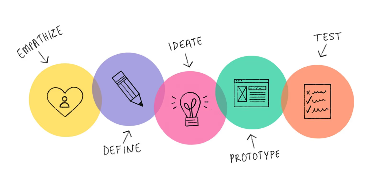
Design Thinking process: empathise, define, ideate, prototype, test
Why Design Thinking is exclusive to each team.
Experienced designers often complain that design thinking is too structured and linear. And for them, this could be true.
A creative mind can not be brought down to levels of thinking in one systematic way on relying on one set of principles, but managers on innovation teams generally are not designers structure and linearity help managers try and adjust to these new behaviours.
As Kaaren Hanson, formerly the head of design innovation at Intuit and now Facebook’s design product director, has explained: “Anytime you’re trying to change people’s behaviour, you need to start them off with a lot of structure, so they don’t have to think. A lot of what we do is a habit, and it’s hard to change those habits, but having very clear guardrails can help us".
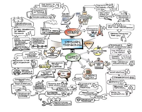
Simply put, teams can only move as quickly as they can successfully communicate. The collaborative nature of design thinking circumvents this friction by involving all team members from the very beginning in a workshop-based approach.
As the whole team moves through key exercises together, a shared vocabulary organically develops and the common ground begins to be built. When teams have a shared vocabulary, the focus can move from what to how.
Design thinking can transform your organization to better meet the needs and wants of both your employees and customers. It drives innovation and amplifies the creative problem-solving ability of every employee by pulling away from the barriers that prevent them from thinking differently. It’s great for designing products and experiences as a team, can also be put to work to help solve any number of organizational challenges and creates a cohesive work environment.

Working at QED42 around Christmas
Come to think of it, everything that you write has already been written about. Sometimes you are just staring at the blank pages and its not the lack of words. It's the unnecessary thought of being different. When you are at a place to write, you cant ask for themes to write about but can always get inspired. So I did, Christmas was it!
Always Often "Just" with anything adds about to the recent diaries of a narrative, This word has contributed movies we laugh about and the famous T-shirts we wear (you could google, just adding to an activity afterwards), here is about my appropriate yet another use of the word, about my first Christmas at QED42.
As I was saying since "just Joined" at the end of November, the countdown to Christmas was officially on, joining a new workplace around the holidays wasn't completely intentional but it is the best time to know everyone, indulge in casual conversations, become a part of Secret Santa, Games and Gifts and all that food. Can it get more Merrier? It did, did it?
You ask for it or you don't there are things you get - Advice. I had a lot coming since it was my first month of work, a friend from the Human Resources Department at my former office said: "You can deck up all you want but you are still being judged, your actions are always accountable". Another friend who was an accessory designer and my salient lunch partner for two consecutive years added: "Go..., make an appearance, there is no reason not to go, participate in all activities - you might end up being real friends with some of them".
With an absolute fear of missing out I joined in and also because there has always been immense love for all festivals, respect for the traditions and craving for holidays that it brings along, it wasn't just for the plausible love for Christmas candies.
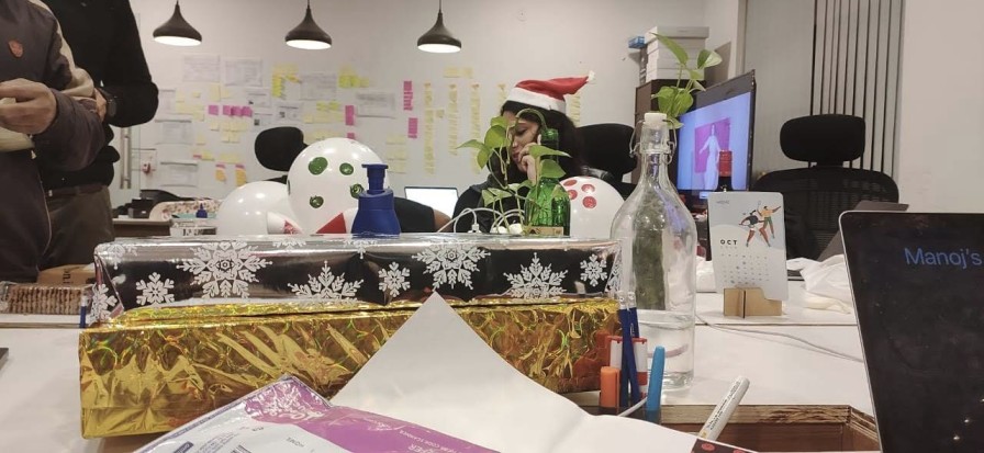
Christmas is a vibe while making sure you have the right vibe for it, you have to decorate. There was something so unusual when you witness the excitement everyone shares with the idea of DIY. It wasn't clinging to the idea of artificial joy. It was like Pinterest right in front of your eyes. We did that classic search for craft material in the cold of Delhi Streets within the radius of a close-by market, knowing we weren’t going to find everything we needed but hoping to pick up whatever we could with somehow managing to reach back office in the midst of honking vehicles and chaotic roads, Metro saved our day. Created our own Christmas tree with lights, reworked the styrofoam sheets, wrapped some ribbons, cut some paper, blew some balloons and we were good to go, all of us together and that was the whole point of it.

The idea of being randomly assigned as somebody's secret Santa is exciting, what's more, exciting is the suspense of not knowing what your own gift is going to be at the same time finding out what your colleague wants. Very seldom at work, you get this one task that gets your hundred percent dedication without any follow-ups, its that task.
We had our well-lit tree made of little lights where the vibe was about the presence and not the presents somewhere amongst the impossible joy of shouting out the wrong holiday's song lyrics, I was handed over mine and for true reasons, I completely fell in love with my gift. It seemed like a day where you are shown how much you are cared about. It's the thought that counts.

A little tradition of our own, a little competitiveness and all that too much fun were the Christmas evening games. There are few pictures but with a mental snapshot of everything there were connections being formed, joy being spread and we were giving each other the gift that means the most, the gift of time.
Wrapping this up with a green bow with jute trims. I know where to look for more words now. we are all together in this observing, getting inspired and creating.

Wishing you a happy new year and many successes in personal and professional life as a part of the QED42 family, until another year to come. "Just" Hopefully.
.avif "Story behind our Hindi Drupal t-shirt")
Story behind our Hindi Drupal t-shirt
It was in 2009 we ventured into the open source community, Drupal. As newcomers, we were excited to be a part of this dynamic community. All these years we have received immense amount of love from the community. In return, we wanted to create something that would show our dedication towards it. A design that would communicate our indigenous identity. An idea that would shout QED42. It is said that honest emotions are well presented in your mother tongue. And we chose Drupal illustrated in Devanagari script as our USP. That was the beginning of the glorious era of द्रुपल.
There are some ideas that you are not really sure about whether they would work out or not, well this was the exact opposite of that. Everyone in the team was immediately on board.
Version 1.0
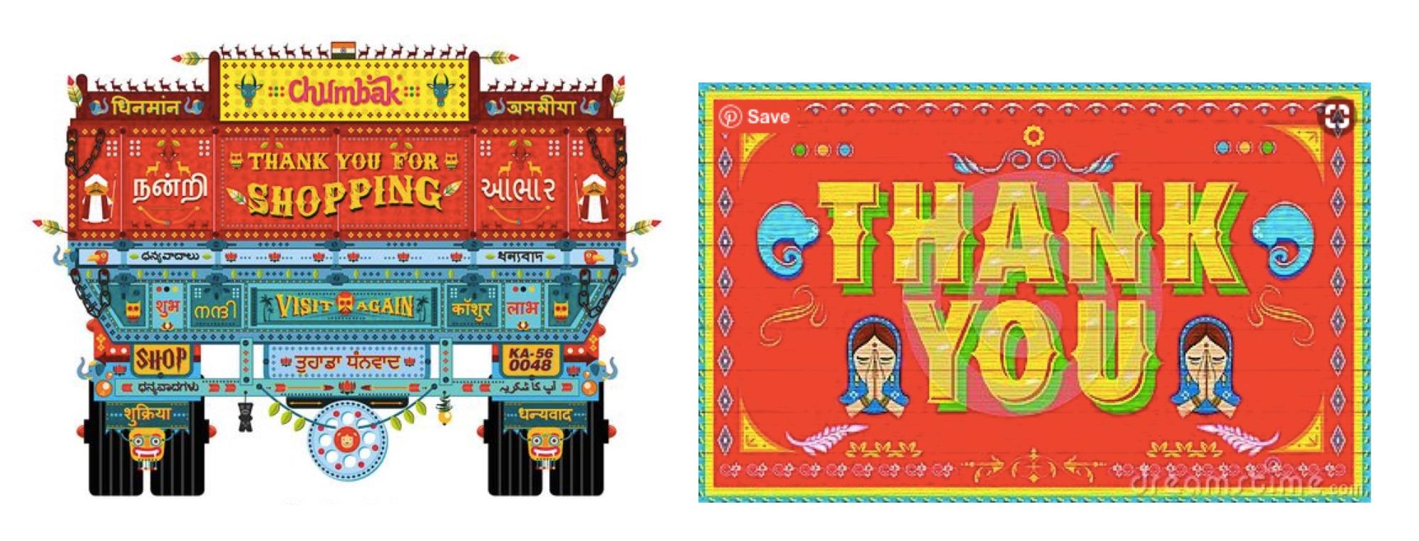
The story behind this is interesting. This maiden attempt was inspired by unconventional truck art. Here are some images that served as an inspiration.
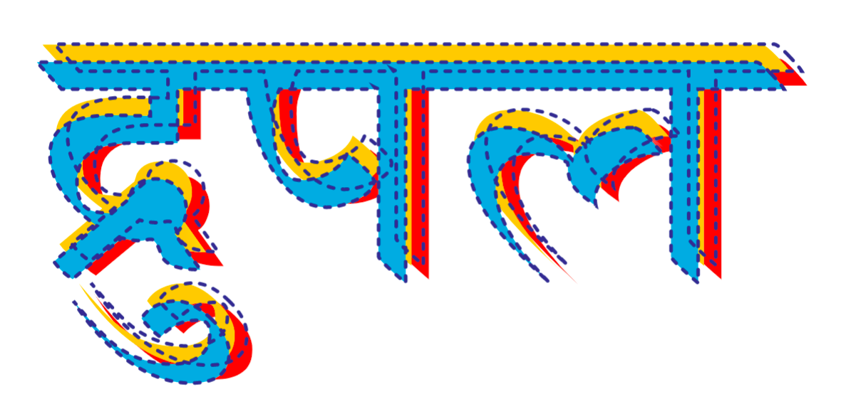
The final design featured simplified truck art aesthetics. Bold colors and graphic lines found in truck art were incorporated into our design. The overlapping colors and outlines highlighted our design.
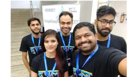
We launched this T-shirt at Drupalcon Asia and the reaction we received, reaffirmed our faith in the design. People across different platforms were curious about our design and it was a huge hit!
Version 2.0
For the second edition, we had to come up with something grander. And what could be grander than our very own country; welcome to India! The land of colors. This design boldly speaks about the country. We wanted to incorporate the vivid diversity of India. Playful forms and vivacious colors that reflect our Indian culture.
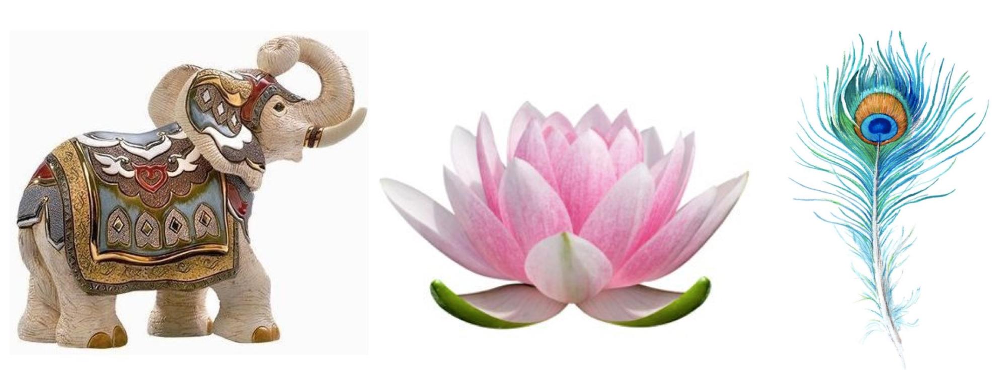
We chose different symbols that would clearly convey our identity. Lotus [National Flower] is an important part of our heritage and is used on multiple occasions..The peacock long considered as the magical bird of Orient was also featured in our design. Elephant the central figure of Indian mythology can also be seen in this version of our devnagari Drupal. We also explored different printing techniques this time. We experimented with gradients and embossing and the result turned out to be really great.
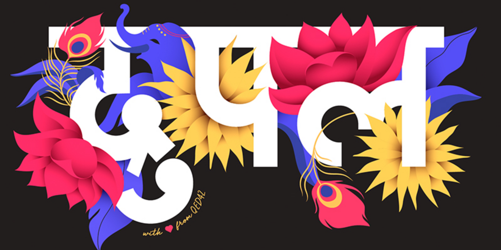
150 T-shirts were distributed and demanded like hotcakes on the very first day of Drupalcon Nashville. Everyone absolutely loved the design and it was all over the social media channels in no time! This boosted our confidence.
Version 3.0
For our third version, we decided to go a little contemporary. These are a couple of images that we gathered to get us going.

The final design was the result of experimentation with 3D lettering and a range of textures. We explored how we could add complementary elements to make the graphic more appealing. This version was released in Drupalcon Seattle.
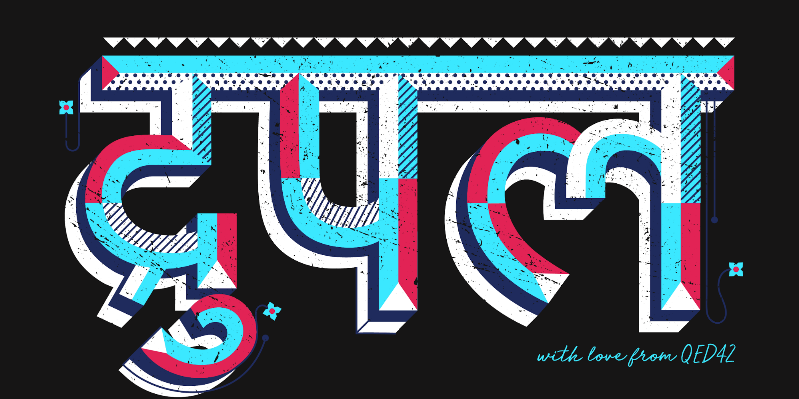
We are as excited about version 4.0 as you are. Our designers are busy discussing the next big idea. Stay tuned for more updates!
Riddhi Juyal has been of great help in putting our story of Drupal Hindi T-shirt in words for this blog.

Design and Drupal ~ DrupalCon Seattle
Fresh from Seattle, and I absolutely can’t wait to share my Drupalcon Seattle experience. Five days of being in the astounding Drupal community and I’m still brimming with excitement. When you imagine a conference for a tech-driven platform, you visualize straight jackets and capital cases. But that was certainly not the case with Drupalcon. Design influence at Drupalcon was huge. It could not only be seen visually but could also be perceived behind all activities, talks and community interactions.
Five days in Seattle marked the global celebration of the Drupal community. Entering the exhibition space - all you could see were colors and emotions. All the companies were weaving unique experiences in their limited spaces. Every brand was fighting for who can attract the most attendees. Drupalcon never fails to surprise us but this year it was even more colorful and fun. Imagine people whizzing by on roller skates and wearing bright silver jackets. And you would get the vibe that was going on. You could see the impact of design at every corner, at every booth. I am a designer. And, I could vividly imagine all those in-house designers planning months in advance. Personalized games, personalized interaction, and personalized goodies! All proclaimed that a lot of cool design thinking was going on behind the screen.

Every booth came up with a concept for themselves. Four Kitchens Midway's booth stood out. Their booth's concept was 'Circus'. They subtly hinted about all their services using the themes found within the circus. Look at that clever copy of “The astounding UX oracle”! These overlapping integrated themes definitely created a high-interest quotient among the viewers. Four Kitchen Midway’s offbeat theme was very appealing to all the visitors. No wonder, their booth was busy at all times.

A notable showcase by Four Kitchens was the green color as their branding. From all across the exhibition center, everyone could see the high flying green balloons marking the arena. It created an element of curiosity and prominence in the event. Besides being a really fun activity, Karaoke party was also a unique collaboration between three companies - Manati, Four Kitchens, and Kalamuna. These companies effectively leveraged joint resources to create a great public relations event.
Bold color choices were seen all around the exhibition. Drupalcon logo that talks about the diversity of the Drupal community through a spectrum of colors were everywhere - in different shapes and layouts.

Many companies were oriented towards the process of design thinking. Right next to our booth was Promet Source which brought the concept of human-centered design. They explained this process to the visitors which was a great way to start a conversation. They even encouraged visitors to contribute to an existing mind map. This surely gave the visitors a mindful insight on how Promet Source works and also testified how design thinking is seeping into Drupal oriented companies.

As I was going through different booths, I was completely bowled over to see puppies and bunnies. These fury helpers were the major attraction point on the exhibition closing day. People were queuing up to greet these volunteers. I immediately joined that queue. They surely gave the moral support all DrupalCon attendees needed, after three days of community conversations.

Drupalcon has always embraced diversity. This time they brought the concept of gender spectrum stickers. This was a novel initiative making the brands more humane and conveying empathy. You could see stickers with different pronouns on them, which were a great way for everyone to walk the talk.
Some Drupal agencies preferred minimalism when it came to booth design. Companies followed ‘less is more’ philosophy and managed to communicate what they had to in the simplest of ways. Designing a booth takes a lot of thinking and decision making. The look and feel of a booth play an important part in creating an inviting aura for the place. This includes all the components of the booth interiors, such as furniture, the color of the booth, lighting, etc.
I speak on behalf of the Drupal community when we say we absolutely love our Druplicon character. Where else can you find all the endearing qualities of Drupal and its community humanized? This Druplicon was everywhere at Drupalcon. Some brands used it as a character, some for branding, and some as mascots.

Drupalcon stickers dominated the arena. Every booth was offering its own version of the Drupal design. Stickers on various subjects like Drupal, Seattle, community, identification and, branding. Sticker hoarders were going from booth to booth looking for the most exclusive stickers for their collection. Drupal Community coders are known to proclaim their love for Drupal with the aid of Drupal stickers, which they put on their laptop screen covers. Many of these could be seen in DrupalCon, their Drupal sticker collection proudly on display.

Continuing their legacy, Pantheon brought their screen-printed T-shirts to their booth that were available in four designs. Everyone wanted a Pantheon T-shirt for themselves. It was exciting to watch the T-shirts getting printed right in front of you. It was pretty difficult to choose one from the four different print options they had in yellow and white. I took the one called ‘I make the internet’ (yes, it is the cool graphic shown in the picture above).

At the QED42 booth, we released V3.0 of Drupal Hindi t-shirt. It garnered love from everyone. All visitors were attracted towards the novel Hindi design. I was beaming with joy when people came to us especially seeking our Hindi Drupal design.
On the last day, we got a chance for a breather and we visited all the booths. We saw and loved countless ideas and inspiration was plenty. The energy at Drupalcon is infectious and it is always fun to be a part of this community. As DrupalCon draws to a close, it was clear that the combination of design and Drupal is here to stay. We are ready to embrace it.
Riddhi Juyal has been of great help in putting my thoughts to words for this blog.

Designers Block? Take a stroll

One often wonders what lies at the root of creativity. How to keep your creative juices flowing and those gears running. When we are stuck at such place, mind blocked towards new ideas - the best solution might just be to put the pen and paper down, get up from that desk, and take a walk in the outside world. This is exactly what we did when scratching for new ideas for a recent project. Luckily the walk for us turned out to be a visit to the India Design Exhibition at Okhla.
India Design exhibition is a premier design exhibition in India where all the luxury design brands come together for a four-day show to showcase the best that they have to offer. Such a place serves perfect hunting ground for that elusive inspiration. It was interesting to see, how a simple concept can be taken to an exceptional by giving attention to detail. A commonplace idea can stripped down to their core values to create modernist new products.
A change in perspective was well documented through an installation by LightAndYou. They set a room set up in an alternate perspective. When visitors clicked and rotated their pictures it looked like they were caught in a scene from Alice in Wonderland. This booth was a big rage with visitors where everyone wanted to get their picture clicked.

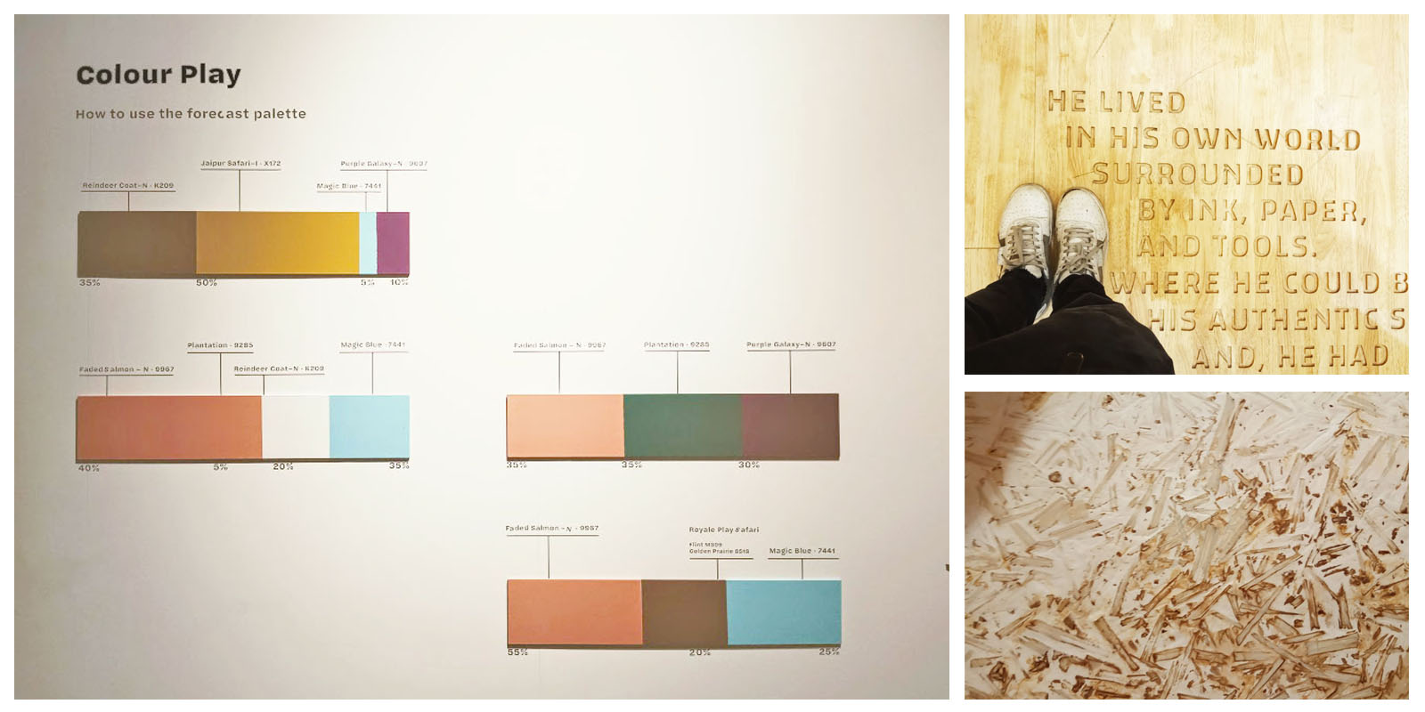
Another exceptional aspect was the visual depiction of the design direction taken by Asian Paints. Frequently what makes a design special is the backstory. Explorations in terms of color, texture, form, and emotion give an insight into the process taken by the designer and his aspirations for the product. This was very well represented in the Asian Paints color Next venture. Taking a visitor on a journey from raw inspiration to a perfectly curated experience. Each of their four presentations was a delightful combination of concept, research, and visualization. It was insightful to see different ideas on how to represent a concept in a three-dimensional space.
We all have the same clay in our hands to make as varied expressions as we can imagine. Countless different interpretations of the same basic principles of design reinforced this idea. A jewelry brand decided to magnify its creations a hundred times the scale. The result was extraordinary sculptures which created an entirely different environment for the brand. Their twenty feet installation left visitors staring in awe. This exhibit created a great recall value for the visitor.
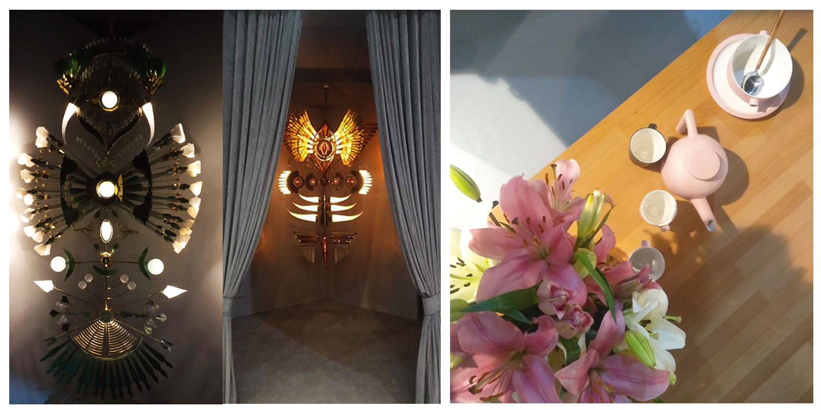
The subtle power of design to uplift the ordinary to extraordinary was visible all throughout the exhibition. Remarking on a pink china set our senior designer rightly said that there maybe millions of pink in the world but it takes a designer's eye and skill to come up with just the right pink to go with the proportion, form and story that blends seamlessly into a well design product. Viewers get delighted by that beautiful color combination. Unknown to them, hours of research and trials have gone to achieve that perfect blend of pink.
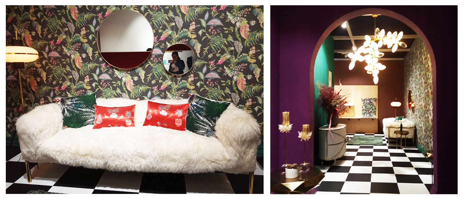
After being exposed to such a spectrum of wildly creative work your brain cells automatically began to tinker. Each idea gives birth to new ideas. A drive occurs that makes you want to push yourself to achieve more. So, when you are down and out. All the design knowledge you have acquired over the years won't come to your aid. The solution might be to go out for that walk, take in the fresh air and observe.
|basic_html

QED42 Design Studio -- Making

We started our Delhi operations in Nov 2015, though finding the place was a little difficult but we managed to find a nice quiet basement, armed with functional furniture and an internet connection, we got started. Though we liked our cozy new office, we soon realised that it had terrible cellular and internet network and after months of trying to get it fixed, trying different options we decided to move out, since then checking for signal strength and internet connectivity at a place has topped our list of checklist :).
As almost all of our Design team operates from Delhi, it was natural for it to be inspired from good design studios and design in general. Our major source of inspiration was our neighbourhood coffee shop Blue Tokai, often taking breaks at the coffee shop we liked their space very much for its functionality and offbeat design / interiors.
After couple of discussions, we had a broad idea of things and vibe we wanted in our new place. These discussions allowed for a good checklist of things, things like natural light or an open area were important to us. With a comprehensive list came the tedious task of hunting for a place, it took us almost 2 months to find a place that offered what we wanted and was in our budget and we locked it down immediately. We started office setup project with a 3D Model of the office and figuring what goes where?

Once we had a clear picture of how we wanted our office to look like, we went on a hunting spree for lights. Lighting up a place makes a huge difference in creating a soothing ambience. So, we went on to explore an array of options for lights in light markets around Delhi, and finally picked up a variety from Khan market - tracking lights, ceiling surface lights, a suspended light, table and floor lamps, and some really cool hanging lamps. Staying true to our inspiration we chose a colour combination of White, Cool Grey, Earthy Brown and a hint of Black for the interiors. So we decided to have all our lights have a black body.
We spent some time in researching about the furniture we wanted for our office space and we realised that getting the right type of furniture is quite a tedious task. We wanted the furniture to look contemporary, with all comfortable features and which also suited our office space and interiors so we had to be clear about certain questions like - “How much amount of money were we going to allocate for the furniture?” “What type of chair or desks will we be needing for the office?” We finally settled on having custom made furnitures from Kirti Nagar in Delhi. Two long, white tables were added to the main office area and for the cafeteria separate set of wooden table and chairs was set up. For a more comfortable working experience we’ve included two bean bags as well. Any office space cannot be complete without having a little space for spending quality time reading books. We have a set up our own little library in the office with a stylish book shelf where we can take some time out of the busy schedule and just relax for a while.
Talking about comfort, it is also important to have proper air conditioning especially in a comparatively hotter place like Delhi. Our office has a split air conditioning system since we have three different work areas. One is the main workspace and the other two are conference rooms.
It is sometimes likely to happen that some of your ideas won’t get the chance to be executed. For us as well, there were a few ideas that did not take shape because of various reasons like keeping a cost limit, time constraints, availability in the city, etc. But we were quite happy with the way everything had turned out.
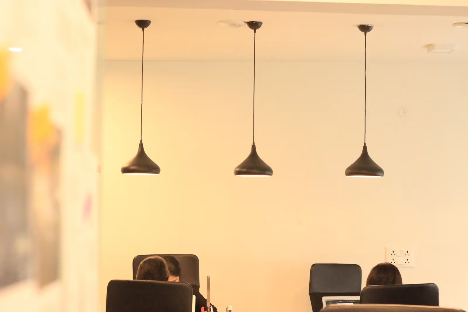
Cafeteria
We did not want to separate our workspace and cafeteria by creating walls all around. Instead, the two different kinds of flooring does the job for us, by creating a visual difference. The cafeteria has wooden flooring which makes it look like a completely different section from the workspace which has carpet tiles flooring.

Most of the time we are seen lying on the oh so comfortable carpet (thanks to Money Bhaiya who keeps it clean all the time).
When we meet at lunch break or anytime during the day, it is a matter of a lot of fun! We catch up about everything apart from work. It is a place where we laugh, talk and connect with each other. We definitely don’t miss out on the chance to pull Manoj’s leg. Aren’t these little moments of joy we share with each other that make office less boring and more homely?
The Reading area
Having a cozy, isolated space for a person who loves to read or for the one who just wants to spend some alone time is what the reading area is all about. It surely helps us get our energy and motivation back.

We are a team of motivated people who like to compare work to an adventurous journey where we daily explore so many things and learn something everyday. Sometimes, we have a lot of work pressure, and the reading area gives us a respite from the restlessness of the day. It acts as a zen space for us to calm our minds down. No one would deny the fact that such breaks are really important to meet deadlines.
The reading area gives us the opportunity to think and grow with a peaceful mind and come up with effective solutions because sticking to the laptops the entire day, does not help to find the solution always..
And don’t forget the comfort of the bean bags!
Plants all around

‘GO GREEN’ because that’s the need of the hour and we unfailingly follow that.
From the workstations to the balcony, there are plants kept in beautiful white pots. They not only add the green to our palette, but also make our space fresh and clean.

Designers’ cabin
This is ideally the brainstorming room where we discuss and create products and services with prolonged discussions and iterations. We’ve enhanced the look of this area by placing colour co-ordinated chairs and a round table. To make it more designer-like and artsy there stands an easel with a white board and a black board as we love using chalks!
Balcony
When we feel like taking a glimpse of nature we go outside in the balcony where we have put up hanging plants and four chairs. We can sit and relax while we take a good sip of coffee with the nature.
We do have our fun benefits of working here such as:
Our all time stocked up fridge makes every hour enjoyable, and Happy hour is not the only hour we enjoy.
When we are too lazy to travel back home after work or just want to take our mind off the work, we like to let our fellow mates showcase their talent and entertain us with some good music. Jaideep and Zango sir lighten up the mood in the office by playing some beautiful music on flute (which Jaideep carries everyday in his bag) and guitar.
--------------
What we sincerely believe in, is the fact that the mood of a workspace certainly plays an important role in defining the efficiency, productivity and creativity of a person working there. The words ‘fun’ and ‘work’ don’t have to be antonymous because we can always have fun while we work. And we do have a lot of fun here!
We have been extremely focused while getting this studio built from scratch. It is quite a challenge because you have to keep in mind all the possible setbacks that may arise while setting up a place. But sometimes it is necessary to decide what’s best for us and hence, we also had to reject a few ideas.
P.S. - We certainly have missed out a few things here and there (like we sometimes laugh about how a fully equipped office does not have a power outlet in the conference room). We plan to complete the final look and feel, by the end of the third quarter this year.
However, we have very well managed to put up a workspace that we already love.
From the lights to the furniture, from the reading space to the cafeteria; everything looks perfect. And we’re sure you can’t wait for the pictures of our new office to come.

Kudos to the team!